Over the last 10-15 years Auckland had seen spectacular growth in the use of public transport – although coming off a low base. The growth came off the back of improvements to infrastructure, such as the upgraded rail network and Northern Busway, and improvements to services, such as the new bus network as well as integrated ticketing and fares.
The last of those major changes occurred in 2018 with the roll out of the bus network to the central isthmus and North Shore areas. While none of these were necessarily easy to achieve, the growth they enabled and encouraged has exceeded expectations and I feel that allowed Auckland Transport to get lazy as they sat back watching the numbers tick up. Why push to make even more changes to the user experience if you don’t have to?
They have instead been preoccupied with big infrastructure projects such as the Puhinui Interchange, Eastern Busway and City Rail Link as the solution to growth. This is not to say they’re bad projects by any means, they’re very much needed, but it has meant the user experience on other parts of the network has been stuck in a bit of a time warp. Many of the less tangible things that frustrated people and put existing or potential users off using PT a decade ago still exist.
This is even more confounding when you consider that AT has a division dedicated to ‘Customer Experience’ with the leader of that reporting directly to the CEO. They have produced a few good things, such as the ongoing improvements to the mobile app, but in general you have to wonder what they do all day – focus on gimmicks like subsidised taxis I guess.
As a result of all of this, the rate of growth on PT was slowing even before COVID-19 hit and AT’s preference of just throwing more peak hours buses at the problem felt like it was hitting the limits of financial and spatial constraints. It was increasingly difficult to see where the next 50 or 100 million annual trips were going to come from. But we’re going to need multiple times that kind of growth in a relatively short space of time if we’re going to make an impact on issues such as congestion and climate change.
So perhaps one silver lining from Covid could be if AT were to use the opportunity to overhaul their service offering, aiming to make it something that you don’t just use because parking is expensive or because you don’t want to sit in traffic but use because it’s easy and convenient. This could help not only help in making the experience better for existing users but set up a whole new wave of growth that could help push usage levels back up as well as setting up the system to be able to handle that better.
The big infrastructure projects will contribute to improving that experience and I’ve written before about the need to turn up the dial on all day/week frequency. But in this post I thought I’d look at the often really little stuff, the stuff that should go almost unnoticed but can play a big part in the user experience. These are in no particular order.
Access to stations
AT need a programme of work to vastly improve the levels of access to train/busway stations and even local bus stops. So much could be achieved if we made it easy to walk and cycle to your local stop. This includes, but is not limited to, things like pedestrian crossings and ensuring safe walking and cycling to stations and that there is ample space to park bikes.
Advertise the network
Since the new network, PT routes have been designed to work as a single network but you’d never know it from AT’s website or collateral. Trains, buses and ferries are all treated completely independently of each other. For example, if you’re on the Northern Busway there’s no mention that the NX1 connects to trains at Britomart.
When AT do try to do marketing it’s often very localised and/or route specific or are so generic to be pointless. AT’s Go Metro campaign is a classic example of the latter and even if you go to the website link, it just tells you to then go to another page to use the journey planner.
One of the best things for advertising the network would be to just show the network. The map below showing just the rapid and frequent networks was developed as part of the new network project but why is an up to date version not used? It should be at every train and busway station and every bus stop on a frequent route at least, not to mention all over AT’s website.
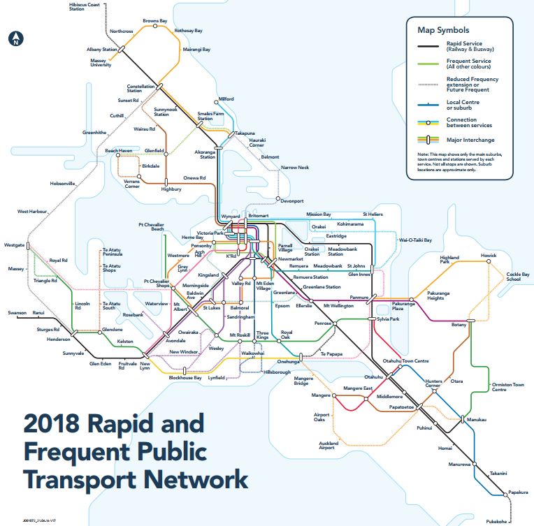
As Roger suggested in his post last week, why not come up with some specific branding for this or even just the rapid transit portion. Instead we get this which is only on the trains and makes the busway feel tacked on and not really part of the network.
Wayfinding between the RTN
Seamless transfers aren’t always possible and one place that’s most evident is between Britomart and the NX1. How about AT do something like paint a line on the ground to guide people. Follow the yellow brick road, or something like that.
Route maps
At some train stations AT have put these sparse route maps showing the upcoming stations. These are quite common overseas but AT’s design leaves a lot to be desired, for example to me these are normally presented bottom to top, with the upcoming stations above the one you’re at.

Last year, Sam – who wrote yesterday’s post, took a crack at redesigning them and there’s a night and day difference between them – and not just because of the choice of background.
- It fixes the issue I mention above.
- The rail line connections are easier to understand instead of a line of text
- It also includes some of the frequent bus connections which also adds to discoverability of the network.
- It includes the scheduled time to reach upcoming stops
- You can see the entire line, with it clear which part is ahead of you (in case you’re on the wrong platform).

Consistent signage
AT launched their Metro brand in 2014 and that has subsequently been rolled out to buses and trains across the region, but bizarrely not everywhere with a number train stations still sporting the old MAXX branding. I might understand a few lessor used bus stops not having been updated but the rail network and busway are meant to ATs flagship services. You’d think at least they would get updated.
For example here is Swanson but there are other stations like it.
Better Displays
At a handful of stations AT have installed some newer, more readable displays but most train and bus stations still have the old dot matrix displays that can be difficult to read, even relatively closely. AT need to roll better displays out around the network.
More Displays on platforms
Most train station platforms are about 150m long, just long enough to fit a six car train on. Yet they will normally only have a single electronic display that even with good eyesight is nearly impossible to read from parts of the platform. You also don’t always have a hand free to be able check the AT mobile app for something that should be abundantly provided at stations.
So, how about another couple of displays scattered along the platform?
Displays from the street
Many train stations have a large plinth advertising the station at one or more entrances, normally near a main road. An example is below from my local station – which as per above still remains in the old MAXX branding. Why not have a display in with say “Next train to the City” and just a large number showing how many minutes away it is. The idea is that if you’re approaching the station and a train is close you can speed up to ensure you make it.

HOP Cards in Vending Machines
In most cities you can buy the equivalent of a HOP card at a train station, but not Auckland. I don’t know why Auckland Transport cheaped out and bought top-up machines that couldn’t dispense cards too but they did. But here is one really simple solution – make use of the vending machines.
A few years back AT installed vending machines at most train stations a way to get a little extra revenue. How successful they are I have no idea but they’re I do know they’re stocked with multiple versions of the same product e.g. my local station has multiple rows of the same brand/size bottled water. Why not take a couple of slots and convert these to storing some pre-loaded HOP cards?

Specialist child cards
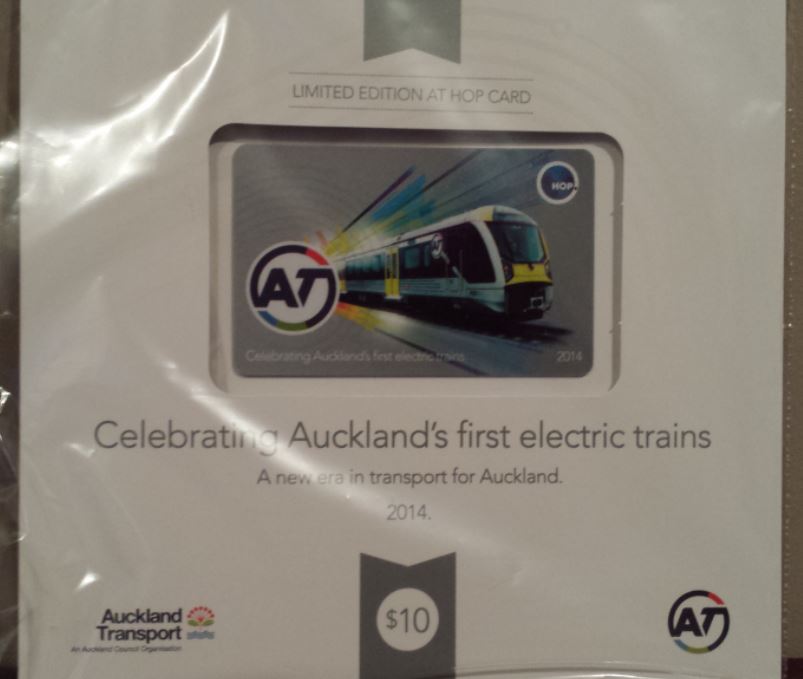
We have special HOP cards for Supergold so why can’t we get the same thing for children? It could be a unique design to make it stand out and come pre-loaded with a child discount. They’ve even kind of done it already once before as part of their Te Ara Haepapa schools programme, which involves 9 schools with 900 students, where they gave the schools free and uniquely designed HOP cards pre-loaded with a child concession.
More HOP machines
You arrive at a train station and need to top up your HOP card, only there’s a line of others needing to do the same thing and the train will be at the station soon. What do you do? More than once I’ve seen people miss trains because of this and if you’re on the receiving end it must be awful. AT seem to have deliberately put fewer machines than they should have in a bid to push people to online and automated top ups but in my view it has just let to poor customer experiences. They need to put more top-up machines at train stations. It seems to me there should be at least two on island platforms or on the peak direction platform.
It would also be good if they could be at the entrances to stations and not in the middle of them.
More HOP tag posts
One of my big bugbears is that AT try to scrimp by only have one HOP tag post at each entrance to most platforms. Having to queue up for a minute or two just to tag off when a lot of people get off the train in the evening is infuriating. Even worse, just last week I saw someone miss a train because the tag post was surrounded by people waiting to tag off so the person arriving to catch the train couldn’t tag on and therefore had to wait another 10 minutes for a service.
Below is just one example from the Gold Coast Light Rail system. This is at the end of the Line at Helensvale and features six tag posts. Other stations have them scattered all along the platform so there’s often one close by you can use.

AT need a programme of increasing the number of tag posts at stations. They should have a minimum of two per station entrance, if not more at bus stations.
HOP tag posts by top-up machines
Topping up a HOP card using a machine on a station platform is needlessly customer hostile. Putting aside the issues with the machines themselves, you first have to walk to the middle of the platform to get to the machine – which could be 70m away from the station entrance. Then, after topping up you need to tag on, only those tag posts are back at the entrance to the platform so you have to walk back there to tag on – then possibly back to about the location machine again depending on which carriage you might want to get on.
This is needlessly convoluted and if you’re running late you could be trying to do this as the train is approaching the station.
Putting aside the more machines issue above, much of this issue could be solved simply by putting a tag post next to the top up machine.
HOP machines with different station orders
Admittedly It’s been a while since I looked these but from memory if buying a paper ticket the HOP machine displays a list of stations in alphabetical order rather than something more coherent like the line map above based on upcoming stations.
This is important as often those buying paper tickets are the irregular users – who are also the ones we want to be showing that PT is easy and convenient to use.
HOP machines with more intuitive layouts
As per above, it’s not just the order of the stations that could do with a tweak but the overall layout. Even as a regular user I’ve found I have to concentrate harder than I should have to have to work it all out.
Prepaid top up codes/bundles
Go to a supermarket and you’ll often see a rack with a variety of prepaid cards for purchase. Why can’t AT do the same with HOP, which among other things would then enable people to more easily buy travel for others.

Better disruption communication
Street disruption sometimes happens and when it does buses will need to change routes. Yet AT’s communication of these changes is archaic. In this example there is one but often there’s nothing but a table that looks like this. Have they not heard of maps?

Special event HOP cards
Like with child HOP cards, AT should be cranking out designs every few months to celebrate special events.
Better Bus stops
You may recall five years ago AT were looking at options for new bus stop designs. The winning design is now being rolled out around the region but crucially one is missing, the neighbourhood interchange idea, which is meant to be in places where frequent routes intersect. They said at the time up to 20 neighbourhood interchanges will be needed and AT want to ensure that they “are impressive from both a form and functionality perspective”
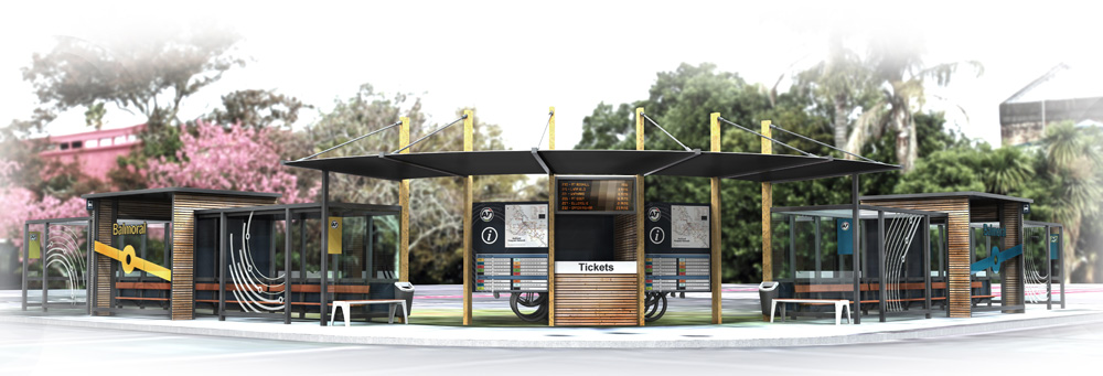
I don’t think one has been installed and transfers between services is often still far less than ideal.
There are plenty more ideas out there and this post is already too long so chuck them in the comments and let’s create a list.

 Processing...
Great post. I don’t who/when it was decided at Akl Transport that no one wants or finds maps useful? Even when they have them they’re buried, so hard to find on the website.
The journey planner doesn’t work for me, but give me a good map and I’m there, just how my brain works I guess… more maps please!
+1
+ Another One
+1
They need two sets of map, one is a local map for that suburb and the nearby suburbs. It should shows local Point of Interest near that stations such as how to walk to the town center, where is the nearest library, where is the supermarket, how to walk to the other transport interchange, etc.
Then they need another map that shows the regional backbones. It shows how they can move around Auckland using PT.
They need to stick both maps in the bus station. The local map should also be installed/printed in town center/library/recreation/supermarket etc.
We could learn a thing or two from Transport for London, who have very consistent local wayfinding signage at most of their main stops. Their ‘Legible London’ programme is something AT could learn from.
https://tfl.gov.uk/info-for/boroughs-and-communities/legible-london
This link shows the style of wayfinding sign I think AT should use around Auckland:
https://tfl.gov.uk/cdn/static/cms/documents/legible-london-product-range.pdf
Also sections 3.14 onward of TfL’s document here might be of interest to AT… http://content.tfl.gov.uk/tfl-interchange-signs-standard.pdf
Thanks.
Also I’ve long been puzzled why the building above the Britomart Eastern entrance has no sign at all that it is a train station, nothing, nada.
In London that would have the underground rondel and the station name above the entrances, on both sides, plus better way finding to the stairs/lifts themselves. Baffling
Drinking water is part of a Healthy Streets design. I realise this is wishful thinking, but if Council and AT took the Healthy Streets concept seriously, they’d be installing drinking fountains at stations and whenever they install new bus stops, at least the major ones.
And undermine the sale of overpriced water at the vending machines that the consumer will finish within an hour or so, packed in a single user plastic bottle that has a high chance of being around for the next 10,000 years?
How could you suggest such a thing?
It’d be bad for GDP, wouldn’t it? Just like reducing our reliance on cars and oil…
Exactly 😉
Public drinking fountains probably wouldn’t work with social distancing atm either. I’m in Melbourne and they have notices on the public drinking fountains saying not to use them.
The public health implications of not having access to water are bigger in NZ. Even to be resist contracting a bug you come across your body is stronger if well hydrated.
Public water fountains can be perfectly safe – the water is untouched by human hands, ever, till it reaches your lips. Its just the button that is the issue. So: it becomes a design issue. Simple – redesign the button to avoid need to touch with human hands. Have a motion operated button. Have a foot operated button. Have an elbow operated button. There are many such systems already out there. We just need intelligent action from those in power to order them, install them, and we can go on our way, re-hydrated safely.
Maybe Vanessa Ellis – Executive General Manager Customer Experience should wire an article for the paper or present st an Auckland Council event to explain what her team are up to. If you google her there is nothing apart from LinkedIn and the like.
* write *at
Typical council – it takes a team of people with a high paid GM to do a job that any of us could do in an hour or two a day.
The resistance to putting in safe pedestrian amenity near stops is what really does my head in. AT still treat pedestrian crossings as a source of danger instead of realising the source of the danger is the arrogant driving culture that their system has produced.
The number of elderly pedestrians being hit should indicate to AT that they have to stop assuming pedestrians can get across if only they are sensible… AT are designing everything for the healthy agile adult instead of the whole gamut of abilities that people have. Children take the hit by not being allowed to be independently mobile, with enormous effects on their health and development.
Again Heidi, I can’t believe there is no zebra crossing at the city end entrance of the Panmure Station. And almost none of the street lighting works either. Also where AT has failed is in making their main upgraded stations like Panmure and Otahuhu, vibrant hubs. Both are so sterile and dead compared to stations in Japan etc.
Some good ideas and thoughts in this post. One again where Japan is so much better, is in promotion. There are always promos going on, with special celebration eg 10th anniversary of opening etc merchandise, including transport cards.
One of the main stops on Richmond Road for the 105 route, they have the bus times on a small sign attached to a pole literally in the middle of the grass. In Winter anyone wanting to get up close to view times has to literally walk on boggy mud to view it, it literally does not make an ounce of sense,
Here the link, its now on that pole on the grass rather than in the bus stop and in very small font. Most younger users like myself can easily view on phones, can’t imagine how hard it is in the Winter for an elderly person to go over to it and not slip.
Like you sya, its the little things..the things t hat just need some common sense applying.
https://www.google.com/maps/@-36.8569753,174.7404967,3a,75y,67.4h,76.07t/data=!3m7!1e1!3m5!1sLhv1hSfEa1KwStSW6xBy9Q!2e0!6s%2F%2Fgeo3.ggpht.com%2Fcbk%3Fpanoid%3DLhv1hSfEa1KwStSW6xBy9Q%26output%3Dthumbnail%26cb_client%3Dmaps_sv.tactile.gps%26thumb%3D2%26w%3D203%26h%3D100%26yaw%3D123.949394%26pitch%3D0%26thumbfov%3D100!7i13312!8i6656
“So, how about another couple of platforms scattered along the platform?”
Good spotting, was a late night typo
In Wellington you need cash to get a train. Who uses cash these days. There’s no atm near my station. There is a dairy 10 minutes walk past the station. But will they give cash out? Less inviting for an occasional user than a hop machine.
By your logic; everyone who uses the Wellington trains (except you) uses cash these days.
Most regulars have 10 trips or a monthly. But they only cover the journey your normally take. Paper tickets are not felixable.
So any non regular journey is cash. If you don’t have a ticket or carry cash your stuck
Wellington is 100 years out of date but despite that there is absolutely no urgency to fix the situation. At least they now let “monthlys” use other lines. It used to be that a regular Petone-Tawa commute needed 2 monthly tickets despite being in the same zone! Amazing and so dismissive of their customers.
Or you can buy a paper zonal day-ticket which gives you unlimited travel within the zones you purchase for. And you can buy these on the train (cash only, of course). Or at main stations (Cash/card). They are good value if you plan to return or interchange between trains ( but of course they don’t work before 9am on weekdays :o(
All a bit 20th Century.
I am sure the current fiasco is the result of a private arrangement from the previous Government, to extend the life of Snapper in Wellington, to recoup some of their investment after Auckland Transport rejected Snapper here in Auckland.
@Zippo:
Hardly anyone in the Wellington region has much reason to take the train to get to any destination off of their own line. The line’s don’t converge until Kaiwharawhara, whose station closed back in 2013 and has only had vague talk of reopening. So you have to take the train all the way to the Wellington Terminus. And to be honest; there’s not much reason for people in Johnsonville, Porirua/Kapiti and the Hutt valley to especially want go to each other’s areas most of the time to begin with.
Not really a problem. I buy a 10 trip ticket. Job done.
The alternative is that all 53 stations have barriers and gates installed, at a cost of $X,000 each. I agree that should be done – but honestly, it’s not really an issue without them. Most of the passengers on the train are regular commuters and already have a monthly pass or a ten trip ticket, and most of the tourists (bygone concept, i know) start from the main Railway station and go out into the burbs, rather than the opposite direction.
No need to gate all the stations, Auckland only has around seven or eight stations gated.
All you would really need would be to gate Wellington, Porirua and Waterloo. Most trips will go through at least one of these stations, only one end of a trip need to be gated to make it effective.
Great post. Certainly makes me wonder what the teams at Auckland Transport who have this as their job actually do all day.
But for those who try to improve things, and get cut back by silly management decisions, do keep trying! You’re doing noble work.
Our local bus stop has done local board public input written letters to the team
And even collected users number data over multiple dates to suggest and support the news for a top up machine. We have emails from the owner dating back to 2016. We are on a waiting list that seemingly goes no where… next term we may try a petition from the 3 local schools.. but yes improving customer service and improvements in current service seems to stay a non urgent issue to say the least
A lot of these ideas seem to be very expensive for limited benefit. Have you asked AT how much a new, full installed ticket machine costs or multiple screens in addition to the ones already there? AT is under severe financial pressure, in my opinion internet services for ticketing and timetable/general info is the way of the future.
All bureaucratic organization always says they need more money, so they can grow their ’empire’.
If we accept that excuse, nothing more will be done.
A good comparison is banks where the future model is almost complete reliance on internet based services. There are plenty of other areas where the investment may get better results. Extra tracks, electric buses etc etc.
What is your definition of very expensive. For example $1 million would be a rounding error on some AT projects…
24/7 bus lanes and connector buses running as frequent as the FTN buses like the 33….
Passenger Experience (PX) is a confluence of legible / intuitive wayfinding, service marketing and service communication.
As every good PT operator knows, getting the basics of PX right, is fundamental to success in service usage growth and revenue generation.
A public transport entity that pursues a PX strategy focussed on general awareness marketing, app-based journey information and a belief that public transport service provision is principally for the weekday commute, will continually struggle to grow service user numbers and secure crucial service opex funding.
+1
The issue is AT is private entity and therefore not driven profit and efficiency.
They are more a bureaucratic so their intention is to keep their job secured. That means staff try are not motivated to take any risks and do anything extra.
They are only concerned for the ‘next big project’ that are well funded by political agenda. Everything else are not important.
The issue is AT is *NOT* a private
I wonder how long those plinths And station signage with that lame & dated MAXX branding will remain? I’m sure they evoke bad memories for some Aucklanders.
AT changed the journey planner recently, but it’s still not based on what users really need.
There are often multiple different routes to get somewhere, with a different combination of trip legs. With low frequencies on some lines and slower (or faster) services on some lines, knowing more about transfer possibilities than what the computer spits out as optimal for the times you’ve given is critical.
It would be good to see the generic trip combination possibilities, then click on any of the particular routes to see the individual services on offer at that time. Often I would choose the trip combination that has the most options on offer for the second leg, in case the first trip doesn’t work out so well.
I need this more because I don’t have a mobile, but it’s not just people like me. I find this the case often when I’m trying to assist people not used to using PT. I want to recommend the trip that is most likely to provide a quick transfer, but even fiddling around trying to show them the possibilities on the Journey Planner puts them off.
Another thing I forgot to add
Can we please have displays that focus on the next bus to arrive, not the bus in an hour. This is especially the case on the Northern Busway where you want to find out when the next NX1 or 2 is and you have to wait while it scrolls though a heap of future services instead of just showing the next one
Yes please. I recall a very useful suggestion by another reader to show on one line the service name, minutes to next service, then to the right minutes for the ones after.
Have seen this overseas, so much quicker to get the info you need.
Matt L the worst I have seen is the signage for buses at Grafton it takes what seem like 5 minutes to scroll through all the different buses that are due to arrive and half of them have the * saying it is due or arrived which is sometimes doesn’t apply as it either has gone or been delayed with traffic somewhere in Newmarket .
And I think the way ticket are placed may have desifned by the clown that said Mercury Lane was an easy walk up for disabled people .
I like the PIDs at bus stops in Wellington
“AT has a division dedicated to ‘Customer Experience’ with the leader of that reporting directly to the CEO.” Shhh. Now you have drawn attention to this division when they were trying to keep their heads down. Expect it to dissappear in the next re-vamp. Seriously, I think AT is a top down organisation. Decisions are made and passed down to ‘Customer Experience’ to implement. They cut the cloth accordingly. I find most organisations have heard of ‘continuous improvement’ but either dont have the corporate structure to support it or dont understand that it exists past the initial rollout of the project. Projects are viewed as a series of unconnected milestones. As such there is no way of funding reviews and improvements as this is not budgeted and the teams disestablished to work on other projects. This is especially true where a large part of the head count may be contracted rather than permanent, so there is no corporate memory or even a permanent ‘champion’ for the project within the organisation itself.
+1
I also think that a number of organisations aren’t interested in investing in their people, so the mindshift required to maintain momentum of continuous improvements programs never happens.
Great post. Totally agreed with everything you said here. These little things usually overlooked by designers but it is painful for people who uses it everyday.
I think the key point is the people who design the PT need to actually use it themselves.
A lot of the issues such as the poor locations of tagging machines, poor wayfinding, unintuitive information, etc means the initial designer is not a PT user. Otherwise he would had picked it up, and correct it quickly.
Moving forward, I would suggest new PT infrastructure/operations should be co-designed by people who uses the PT everyday.
Also existing user-experience issues should be fixed asap. AT should allocate fund for a dedicated “PT customer experience optimization” project and fix most of the things mentions in this post.
That bus stop design is terrible for several reasons:
1) It is expensive
2) It provides little in the way of protection from either rain or wind
3) They continue to build them with glass despite most bus stops being vandalised and glass smashed regularly costing thousands of dollars of damage per stop each year!
4) Tiny capacity. They need to hold more people.
5) Quality. They look like they’ll only last a decade before needing to replaced at great expense with replacements.
Quite simply they need to build robust, economical and practical shelters that are safe. If they did that they could have more shelters in more places at less cost with the money saved being used to improve services.
I think the bus lanes themselves are a missed advertising opportunity. Why not write the route numbers on the ground for example? Why not color frequent routes differently? All sorts of options there…
Or just some large font at bus stops with the route number so drivers can clearly see it. People are much more likely to cange if they know that they drive past stops on the #33 route the whole way to their destination.
Nice idea. I think the traffic device rules legislation prohibit this sort of marking. You’re very constrained with what you’re allowed to mark on the roadway.
For frequent bus routes how about coloured bands around the bus stop sign support poles and selected lamp posts along the route?
Marking the roadway can reduce the need for signage and in some situations it would be appropriate.
There are some lovely pictures going around of blue, pink, red pedestrian spaces https://twitter.com/jen_keesmaat/status/1282423927986421760 which I’m sure our traffic devices rules legislation would outlaw too (ugly signage would be required instead). As I’m sure you agree, the problem here isn’t with the concept. It’s with the legislation – and with the various parties who’ve known of its inflexibility but haven’t professionally stood up to demand change.
That detour list for the 743 and 751 is especially good, as I imagine a bus would find it very hard to turn left from Mountain Road to Te Horeta Road, given this is a tunnel beneath mountain road? Just shoddy, and would be so clear using a MAP!
I find it baffling that AT does not widely promote its network map. Personally, I think it’s too complex to include all the FTN lines. However, an RTN map when developed could be as iconic for Auckland as the central London tube map. I don’t think AT is thinking too much about what it would take to raise awareness of the network to the motorised public.
I really love the idea of the strip maps for station platforms, though my initial instinct was to try to read it top-down, not bottom-up. Maybe that’s just me.
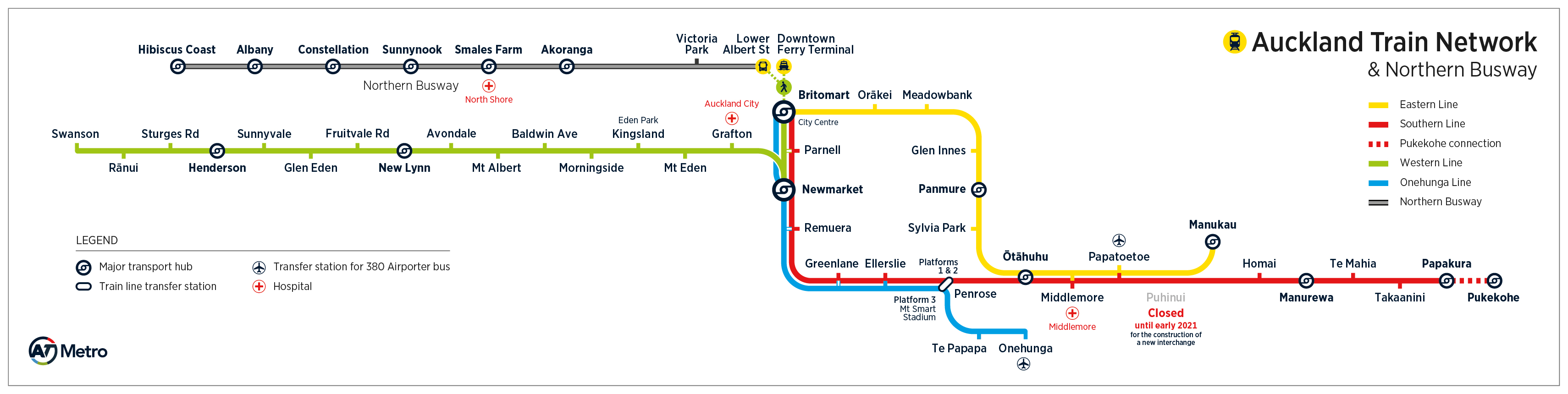
Also agree that the Northern Express seems to be an afterthought on the in-train “network” signage. It’s entitled “Auckland Train Network” in bold type and then in small type “and Northern Busway”. Quite apart from the fact that it’s NOT the Northern Busway which is shown, it’s a selection of the services that USE the Northern Busway (it fails to acknowledge there are two NZ services so it’s still only showing a portion of the overall RTN.).
Surely AT should first test their signage etc with people who are regular passengers and knowledgeable about the network? It’s currently a rather amateur.
And while we’re on signage, why not consider what they have on-bus in Stockholm? On a recent visit I noted that the on-board LED monitor showed not only the name of the stop, but also what connecting services operated through it AND how many minutes away each was. Very useful indeed.
The problem of lacklustre PT-management is all over New Zealand. I fear it stems from the fact that, a) many managers never use the services they purport to manage, and b) many remain infected by the tired old kiwi-mindset that nobody really wants to use PT so why bother being customer-focused or innovative. Just provide what you must, to keep your job ticking over.
Those visionaries who really believe in what they are doing and want to make a positive difference get incredibly frustrated and are all too often kept out of key positions.
I agree.
But let’s not forget; before the second world war taking PT was the norm even in NZ and automobile dependency was the progressive new mindset.
Change may take time but it can still happen nonetheless.
+1
It is the nature of bureaucratic organisation and power usually allocated to statue of quo instead of allocated to innovators.
One amusing/bemusing farce that has played out daily over the last few months are the direct express bus services from Panmure Station to Lloyd Elsmore Park (728) and Howick (729). They are always completely deserted, because they are timed to meet the eastern line trains in Panmure by 4 minutes, but the trains have been consistently 7 minutes late because of railway improvements. For 2 months!
I managed to nab the bastard this evening, only because I managed to catch an “earlier” train that was in fact 7 minutes late, which JUST made it in time. The driver was totally stunned to see a desperate hand flung through the closing door…
To be fair, the train/bus combo was almost like clockwork before the railway improvements began, but still…
Audio-visual announcements on buses for what stop is coming up, what transfers and attractions are available from the stop. Like the trains and London buses have. At least the airport bus has a map and stop announcements, when the driver remembers to turn it on.
Anyone riding a bus on an unfamiliar route in Auckland needs either a smartphone to monitor their location, or to nag the driver about which stop to get off.
Both the Inner Link and The Link Buses do/did have that system .
Lots of ‘did’.
Heidi ;-Both the red and green link I got last week , all they had was stuff from the Herald being posted on them and no route information that use to be shown
When the Outer Link screen maps work, they’re quite useful. One improvement could be to list where on the map the HOP card and top up locations are.
Trains that consistently meet the timetable would be much appreciated by customers. Can’t help but think trains should spend less time at each station and travel faster especially when leaving stations. Ensuring the rail corridor isn’t rubbish strewn would improve customer experience too.
Lots of small issues alright around Auckland and I general.
Signage and way finding often bad and a big bear of mine is we still seem to have bus stops that are missing or don’t match what is on the journey planner/AT Mobile app.
Another little tweek to the top-up / card vending machines: if the screen has direct sunlight, give it a little roof! At Remuera Station for example it is impossible to read the screen on a sunny day.
Coming from Wellington, I find Snapper much easier to use than HOP. It is a nightmare to try and top up your HOP card. I live a 20+ minute walk from the nearest location to top up my HOP card, which is a train station. Otherwise, I need to have the forethought to top up my card online and wait 1 business day before making my next trip. Even in the CBD it is difficult to find a top-up location
Compare to Wellington – almost every dairy across the region provides snapper top-ups. Android phones having an instant top-up function is also a life-saver.
The current Auckland system encourages fare-dodging or driving if you haven’t got enough cents on your HOP card.
Why is NZ so far behind the times when it comes to using an EFTPOS/ Debit/Credit Card or Mobile phone to swipe on and off public transport as is so common all over the world now (Norway, London, Singapore etc)?
Both Snapper and HOP feal destinctly third world in comparison.
I’ve not needed my Oyster Card for London since 2013, why can’t NZ be the same. As a tourist in NZ it’s very frustrating.
Getting the simple things right, hmmm, let me see…
1. Make the trains run on time. It’s really that simple!
I’ve been catching a morning Western Line train from Glen Eden to Britomart since the start of the year and it has literally NEVER arrived on time. As I write this, the service I’m currently on is 7 (SEVEN) minutes late. AT need to drop the she’ll-be-right-ism and just make the trains follow the scheduled timetable (I know that sounds a bit radical). If AT can take this laissez faire approach to arrivals and departures then passengers should have the same ability when paying their fare.
2. “Keep Left” signage on the escalators. Kiwis are bit new to the whole public transport etiquette.
3. Extra rain shelters at Glen Eden, and other stations further west, like the recently installed ones at Avondale/Baldwin Ave.
4. Ability to purchase a return ticket (WTF – AT).
5. Express service on the Western Line. Drop the Newmarket and Parnell stops. Especially the Newmarket one. It’s bordering on farcical as the Western Line train pulls in to change direction, the train driver hobbles to the driver’s cabin and then we just park there for anywhere up to 7 minutes as trains from the other lines come and go. It’s like there is some untapped desire just to sit there stationary like huge swathes of the Auckland transport system.
6. Better customer service/refunds for poor service, instead of the pithy copy-and-paste apologies from Transdev for the numerous track faults, train crew matters, trains falling of the tracks, etc…
AT need to seriously up their game. But hey, we’ve been saying that for years….
I think there is too much of ideas circulating around, but if the situation seems unchanging then we might consider shifting things.