This is a repost that was first published by Nicolas Reid on his Linked In page.
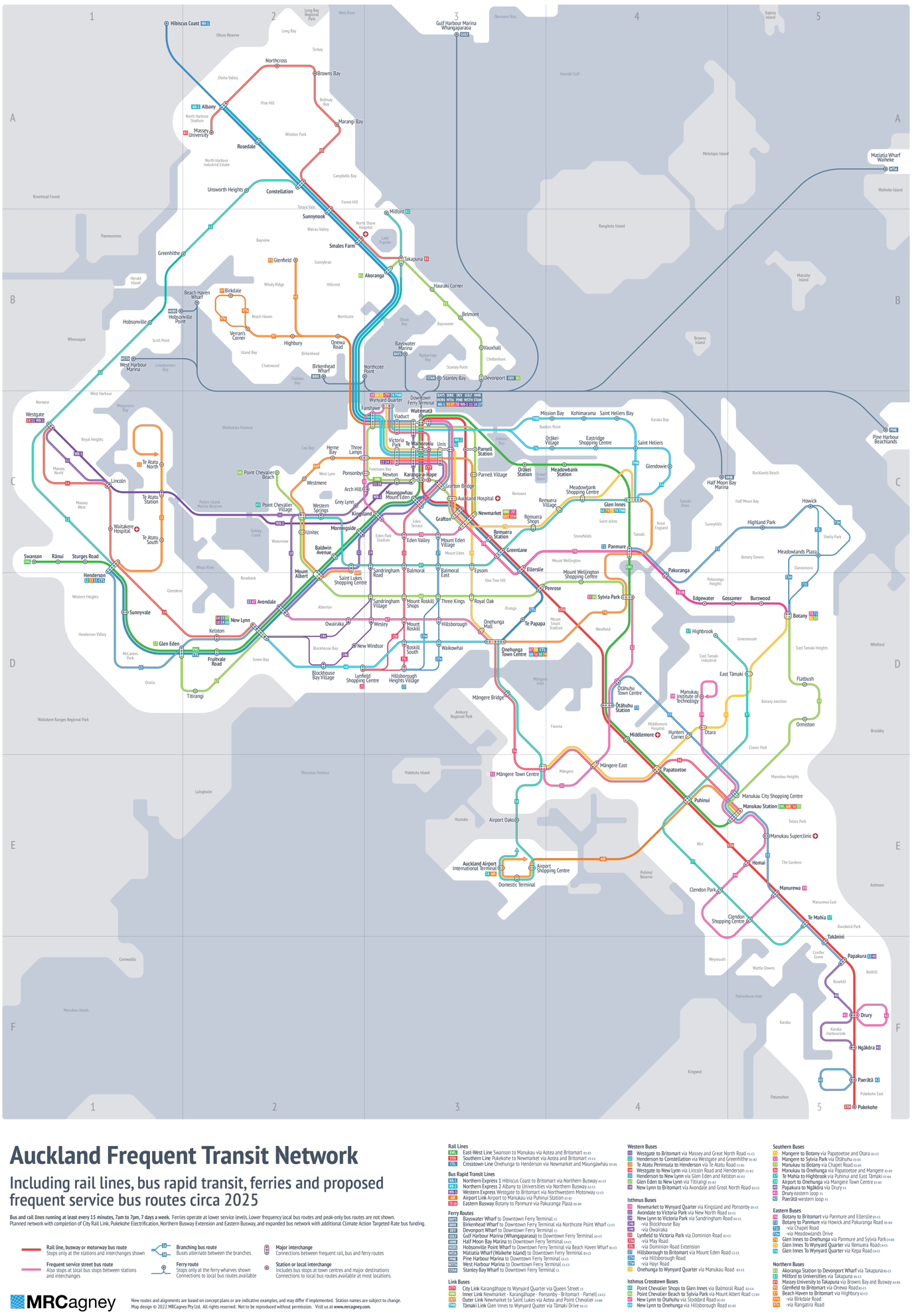
Ten years ago while working on Auckland Transport’s New Network I sketched out a public transport network map for Auckland. This was intended as a tool to help communicate the differences and benefits of the new integrated bus network that we had just designed around a new connective service model. That was my first map, and while a little amateurish, it was spruced up by a design agency and was used publicly for a while.
Public transport patronage has dropped over the past two years of the pandemic with people working from home, lockdowns and being more cautious about risks in public spaces. However, the next three years will see some very significant improvements to the public transport network that will support patronage growth.
To highlight this I decided to design a new integrated network map for Auckland showing what the system could look like in the near future. This incorporates some of the things I’ve learned about network cartography over the years, and includes some changes in content and presentation that I think are helpful.
Click for a larger version
The new map is a diagram of where the ‘rapid transit’ public transport network should be in about 2025 when the City Rail Link and a few other rapid transit projects, like the Eastern Busway, are finished. It also shows what the ‘frequent service’ bus network will be if the proposed Climate Action Targeted Rate (CATR) goes ahead to fund a range of bus network improvements, most of which involves upgrading lower frequency bus routes to the frequent, every 15 minutes, service standard. Naturally I’ve had to make a few guesses and assumptions about future routes, and in one case added my own suggestion (combining route 20 and 64 into one line), so don’t take this as gospel for what will actually be.
I’ve included the ferry network too, partly because they do meet some of the ‘rapid’ characteristics of rapid transit even though they have low frequency and limited service-span… and partly because the first thing everyone says with something like this is ‘but what about the ferries?”.
In no particular order, I’d like to cover a number of design elements and decisions I’ve integrated into the design.
The design concept:
- A user focused design. The point of a map like this is to clearly show the routes people can take to move around the regional network, and where they can connect between them. We transport planners are often guilty of focussing on things that are important for the planning process, but not important for the people who actually use it. This map avoids other planning or operational information that isn’t useful for users.
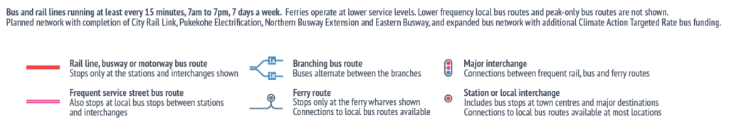
- Diagrammatic and simplified. Like the famed tube map of London, this isn’t actually a map per se. It’s a diagram intended to be clearer and more legible than a true map. This is primarily to show the network as a whole, as much as the individual routes, and make it easier to see how you can travel around the network by connecting between lines.
- But (mostly) geographically accurate. To give an accurate sense of the distances between places and the expected travel time, this diagram was based on a real map of Auckland and almost all the stations and labelled points are close to where they are in reality. The only real deviations from this are that the centre of the network is expanded a little around the city centre where it is most condensed and complex. Also, the rural ends of the routes to Hibiscus Coast in the far north, Pukekohe in the deep south and the outer ferries to the eastern gulf have been compressed to fit in at the same scale as the main suburban network.
- It shows the frequent network only. Apart from the ferries, this map includes only frequent transit services, ones that runs at least every 15 minutes from 7am to 7pm, seven days a week. It’s a map of the parts of the transit network where you can just ‘turn-up-and-go’ at pretty much and time of day or evening without consulting a timetable (there are plenty of other local bus routes that aren’t shown because they don’t run frequently or have short service spans). In that way it is really an attempt to map the extent of the Auckland transit network that approaches the accessibility and freedom of the private car.
How the routes and lines are shown
- Service-led and mode agnostic lines. The map shows one joined up network of bus, busway and train routes with little differentiation between them, because it aims to show all the routes that have that same ‘turn-up-and-go’ frequency and legibility. Plus when these routes have the same service levels, whether the transit vehicle’s wheels are made of rubber or steel is pretty much irrelevant.
- Rapid transit vs. street transit. There is one element that is shown because it is important information for how someone might use the network. Sections of routes that run rapid transit style and only stop at the stations show are solid lines. This covers all the rail lines, most of the busways and some places where buses run on the motorway. But conversely, bus routes that also make intermediate local stops are drawn as split lines, to indicate that you can also get on and off in between the major points shown.
- Simplified routing paths. Some of the routes that the transit lines take between stations and town centres are highly simplified compared to what they do in real life. However, this isn’t a problem for a user because people can only get on and off transit at the stops. The specific route isn’t actually important, as long as the stations and stops are shown in the right place and the right order.
Representing the stops and stations
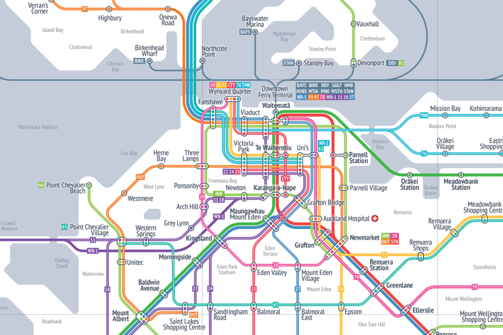
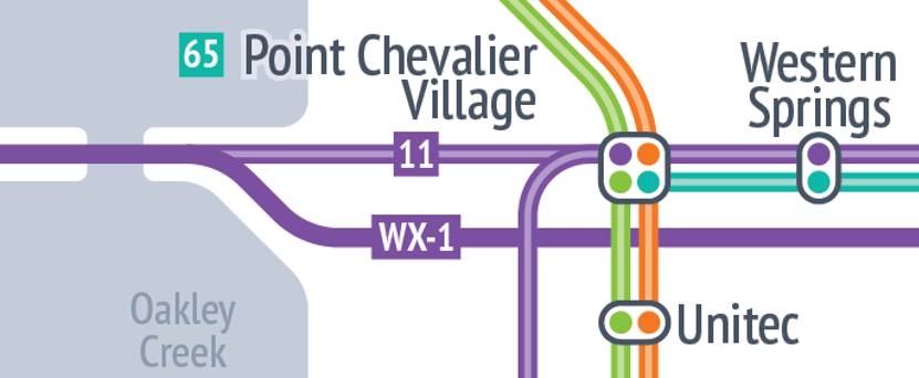
- Interchanges and stations as single nodes. Stations/interchanges are shown as a single point where all connecting lines are joined, even if these may be across more than one set of bus stops near each other, or between a bus stop and train station or ferry wharf that are naturally located a bit apart. What’s important here is showing that transfers can be made between the lines, even if that requires a short walk sometimes. Nonetheless, at a few points in the city centre I’ve used a connector between two or more major stops to give the user an idea of which connections are close, and which are far apart.
- Mode-agnostic stations. Major bus stops at town centres and other points of interest are shown the same as a train or busway station, because they effectively are one. Together this means all the connection points where you might change from one line to another, and all the specific destinations are shown as a ‘station’, regardless of whether that’s a train station, bus stop, ferry wharf or some combination of them in the same area.
- Station markers. I’ve included ‘dots’ in each interchange roundel confirm which lines stop at the interchange location. There are a few places where some routes come close to a station or destination but don’t actually stop there, so it’s important to be very clear on this.
All in all, I think this is a successful attempt to capture the potential of Auckland’s public transport network, especially what the integrated frequent service network could look like within a few years when a few upgrades are delivered. It also provides a nice base to look at further network improvements or route changes on.
What are your thoughts on the map design or the way it’s presented?

 Processing...
Jay Foreman did a new tube map video last week. I am sure AT will have their very own Frank Pick you could take it to.
As great as the map is, incredible work has gone into it, it’s looks more comprehensive than the Tube or NY Subway map. When a tourist arrives after seeing a fully fledged transit map and finds themselves on a old diesel bus with a few bus lanes and light priorities here and there they might feel a bit short changed!
True, but they’ll still have the information they need. That’s good enough.
Surely we’re not designing anything around the expectations of tourists when we have a resident population suffering from a dysfunctional transport system that’s not providing the basics?
The map delineates pretty well between a train/busway and what is basically a suburban bus with good frequency.
Needs a better bus network for South Auckland south of Manukau, Manurewa had a bus to botany( now the 361 took took part of that service from Manukau to Otara via Papatoetoe pembroke- huia street) and the 31 took the service from Otara to botany via Smales road and chapel. And a city bus from Papakura ( rip 471 472 bus)
Great map!
Really highlights the gap in east-west connectivity on the North Shore. Can’t understand why there’s no link from Birkdale through to Glenfield and then Sunnynook.
This is the same sort of thought I was having. It seems pretty unbalanced that the isthmus is crisscrossed by so many rapid routes but the North Shore and Howick are left so very barren. Like the isthmus these areas are full of residential properties (and they are becoming more densely infilled) so why are they being ignored and the funding going to allow even more routes in the middle? How does that encourage the people who have further to go to get out of their cars?
Great work on the map though – it looks very useful.
Yes, Northcote Road, Glenfield Rd (most of), Albany Highway, Tristram/Hillside and East Coast Road are missing.
I suspect a lot of it is to do with the more old fashioned grid like nature of the roads & town planning in the Isthmus.
Good to see these issues being noticed. Also Rosebank Road anyone? A lot if light industrial there and no practical routes.
The isthmus is better suited for public transport – historically they were built around tram lines, in effect transit-oriented development. The isthmus has historically had an okay combination of walkability, linearity, and density where e.g. Dominion Road buses can run every 3-5 minutes and be a profitable operation. Alongside Sandringham, Mt Eden and Manukau Rd operations – they’re all high patronage lines that are money makers.
That doesn’t mean north/east can’t have better service, but they’d almost certainly have a higher subsidy per passenger for a long while. You’re going to get lower patronage assuming all else equal with the quantity of horrific stroads, disgusting street layouts and cul-de-sacs, no footpath areas, low density, and car-oriented land-use planning.
You can fix some of that, but it’ll take time for land use to really respond.
” How does that encourage the people who have further to go to get out of their cars?”
*Tries to add a bus lane to Pakuranga Road*
*Has the National Party Transport spokesperson and possible next transport minister jump down their throat, shouting how AT is destroying western civilization*
Areas with more PT gets more PT more easily. Areas with less PT hinder improvement, because “what about the drivers?!?”.
It’s not quite as bad as it looks. The 941 goes from Beach Haven to Takapuna via Glenfield Shops and Wairau Valley, and runs at 15-minute frequency for a while in the mornings. There’s a 942 with similar end points but goes via Onewa Road and Northcote too. They are frequent services, but not rapid with a circuitous route the various suburbs.
It should also be noted that the 95 service is split between 95C that goes to the Constellation park and ride, and 95B that goes around Bayview, why these aren’t shown like the 97B/R split services to Beach Haven / Birkdale, I don’t know.
And the 917 goes between the Birkenhead ferry and Albany via Highbury and Glenfield, but that runs with the frequency of the ferry, so clearly doesn’t count as a frequent service.
So Birkdale – Glenfield is sort of covered, but on to anywhere north of Takapuna or east of Albany is a challenge.
The 95B and 95C aren’t shown like the others because they branch off in two separate directions without coming back together, so Glenfield is where the frequent service ends.
In the other routes that split both halves start and end at the same place so they have frequent service to the end of the route, e.g Botany to Howick or New Lynn to Sandringham village.
yup, and even if you want to go south/north if you don’t live near busway, then you’ll probably choose a car unless you’re up for a few hours adventure and gambling on 1h frequent buses to show up or not to get you to the busway.
I agree, the shore has buses in the eight place but the frequency is lacking to make the connective grid/busway feeder concept work well.
My suggestion would be to make the following routes frequent service to really cover it all off:
– 95c frequent right up to constellation
– 923 through Northcote to the city
– 914 and 924 crosstown through Glenfield, Birkenhead, beach Haven, Northcote, Smales, Akorangaand Takapuna
– 843 as extension of the 82 to city
– 879 on east coast road
One thing that map really highlights is that during the rail closures next year we shouldn’t be wasting resource on slow bus replacement services. Instead we should be focussing on the existing bus routes that allow people in GI, Panmure, Sylvia Park etc to connect to the Southern line, potentially boosting these frequencies and definitely priority.
Yes. We should be boosting the bus network and creating a cycle network.
No we should all be buying cars. They will close the rail network for months and then two years later close it all again to lower the tracks and then two years after…well they will think of some reason.
Highbrook’s level of service like a village at the end of the line.
Looks pretty good, but feel like rapid should be 10 minute frequency not 15, doesn’t really lend itself to 2 or more transfers
Agree, if you follow the link through to my other LinkedIn posts you can see a proposal I had for 10 minute frequent service network.
How have Onehunga and Te Papapa train stations made it onto a map of Stations that are serviced at a maximum interval of 15mins? Their interval is a woeful 30mins.
“The new map is a diagram of where the ‘rapid transit’ public transport network should be in about 2025 when the City Rail Link and a few other rapid transit projects, like the Eastern Busway, are finished”
They’re due to be every 20mins in 2025. Still doesn’t quite meet the threshold but it would be crazy to leave a small bit of the rail network off the map because of this.
Its a bit of a cop out, but the map is of the frequent network and rail and ferries, not just the frequent network.
Great map.
Projected 30000 more people in northwest Kumeu so your map sucks
by 2025!?
“… your map sucks”
Jesus, Bob get off the bloody internet.
Thanks for your input Bob.
If you’ve got an issue with the network the map shows you should make a submission to AT, they’re the ones that design the network.
I like it. What does AT think of it?
When I posted this on liked in one of the AT staff said they are working on something similar themselves to go in the next RPTP.
How about adding services that connect with ferries in dotted line? That would match ferry frequency and show how they connect to the rest of the network.
Thought about that, but if you add in the routes that connect to the ferry then you really need to add in the routes that connect to the busway and rail lines… and they you’re showing just about everything and its not a ‘frequent and rapid’ map anymore.
I notice the Outer link has had its circular route axed on this map.
Good. It should have happened years ago.
Yep was based on the plan that went out to consultation a while ago. Not sure its proceeding but I hope it does.
FYI: the 25B does not terminate at Lynfield.
Thanks JimboJones, im aware the 25B doesn’t terminate there, but the ‘25’ does. Lynfield is the last/first point with frequent service on the line… and even that is a bit of a stretch cos the two halves stop a block away from each other on different streets.
I see you’ve routed the southern line through Parnell. I understood Parnell to be served post-CRL by the Onehunga line only.
That routing is the latest published plan I could find, it comes from the background reports on the Auckland Light Rail website.
It seems the CRL network plan changes pretty often and I get the feeling they’re not 100% yet on what will actually be run when it opens.
Just 1 question: 2025? or 2125?
You’re unfair to ferries. For the place like Hobsonville Point they are a lot more rapid than any other modes. Ferry trip from Catalina is comfortable and takes just about 30 minutes to the city, bus + train as opposed is a pure masochism and takes nearly 2 hours.