This is a guest post from Werner Pretorius
In a city planning context, it’s impossible to be everywhere all the time. Which is why we use data – to help us see the unseen, to fill the gaps in our knowledge.
The Census Commuter datasets are one of those that help you see the bigger picture and detail aspects of commuting patterns.
In New Zealand, it’s surveyed every five years and aims to capture the entire population during the Census collection. These datasets are often used by central and local government, academics, transit companies, transport and city planners for a wide spectrum of use cases.
With the latest 2018 release, Stats NZ included the travel to education and work data by mode. Which is much more exciting to look at.
The main reason I prepared this post was to share with you the latest 2018 Commuter data in a new and hopefully more engaging way. Also wanted more city planning professionals to be able to understand commuter data very fast.
This interactive data visualisation below, using NZ 2018 Census data and flowmap.blue will make it easy to ask questions ranging from micro-detail to macro-regional movement in and between cities.
You can see how people travel to work and education (combined) for the entire New Zealand using different travel modes. I created a short video to show the key features here:
Each geographical area unit (SA2) is represented as a centroid point. The flows between centroids show the desired lines of how people travel to work and education.
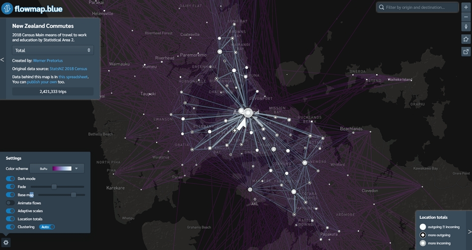
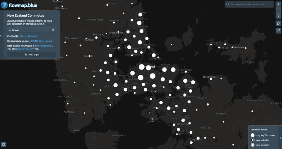
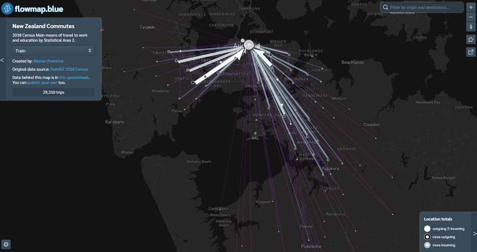
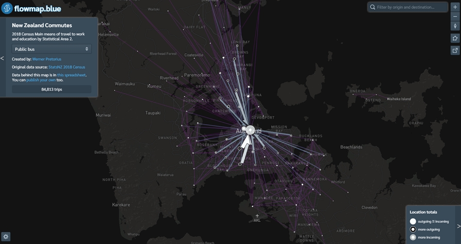
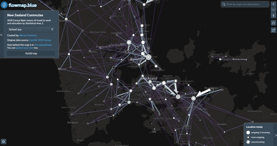
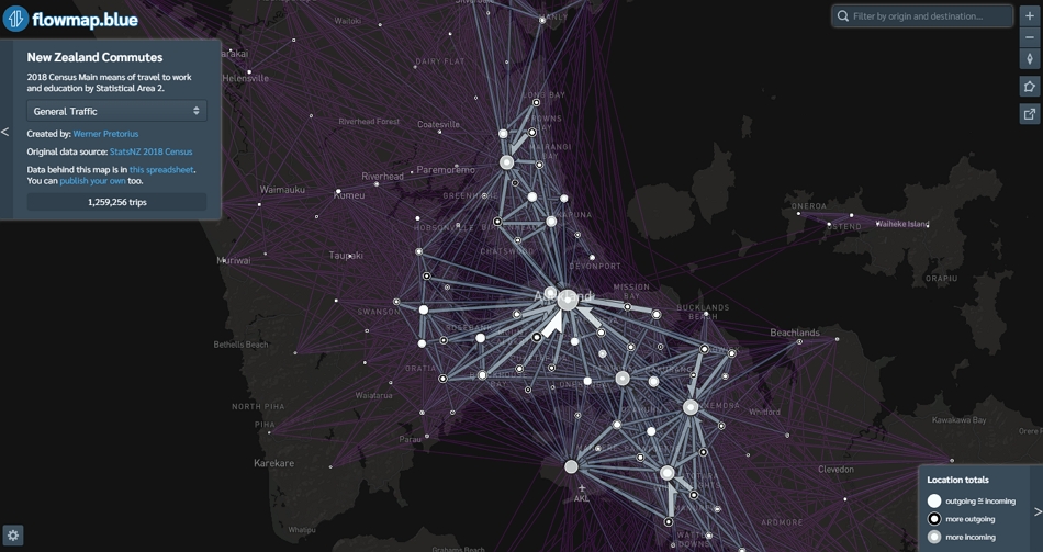
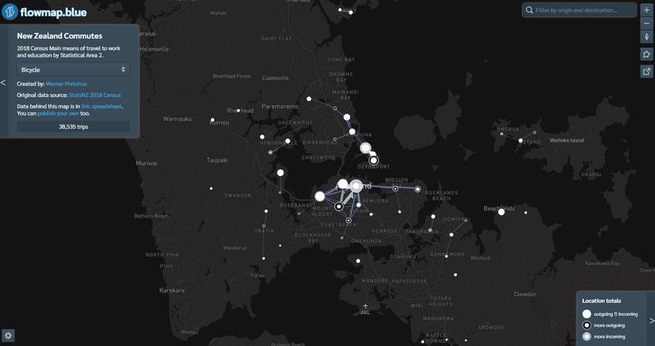
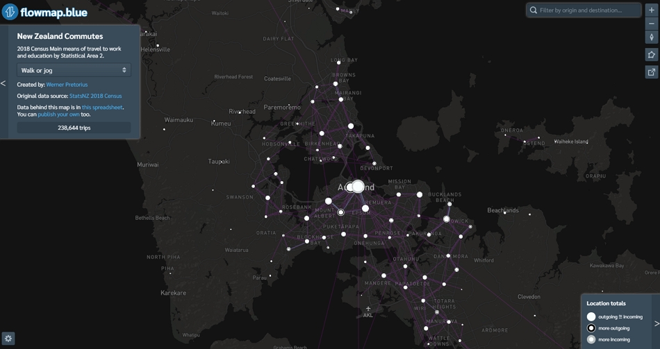
Clipped a few screenshots of Auckland’s commuter data, which highlight the desired travel demand by mode:
Total Trips (all modes): travel to work and education, combined all modes
At Home: did not travel to work or education
Train: travel to work and education using the train
Public Bus: travel to work and education using the public bus
School Bus: travel to education using the school bus
General Traffic: travel to work and education using car, van or truck
Bicycle: travel to work and education using the bike
Walk or Jog: travel to work and education by walking or jogging
To explore the interactive data visualisation yourself use this link.
I am interested to understand the potential different use cases and how it could help key decisions in shaping Auckland’s future. Leave a comment if anything comes to mind.
Enjoy!
Some caveats:
- This data only represents the journey to work and education and does not amount to all the demand on the network.
- This data only represents the main method of travelling to work and education
- Every dataset has strengths and weaknesses. Always apply ABC when working with large datasets.
- I found some anomalies (surprisingly long distance travelled) in the ‘walk or jog’ category, which seems to be a misclassified or misrepresented in the original data. Speculation only but suspect it is people living in another city, flying in but walking from their hotel to work.

 Processing...
Link to video: https://vimeo.com/433089046/67ac063df6
I live in another city, keep a flat in central Auckland and walk to work. If the census assumes that people only have one place of residence, that will produce some anomalous results.
That seen at 1.50min makes the airport look like a black hole with everything being drawn into it .
Note the flow of bus users from Helensville/Waimauku/Kumeu is primarily to Henderson/New Lynn. Which is one of the reasons why a train service that links those locations makes sense.
Trickle is probably a more accurate description than flow. What stands out in the map is how insignificant travel of all types in and out of Kumeu is.
Uhh you’re looking at school buses Geoff, Kumeu kids go to high school in Massey. 153 of them according to the data, several buses worth!
But if you look at public bus you’ll find a grand total of 36 trips out of waimauku/Kumeu, none of which go to Henderson or New Lynn. Which is one of the reasons a train service that links those locations is a terrible idea.
Note the figures in the summary box are daily figures for all of NZ.
Thanks, Werner! I had a play with this the other day, but watching your video was great: you showed me how to do things I hadn’t realised were possible.
As you say, the data is limited to the journey to work and education. It’s really important we get the next census to include all travel, because there’s far too much focus on commuting trips and not on making the network function for people.
For another version, is there some way you could change the thickness of lines so that the visual impact of each trip remains the same, regardless of its length? ie shorter trips are thicker and longer trips are made much thinner?
I was in a conversation yesterday about what happens when people sell their car and use a bike or ebike instead: they change what they do and where they go, choosing more local travel, with shorter trips. Being shorter trips, their travel is seen as less important by the agencies, less representative of people’s needs in mobility, less deserving of funding, and providing less of a lesson about how to move forward. The agencies are looking at the people travelling longer distances and focusing on them – particularly those doing it at peak hour.
Maps that are designed to overcome this flaw would be really useful.
Hi Heidi, glad you enjoyed it. To identify people that could sell their car and use a bike or ebike instead, I think a distance filter equal to typical cycling distance would help more. Then you can filter car trips that have the propensity to cycle instead of driving. The best thing for NZ is to develop a similar tool to the propensity to cycle tool used in the UK. Here is a short video about it – https://vimeo.com/390429962/46329ccadd Alternatively, you can also add a sustainable factor that increases and decreases flows based on their effect on the environment
Thanks, Werner. Of course, you need to know where the trips are to start with and here we’re only recording travel to work and education in the census. And the HTS isn’t mappable or even location specific enough to do much with.
This is important stuff – emissions modelling needs the travel behaviour of people in different parts of Auckland to be able to input different likely outcomes for each development and transport systems scenario. We’re having to use information from overseas because we just don’t record it here.
Tim Duhamel also created a visualisation that separate work and education trips. Here is the link: https://flowmap.blue/1ySZqe2onnkehmFIyXc4o3UqbyZq4RCk9AYcaAC-kWzA?v=-36.882853,174.723889,9.25,0,0&a=0&b=1&bo=75&c=0&d=1<=1&lfm=ALL&col=Default&f=50
Tale of two cities: significantly centralised for PT use, significantly polycentric for drivers. No surprise then that people view the city differently depending on their own experience, particularly, though not solely, in these two highly contrasting ways.
That there is divergent pattern is no surprise either. It is hard to use PT effectively and efficiently to most any where other than the City Centre, and the City Centre, while/because the focus point for our motorway network, suffers most from congestion and has highest parking costs (ie time and money costs of driving are highest there).
Also of course the outer centres were all located and designed for driving; The metro centres; Manukau City, Albany, and Westgate are m’way/parking focussed centres. Two now with rapid transit subsequently added.
East Tamaki and Airport poorly served by alts to driving too.
“No surprise then that people view the city differently depending on their own experience”
Precisely. As a car driver, I have always found it quick and easy to get around Auckland. Whereas someone locked into PT dependency will find it slow and awkward, and in many cases impossible.
If you own a car and use it for most travel, but use PT for peak trunk route travel you’ll find Auckland actually functions very well.
What’s annoying is when someone locked into PT dependency demands that the ease of driving be disrupted. That’s taking a step in the wrong direction. Enhance other modes, but not at the expense of the one that already works very well.
Sorry could you please explain to the layperson what I am actually seeing. For instance if we look at the set for Bicycles it appears that no one from West of Avondale rides to the city.
The data is anonymised. Any trips of 5 people from a location to another location are removed from the data set.
Also see this discussion.
https://twitter.com/gallicist/status/1290360658647638017
“When multi-modal I think they ask for the one with the longest distance covered”; and
“They’re responses to the census question about how you normally commute to work, so I guess you could say it’s an indicative daily workday total, but only for the ‘regular commuter’ subset of travellers.”
I think they block out anything less than 6 and all other values get randomly rounded to multiples of 3. It means where you have lots of small numbers like in Journey to work at SA2 level, area to area, most of the data is lost. All you get are the big values. Read about it here if you can be bothered. https://www.stats.govt.nz/assets/Uploads/Methods/Applying-confidentiality-rules-to-2018-Census-data-and-summary-of-changes-since-2013/applying-confidentiality-rules-to-2018-census-data-and-summary-of-changes-since-2013.pdf
I wonder how Access for Everyone will change this? (Tenuous link justifying posting of this link, which is seeking a team to develop the business case for progressing A4E:
https://www.gets.govt.nz/AT/ExternalTenderDetails.htm?id=23094422 – there may be some people here who are interested).
Business case lol don’t they just need a design?
Nope, if you’re going to ask the NZTA for 10s of millions of dollars in funding you need a business case.
Is there a way to consolidate flows thru nodes on the network? eg. train lines? Or main chokepoints like the SH20 bridge?
Yes defo possible, can either assign the demand to a network using a model or segment the demand along the rail network to visualise it.
Thank you!!!
Thanks for the post. Great to have this data out will love it have a closer look soon.