Last week Stats NZ released a new bunch of results from the census, after the first release late last year. This release included one of the bits I’ve been most interested in seeing, the Travel to Work data, despite the issues with both the change in question and the census in general.
Before getting into the post, let’s just look at the issues with it first. There’s a lot more detail about it here but at a high level:
The issue with the change in question is that it changed from being about the main mode you used to travel to work on the day of the census, to how you usually travel to work. This will have changed how some people may have responded thereby breaking the ability to more directly compare the outcome to previous censuses. They do however say that to compare with previous censuses to use the proportions (percentages) of those that worked that day rather than actual counts. In addition to the change in question, they also dropped the motorcycle category but added a ferry category.
I also have an issue with the question in general in that it only asked for the mode you used the most which doesn’t really suit us well in a more multi-modal future. For example, my normal commute contains both a bus and a train journey but only one of these gets recorded.
Then of course there’s the wider issue of the poor census returns in general. They say about 81% of the data comes from census responses with the remaining 19% coming from statistical imputation. Overall they rate the data quality as moderate while the external data quality panel rates it as poor.
Onto the results.
NZ Overall
Starting at a national level, I’d previously found results dating back to 1981 giving a useful history for each category so I’ve added to that using the calculation I mentioned recommended above. Of note:
- Driving to work reduced slightly from 69.2% to 69% between 2013 and 2018. This follows the same scale decrease from 2006 to 2013.
- There’s also be a continued decrease of people as passengers in non public transport vehicles down to 4%
- Buses and trains have both seen increases of 0.5 and 0.6% respectively. I haven’t delved deeply into the data but based on other data, I suspect much of this change is being driven by the growth of PT in Auckland
- Working from home has also increased quite a bit, growing from 9.9% to 11.9%.
- Both walking and cycling have decreased at a national level but again I suspect this will be a different story in some specific scenarios.

Auckland, Wellington and Christchurch
For regions I’ve decided to only look at Auckland and Wellington as they’re really our only two systems with strong multi-modal use. I’ve also included the Christchurch City Council results. The data for this doesn’t go back as far as it does nationally.
Auckland
Auckland has broadly followed the national trends.
- Private vehicle use in Auckland is slightly above that nationally but it has some down more, dropping from 72% to 70% in 2018.
- We’ve seen strong growth in public transport over the last decade and that’s being reflected in the numbers. Buses have increased share by 1.1% to 7.1% while trains have gone from 1.7% to 3%. That means a combined bus and train increase of 2.4% which is very positive. Combined with ferries, PT is sitting at 10.7% share of journeys to work.
- Working from home has also gone up but only by 0.9% so not as much as it has nationally.
- Like Nationally, the overall share of walking and cycling has decreased but only just and it looks to be a reflection of other modes growing more strongly.

Wellington
Wellington too has seen the same trends as seen nationally and in Auckland but generally started in a better place.
- Vehicle use has again declined, now down to 54%
- Bus use has increased and although the census was from prior to Wellington’s new network, other data suggests it is improving.
- Train use is usually just a little bit behind buses in Wellington which is the same this time but the gap has closed
- Combined, PT use in Wellington is sitting at 18%
- Walking and cycling took a bigger hit than they did in Auckland but are still tracking higher.
- Working from home jumped by just under 2% which is close to the national trend.

Christchurch
Perhaps understandably, Christchurch takes a different trend. Most notably in car use being higher and public transport use smaller, but so too is cycling share with it at 5.6%

Finally I’ve put the 2018 data for these main centres together for comparison
 Auckland Modeshare Maps
From the data I’ve also whipped up a couple of quick maps. I’ll write a separate post with a deeper look at these as there are some interesting things to see, especially over time.
Public Transport
This shows modeshare of public transport for travel to work. The Central isthmus has long been one of the strongest areas of public transport use but that is now being joined by the lower North Shore and also the areas alongside the western line – the western line doesn’t really show up like this in previous years..
Unsurprisingly the areas that have poor PT usage include the East, which is one of the reasons behind the Eastern Busway, the South – even around the rail line, and the Northwest.

Cycling
Like above there’s some interesting results showing through. In this case the Inner West and central isthmus is showing up particularly strongly, as does the area around Devonport and the east towards St Heliers. I imagine with Skypath Northcote will start to look much like these areas.
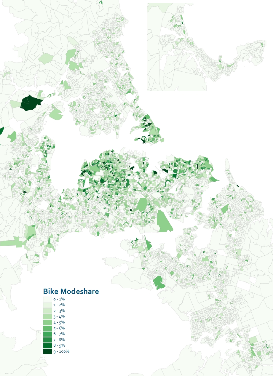
As mentioned I’ll look at these in more detail in a separate post.

 Processing...
Nice work, I haven’t seen any of this analysis elsewhere yet. The Western Line really sticks out doesn’t it? And even in a pre-CRL situation where it’s hopelessly slow and indirect for many people.
It would be interesting to see some analysis of “change in mode share”. I’m particularly curious about whether areas that were already doing well have leapt further ahead or whether the laggards have been catching up.
Which is really interesting, right? So what is poor about the Western Line’s slower and indirect nature (pre-CRL), looks to more than made up for by its rich station frequency.
So perhaps end-to-end line speed, the thing MoT tells us is the key metric for the Light Rail project, and key justification for spending a fortune on tunnelling it (we hear) really has to be balanced by local access to, and across the line?
So if they spread stations out to 1. Increase speed and 2. lower overall build cost (stations are expensive esp underground or elevated ones), they also critically limit access and usefulness along the route…? Tradeoffs much!?
On the topic of transport and the census, does anyone if SNZ will eventually be releasing the origin-destination matrix of journey-to-work results (e.g. total counts of people moving between SA1/2’s)?
In the past they haven’t as a general release. You can request a table but their rounding to the nearest 3 meant a lot of cells in an O-D table ended up as zeros so the whole thing was of little use. Having said that some of the council’s managed to get around those rules and get the data and one of the large consultancies managed to get the data as well.
The trick if you do request a table is to use big zones and you will have a better chance of getting row and column totals that are closer to the released totals.
You can avoid the issue by using CommuterView on their website which is based on raw data.
“whipped up a couple of quick maps” They’re super… thanks for all the work. I’m looking forward to the analysis of how these have changed over time.
Huge differences in different areas show clearly that what people choose to do is determined by what choices they have available.
Yes it’s good to see increases in the usage of PT in general. But there’s still a long way to go.
But it is a shame to see a drop in cycling to work.
And it’s also a shame to see a drop in car-pooling or the usage of Motorcycles/ Motorscooters/Moped’s, which are still far preferable to single person using single car.
We don’t know if there’s a drop, they’ve just stopped counting it
That’s only for motorcycling.
Even more concerning: There’s also a decline in people walking to work. And that’s probably mostly in Christchurch and provincial cities; which are more ideal for walking around than Auckland is.
I think we might find that outside Wellington, Christchurch & Auckland; driving to work, a single occupant of single automobile, has unfortunately increased.
A decline in the percentage of people walking to work, not necessarily a decline in total numbers. But my suspicion is outside of the main centres, car use is becoming more prominent
The absolute numbers show increases in walk and cycle counts for most major centres since 2013. But that’s complicated by the fact that previously one of the options was “did not go to work today” (eg those who were sick), whereas now those people can state what they *would* have done… Also, growth in numbers for all modes is likely with population growth; the key question becomes what the *relative* rate of change for each mode is.
This change in question really does cause big headaches for the travel modes with smaller numbers. Leaving aside the problem of multi-mode trips (where the shorter trip legs like walking are not likely to be recorded at all), it also makes it difficult to record those who mix around what travel mode they use each day. To give a simplistic example, if 5 people normally biked to work two days a week out of 5 and drove the other three days, then previously there’s a likelihood that 40% of them would have biked on Census Day and recorded it as such. Now all 5 should technically say that they “usually” drive…
@ GlenK;
Increases in walking and cycling in the major centres is good news.
But I think it’s concerning if it’s not also declining in the provincial centres.
I’m thinking the issue isn’t that inaccurate as it it should average out. There could be just as of another 5 people that normally drive to work two days a week out of 5 and bike the other three days.
Also say someone that does a connecting bus at the end of a longer train ride would mean most would say train as the main mode. If they could of ticked walk, bus, AND train then we wouldn’t know which was the larger component of the 3.
In other words the trends should overall still be captured. It would be further complicated for people that drive to a P&R and catch a train, bus then walk for example. It would have to be a fairly complicated question to capture multi modal commutes properly. Think it’s silly to drop motorcycle though for sake of one line.
The current crisis might see a sudden jump in the usage of mopeds/motorscooters.
It’s interesting to see how cycling has become a popular transport mode in the wealthier areas. While in the lower socio-economic areas, everyone drives. A total reversal of how it used to be.
That’s related to level of local infrastructure and the urban planning & design.
And the access to those cheap (& often nasty) second-hand Japanese imports.
Fix those; and the ratios will look more like those of 1981.
I think there is a large third factor in that equation, the ease of access by bike to a place that is difficult and expensive to drive to, ie the city centre.
The central suburbs tend highest for bikes, although excluding some of the wealthiest like Remuera. Waterfront areas are high but only where they have a short. direct and flat waterfront road, a Tamaki Drive but not Bucklands Beach.
Devonport and bayswater pop out because of the access to good ferries where you can take a bike over the harbour, but not takapuna or the east Coast Bays where you can’t.
I don’t think it’s a case that rich people ride more, so much as wealthier people are the ones that can afford to live In central suburbs close to where they work in town, which is a natural fit for cycling regardless of their income.
The thing this points out is that we need to tilt the balance for other neighborhoods, so that they have quick and convenient cycle access to workplaces too.
Could there be a correlation to Single House Zone?
(note: I do not expect putting SHZ everywhere will increase cycling)
This explanation makes sense, but it will not change the fact that areas with high cycle mode share are predominantly the more well-off areas.
Now we can stop mocking people who point this out.
It’s so true. And it’s a real shame that have the most to gain from cycling for its lower costs and mental & physiological benefits are generally those that have the poorest access to it. The sooner it is “normalised” as a transport mode, the better the city will be for everyone.
I would frame it the other way, the more well off areas are in places where high cycle mode share is more likely.
Out in some decent cycle lanes up the Great South Road and that would change.
Plus decent cycling infrastructure in the further out suburbs to train stations – which then opens up more travel.
Yes.
19% comes from statistical imputation. That means they used the data they had and applied those proportions to the total pro-rata.
This census was a cock up from the moment they decided to not send someone to every house.
Yes. What remains to be seen is whether we’re allowed to go back to what we had or if we’ve got to move on to higher tech.
How do you know this?
Matt wrote: “They say about 81% of the data comes from census responses with the remaining 19% coming from statistical imputation.”
I was more referring to how he knows if it was any cock-up. Is “miffy” a statistician? I’m expecting that to be a no.
Daniel perhaps you could try reading a Newspaper. They sell them in lots of shops.
https://www.stuff.co.nz/national/111052779/365-days-and-still-counting-census-2018-results-nowhere-to-be-seen
Even before this census stuff up one has to be very careful about reading too much into very small changes. There is always an element of undercount, poor responses etc even in the best past census results.
The mode share needs to improve faster. It seems despite our investment in PT, the mode share hasn’t changed significantly.
I think we have still allowed sprawl though new green field developments which can only be accessed by car will continue to grow car usage.
Most new developments should be like Drury built with transport first.
This is aggregate data. The mode share has been changing rapidly in places where PT is a viable option. That suggests developments at places like Drury make a lot of sense as you can use the train.
Whereas if you consider all trips, not just trips to work, the situation changes considerably. Put that development at Drury, even if some of the people take the train to work, almost all the other (non work) trips people do will be by car, because people would be living in a bubble of mainly residential land use in the midst of farmland, and it’s not possible to have a full work-life-play-for-the-whole-family lifestyle in and around that bubble.
Whereas if we put that development around other train stations closer in, which are surrounded in all directions by existing communities, the residents will provide more ridership to support the PT network there and strengthen it, and will be able to leave the car at home for more types of trips, being able to walk, cycle and bus to more things.
A compact city is a key component of C40 and other climate change plans for good reason – it works to lower emissions.
They can use the train, but most won’t until the train can run express for a significant part of the trip. Stopping at every station all the way to the CBD is a real disincentive when you’re this far out.
Except the vast majority of people don’t go to the CBD so planning everything as if they did is ridiculous.
“Stopping at every station all the way to the CBD is a real disincentive when you’re this far out.”
But stopping at every interchange all the way to the city centre isn’t?
Also, I disagree with Heidi. There are plenty of live, play, work towns in The Netherlands completely separated form other towns. If we build Drury to make cycling within the town and train outside of the town the obvious choice, then people make that choice. For Drury, the sub-regional infrastructure is at Pukekohe (stadium), Middlemore (hospital), or Manukau (universities), all accessible by train. Much of the employment will be local (cycling and walking) or at Manukau city centre or the airport (rapid transit), or in the city centre (also rapid transit).
If we are going to build new towns anywhere, Drury is the absolute best spot. I think we realistically have tobuild new towns as site aggregation is too slow in the urban area even if the zoning were changed citywide.
@Sailor Boy – Speaking of Drury. I went and had a nosy at Auranga development. I liked what I saw. Fully seperated cycleways along the main arterial into the development. Most buildings were duplex developments with good intensity.
Very narrow streets, a lot of green space, walking tracks, extensive planting in and around wetlands. Didn’t feel like NZ. Proof will be in the pudding if they can connect through to new town centre and train station. Would be keen to hear some GA nerd opinions on what is good and bad about it…
Sailor Boy,
“If we are going to build new towns anywhere, Drury is the absolute best spot. I think we realistically have to build new towns as site aggregation is too slow in the urban area even if the zoning were changed citywide.”
The IPCC says we have to take drastic steps now. That we must work in every sector, at every level. C40 and others say the key is a compact city. Everything we do must enable this.
There’s no place for greenfields development any more. We have to get our heads around this and make the intensification happen.
We’ve seen that governments can take drastic steps to protect the population from short-term threat.
They need to take drastic steps to protect the population from the far bigger medium and long-term threat.
Waiting for private developers to lead intensification at the rate we need is NOT taking “drastic action” nor “working in every sector at every level”.
What we used to do… is not what we must do now.
@ Lydicrous
Horses for courses but I think what they’re doing to Drury looks dreadful, repeating concepts that failed overseas 50 years ago. I wonder if it will become a slum in years to come?
Heidi it isn’t a choice. The Council can’t stop greenfields development, all they can do is influence where it goes. Pokeno grew because the ARC said you couldn’t develop outside the MUL. so the developers went outside the ARC’s jurisdiction with the result that trips got even longer. Stopping Drury will just result in more development at Te Kauwhata.
What they can do is focus development in places where PT is an option.
Real development requires large sites with few owners. Everything else is words and empty gestures.
Real development could involve Council building on all its carparks. And government buying along transport corridors at scale.
All the money they’re spending on this sprawl infrastructure should be being directed to this.
I’m sick of words like “can’t” when they’re not attempting to treat this as the emergency it is.
Council has been a member of C40 since 2015. In that entire time, have they told government they need legislation to enable the buying of property – landbanked, underutilised or owned by a serial polluter would be where’d I’d be looking – to enable the compact city strategy to be realised, so that we can actually meet our C40 targets? I don’t believe so.
We’ve had too many backward-looking visionless councillors and council officers believing they know how things work instead of understanding the science and the direction things need to go, then working back from there how to achieve it. The few with good understanding have been fighting for tiny improvements.
So we could have our own version of ‘Little Pink House’ (or Kelo vs City of New London). All the small owners could be booted off their own land so an all knowing local government could build to suit their cronies? The good thing about democracy is you can throw out anyone who would try it.
Mr Beat does a good precis. https://www.youtube.com/watch?v=9eZKcPwWVgs&t=458s
The story of Christchurch city centre after the earthquake
Yeah we could, miffy, or we could be grown ups and stop using edge cases to prevent thinking about the possibilities. We could acknowledge there are LOTS of properties that could be purchased that wouldn’t have any negative social effects. Properties purchased under the PWA to enable grossly polluting and socially severing roading projects to go ahead have often been privately owned homes. I’m not suggesting those.
@Miffy
Rulings by the supreme court of the United States of America have no significance beyond the USA.
I wasn’t suggesting they do Daniel. I was using it as an example of the grief and aggro that is caused when a Local Government seizes people’s land through a legal process in order carry out one of their own poorly thought through pet projects. The Little Pink House story is a great example of one woman struggling against some arseholes who used public money to further the interests of their cronies.
Lucky for us the SCOTUS has no relevance as they are a bunch political hacks pretending to be judges.
Heidi
I agree with you about the stupidity of forced purchases of people’s homes to build roads, but the PWA is all about building roads railways and irrigation schemes. It cheats people of part of the value of their property by requiring valuations on the basis of a willing buyer and willing seller. The whole point is they are not a willing seller because the land has greater value to the current owner.
The Government could probably use the PWA for housing but the usual path is to get a designation first through the RMA to demonstrate the land is required. NZTA, Watercare, AT etc are Requiring Authorities but housing New Zealand isn’t (or wasn’t it might have changed recently?)
But under the current system the Council talks the talk about intensification and a few projects get done but without greenfields we would have huge levels of homelessness and an exodus from Auckland.
@Daniel Eyre. Care to elaborate?
Also have you physically been to see the Auranga development?
I think it could be worth your while. Even based on my rudimentary understanding of good urban form, some features as mentioned above seem ok or at least on the path to being ok-ish…
No I’ve only seen the promotional material.
It still strikes me as far too isolated from employment centres and public transport to get to them. For all its cycle lanes; it’s still very automobile dependent. It remains more bland, soul-less, sterile suburbia.
What needed to happen at Drury was to build upwards more than outwards, and around the existing town centre intersection.
Heidi
You said, “Council has been a member of C40 since 2015. In that entire time, have they told government they need legislation to enable the buying of property – landbanked, underutilised or owned by a serial polluter would be where’d I’d be looking – to enable the compact city strategy to be realised, so that we can actually meet our C40 targets? I don’t believe so.
We’ve had too many backward-looking visionless councillors and council officers”
I completely endorse that and I would extend that comment to the senior leadership. As you know the McKinsey Report that made recommendations for C40 cities to lower emissions said, the first step is to decarbonise the grid. With a little bit of thought most would realise that in Auckland that means Huntly coal and gas. So, after asking the Minister, I asked what the Mayor and CEO had communicated to Genesis about this matter. Nothing, someone else’s problem, and after my response from the Minister, no ones problem.
It transpires that the elected members have not even been briefed on the McKinsey Report.
I am left wondering whether Council’s meetings about climate change are little more than an opportunity to eat scones and sausage rolls. To be fair, sausage rolls always used to be the hallmark of a great meeting.
PT mode share really shows up strong around New Lynn & also the Mount Roskill area (I think) where the extra frequent Dominion Rd buses start from.
Some weird little cycle patches showing up extra high but I suspect this is where the population is small or very narrow work type (eg Whenuapai air base).
Can you still map Journey to work by Company Car?
I think can leave the travel question as is but for it to include place of study as well. Also add back in the motorcycle option.
Then add another question that allows you to select All modes of travel that you use for ANY activity any time throughout a typical week.