Every weekend we dig into the archives. This post by Harriet was originally published in May 2018.
Last year Matt wrote a post about NZTA’s Post-implementation reviews. These reviews are undertaken a few years after a project is completed and perform three functions:
- To see how the outcomes compare what was expected before the project was built
- To explain any variation in those measures
- To identify lessons that can be learned to improve other projects.
We have also written before about them here.
One example of an interesting finding, is from the post implementation review of the Victoria Park – Newmarket project, which is no longer generating any travel time savings. In fact, now travel times are worse.
This is a major problem because the biggest benefit in business cases for general traffic capacity projects is time travel savings. For some projects travel time savings make up nearly all of the benefit. If we are finding that projects are not resulting in these forecast travel time savings, then we need to be updating our models and our process for analysing projects.
These questions about travel time savings benefits have been around for a while. In a fairly ground-breaking 2008 paper, UK academic David Metz pointed out that while travel time savings benefits make up the vast majority of the expected benefits from road investment, actually average travel times are staying the same.
It should be possible to measure time saving if this is a significant part of the benefits to travellers of new investment in transport infrastructure. Travel time is measured in surveys of personal travel behaviour, typically using 7-day travel diaries. In Britain, for instance, average travel time (per person per year) has been reported since 1972/73 as one output of the National Travel Survey (NTS) (see most recently Department for Transport, 2006a). This household survey covers personal travel by residents of Britain along the public highway, by rail and by air within Britain, including walks of more than 50 yards. The most recent value of average travel time is 385 hours per person per year, or just over 1 hour per day. As indicated in Figure 1, this has changed rather little over 30 years, during which period car ownership has more than doubled and the average distance travelled has increased by 60%.

It seems as though this trend is also true in New Zealand, with changes in travel time per person over time mainly being due to modal shift (we walk less than we used to) rather than any actual decrease in overall time:

Metz points out that we should be surprised by these results, given the great promises of travel time savings in the business cases for all the transport investment we have been making:
These data on average travel time offer no obvious support to the idea that travel time savings comprise the dominant element of the benefits from investment in the transport system. Indeed, Figure 1 prompts the following question. What has happened to all the travel time savings claimed to justify public expenditure on British roads of around £100 billion over the past 20 years at current prices? One possible answer would be that had it not been for the time savings associated with this investment, average travel time would have been higher than it has been. The pattern of investment in road infrastructure in Britain over the past 20 years has shown marked swings in expenditure, between £3.5 and £6.4 billion per year (at constant 2004/05 prices) (Department for Transport, 2007) and, hence, in new capacity becoming available. The steady trend of travel time seen in Figure 1 shows no suggestion of a reflection of such variation in new capacity, and hence offers no support for the idea that average travel time would have been higher in the absence of new road construction.
An alternative interpretation of Figure 1 is that people take the benefit of investment in the transport system—private investment in vehicles as well as public investment in infrastructure—in the form of additional access to desirable destinations, made possible by higher speeds in the time available for travel. From this viewpoint travel time savings would be at best transient phenomena. Light might be shed on this possibility by empirical studies of travel time savings putatively associated with infrastructure investment, such as a new or widened road that has been built with the intention of generating such savings.
It is this important distinction between “saved time” and “better access” that sits at the heart of our need to update business case processes to actually match with the real impact of investment. While the two seem similar, there are many ways of improving access that don’t require building new roads – things like better land use policies that allow housing to be built in areas that already have a lot of access. Or investment in public transport improvements that improve the access of an area in a way that can be maintained over time and doesn’t get eaten away by induced demand.
Our strategy documents have caught up with this new paradigm. ATAP, the GPS and the Auckland Plan all emphasise the importance of accessibility. But the cost-benefit analysis process still lags behind with its outdated focus on travel time savings. This means we are continuing to have a situation where roading projects appear to score decent BCRs even though they will almost certainly not deliver long-lasting gains. Getting past this will require an acceptance of two key points:
- Increasing general traffic capacity does not result in beyond short-term travel time savings (due to induced demand);
- Many people will bank the time savings and simply travel further (known as the Marchetti Constant);
If we are to build the right projects we need to ask the right questions and update the way we measure benefits of transport investment. At the moment we are still asking the wrong questions when doing this analysis, which is going to undermine the efforts of our strategic documents to focus more on projects that generate long-lasting accessibility gains.

 Processing...
Perhaps it is time to stop trying to put benefit in terms or dollars, and instead have a maintained target design we simply work towards.
Software development for example is moving towards having a prioritised list that is simply worked through instead of a traditional business cases. Doing so opens the potential of partial development.
This is sort of like a previous post where a European government committed to x amount of electrification for y years
That is a nice idea, but it’s pretty hard to then know how to weight different criteria that you’re aiming for. Not saying that the dollar amounts are right, but just that finding alternatives is hard.
But worth watching the software situation! In a field that’s getting so much wrong, we need to consider all alternative frameworks.
Studying development methodology – Agile is about value creation through prioritisation and maintained productivity, more than focus on individual projects. More of it would be interesting for lessening the ‘big project’ boost effect that seems to occur with interested parties like NZ’s powerful road consortiums able to throw weight behind giant projects with less public interest or priority like East-West link or Penlink. The safety programme is a good example where it should be well implemented! Getting lots of valuable stuff everywhere done instead of only a couple #KeepIt100 expressways.
Just one lie?
With regards the CMJ projects.
I note the VPT project came in under budget both in time and money. This in itself is a major roading crime against Aucklanders.
Because the NZTA arbitrarily refused to underground both directions as they said only the northbound lanes needed it. And so NZTA created a “requirement” for Auckland (City in this case) ratepayers to stump up amount to cover the undergrounding costs for the southbound lanes, which didn’t happen, so thats why we are still using the old viaduct today.
So we were railroaded by NZTA to accepting the vastly inferior outcome of the Victoria Park Viaduct eyesore staying put because they demanded the old Auckland City Council (ACC) contribute. And as it wouldn’t contribute sufficient money towards the undergrounding – mostly because the old ACC argued, (fairly in my view) that doing so provided a regional benefit that the wider Auckland Region, so the Auckland Regional Council should pay for it. The old ARC did not want to do so even though it could have spread the costs evenly over the entire Auckland Region.
So the NZTA and ARC did not actually actually act wisely or even in our best interests.
Had an arrangement to pay for the undergrounding of the south bound lanes been done, NZTA would have likely been able to underground the southbound lanes as well for about the projected amount of money they saved. Meaning the project came in on budget and time.
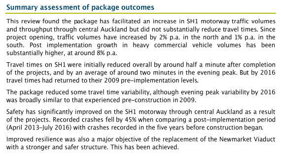
The safety benefits that were found and touted for the CMJ projects as a major success in addition to the illusory travel time savings.
The review showed 45% reduction in crashes through the VPT/CMJ/Newmarket Vidaduct project area compared with before and after.
[Ignoring for now, any crashes involving expensive Ferarris in the VPT]
However, the comparison of the headline figure, ignores two major things.
1. The reduction in crashes elsewhere on the network was in the order of 31% – so the true safety “improvement” is likely 14% at best not 45%. As any safety improvements would similarly have occurred in this section too, even the do nothing/minimum was done instead of these projects.
2. The speed limits on that section prior to the projects was 100 km/hr, reduced to 70 km/hr in construction zones during construction and was permanently set at 80 km/hr for the entire section afterwards.
The resultant speed reductions by 20 to 30 km/hr is with a doubt the major reason why the increased reduction in crashes both leading up to and above the 31% network wide level happened.
This means the true level of “safety improvements” mentioned/used for justification (but not quantified in $ terms) in the pre-implementation estimates, may have been quite small, to non existent.
When done on a like for like comparison basis of the before and after results.
It is true for the Newmarket viaduct it is a safer and more resilient structure (mainly for those using it) than it was before. Which has been a improvement/success.
But the equally and widely touted “re-invigoration” of “Newmarket South” from the viaduct replacement project has simply not happened. So from a local community perspective Newmarket Viaduct replacement has been largely a waste of time.
Nothing much has been gained there in the nearly 10 years since the project started.
We also know that ProdCom last year found big issues with Travel Time justifications for road projects in particular turning into a nebulous ball of nothingness.
They specifically warned against using travel time savings as a justification for most roading projects – and especially for those where Local authorities are also contributing.
Because [reading between the lines] these Local Authorities are in essence, cooking up “travel time” saving [and probably safety as well] arguments, to try and get many roading improvement projects in their areas, accepted and thus co-funded by NZTA usually at 50% or so. For local authorities this is of course a big win – they only have to pay for half the road improvements and maintenance.
Even in Urban contexts we can see that even when the travel times aren’t being cooked, the pre and post implementation analyses are never in agreement. And even when they are, the benefits are mostly lost in short order – usually due to induced demand.
I expect that the Waterview Tunnel project will show the same poor [and no doubt eyewateringly bad] return on investment if and when that analysis is ever done.
It may be so bad, that NZTA “forgets” to publish the analysis.
The 45% reduction in crashes on that section of motorway, and your 31% reduction in crashes elsewhere in the network… this is for the motorway network, I take it? For the exact same comparison of time periods, have you looked at what the injury rates on the local roads were?
The travel time on the section of motorway didn’t see an improvement, but the traffic volume increased. It is quite probable that this will have pushed local road traffic volumes up (even if other levers were reducing them) so more of the local road DSI will be due to this increase in traffic.
So if I’m understanding this correctly, I think it’s even worse than what you state. Improvements on the motorway would have happened anyway, as they did elsewhere on the motorway. But local road DSI would’ve dropped or not risen if this work hadn’t been done and traffic volumes were lower. And it’s on the 50 km/hr road network that most of our injuries are happening.
The project reviews just said “wider network” saw 31% reduction. So I’d assume that meant Motorway [or more likely the State Highway] network.
And at the same time NZTA pushed ahead with the Motorway on-ramp signalling.
So this too caused more traffic on local roads – no doubt increasing DSI and delays happen.
Of course, any of that is not NZTAs concern.
They run/get evaluated on the performance and such of the State Highways not the local roads.
That part is AT’s job to manage. And we know just how fine a job they’re doing on that don’t we?
Sounds like silos rule supreme.
How did all these Wellington highways (kapiti expressway, otaki to pekapeka, tmg) ever get approved? Cant imagine the bcr being very high on any of them.
As for the Melling interchange which is popular polItically why cant building the flood protection aspect sans motorway interchange be looked at?
By a “Ministerial fiat” from Joyce or Brownlee.
The projects are assessed against a “do minimum”, not the current conditions. The rationale is that growth in traffic typically worsens conditions if nothing is done, and the projects mitigate this. It’s impossible to verify savings as you never see the counterfactual to understand how bad (or not) it may have got. Some induced traffic is included in most major appraisals through variable demand analysis which accounts for rerouting, redistribution and mode shift, although not completely new trips.
And its the new trips that the public understand of the term ‘induced traffic’.
The models specifically exclude the phenomenon that extra road capacity creates new trips. That’s negligent, given the evidence of Duranton and Turner, and Garcia-Lopez and many others.
I have seen a project in NZ where the engineer actually added in a token 1% extra in new trips, due to the extra road capacity. This is a laughably small amount, but I’d imagine the engineer was testing the water, and should be commended. I wonder if he increased it for the next project.
The redistribution creates new trips on the infrastructure which are included! Many highway projects result in higher vkt in the modelling because of this. The bit which is missing except on very few projects is the land use impact, or the fact that someone may decide to take 3 trips a day rather than 2 (or take separate trips rather than multi purpose trips) because of increased capacity. The rerouting and redistribution captures most of the additional traffic which is created. I think I know the project where 1% was added, and this could reflect some of the land use changes, and acknowledges that the 4 stage model wouldn’t be particularly responsive up there.
Darren, New trips from the redistribution are insignificant compared to the number of new “person trips”. The model sets those at zero, which is a major source of error. And yes, not including the land use changes is the another big source of error. In Litman’s chart of types of Generated Traffic (ignore the highlighting – that was for a specific illustration), many of the listed types that incur moderate to large cost implications are NOT included in the models used in NZ.
https://www.greaterauckland.org.nz/wp-content/uploads/2019/04/Types-of-Generated-Traffic-highlighted.png
The models do show an increase in vkt overall, but this hides a drop in local and arterial road vkt. If your model involves an increase in motorway capacity but you keep the person trips the same, of course the model will show a decrease in vkt on local and arterial roads! And in fact, in the short term, that’s what you’ll see. It’s wildly inaccurate in the medium and long term.
In the modelling for the Waterview Connection, for example, the models show a drop in vkt on local roads and arterial roads by 2026 of about 5% between the “do minimum” and the “option” (Table 6.18). This is nonsense. If there’s any reduction by 2026 in the local and arterial road vkt, it won’t be due to the new road capacity, which will have induced traffic. It’ll be due to other factors, such as some of those given in this table:
https://www.greaterauckland.org.nz/wp-content/uploads/2019/07/vkt-levers.png
“The rationale is that growth in traffic typically worsens conditions if nothing is done, and the projects mitigate this.”
Yes, and this is wrong too. The traffic typically worsens only because of the road building that is going on city-wide. If we’d not been building roads for the last couple of decades, and had intensified and reallocated road capacity to other modes instead, the vkt would’ve gone down. The effects of the road building we’ve already done will continue to be a lever to raise vkt for some years. We will get to a situation of substantially lowered vkt – as we must – far faster if we stopped building roads, and pushed all the levers in the chart in the direction of reduced vkt.
These traffic models are useful for working out where the traffic would be distributed in the city at a snapshot in time. Using them to compare the traffic in different scenarios is a misapplication. The differences in travel time they calculate are illusory.
I’m sure you’ll agree for the project we’re discussing up north, the level of induced traffic hasn’t been modelled correctly – the 1% is a joke, and probably, as I say, for testing the waters by an engineer who’s aware of the problem but perhaps a little cautious at rocking the establishment.
I agree that travel time savings aren’t a good way to appraise the value of a project, and it’s good to know that other metrics are also used. Vkt typically increases due to redistribution resulting in longer trips, so no reduction on local roads, just local trips replaced by longer distance trips (person trips remain fixed which I agree is a poor assumption for large infrastructure projects but vkt still increases). Typically the dm would result in shorter trips as congestion makes long distance trips unattractive. Many (if not all) projects are driven not by how good the project performs, but by how bad you allow the dm to become, which in most projects you never get to see as a project in some form is built. Same probably applies for land use, is the option under egging it, or the dm over egging it?
Yes, the do minimums look hopeless in the modelling, because those unwidened roads are having to carry an unrealistically high vkt, resulting from that assumption that vkt simply rises.
VKT doesn’t necessarily rise in all future modeling forecasts.
The Ministry of Transport modelled different transport demand scenarios in the future and found that VKT was likely to fall in three of the four futures they analysed.
https://www.transport.govt.nz/multi-modal/keystrategiesandplans/strategic-policy-programme/future-demand/
So is that transferring through to the traffic modelling of individual road projects, Snoozle?
Heidi, no it isn’t. As far as I know that work is wilfully ignored by everyone.
Snoozle, that MoT work is weird. Scenario 1. “While people value face-to-face contact, high energy costs have forced them to adapt.” resulting in a reduction of vkt of 3%?? Say what? Sounds like they needed some Transition Town and Permaculture thinkers to help them illustrate what that scenario actually means. That’s just really misinformative.
The whole thing is a technology will save all dream… the scenarios that do involve big vkt drops rely on virtual and digital interfaces. They’re missing a vital scenario here. Disappointing.
Heidi, you’re right that the link between a highly qualitative description of that particular future and the very specific VKT projection seems a bit lost in the inner workings of the analysis somewhere.
I think the value in scenarios work is at a fairly high level, basically along the lines of “VKT is only likely to go up if energy prices stay low and if technological advancements facilitate physical interactions more than digital interactions”. In other scenarios VKT is likely to decline.
Snoozle, Heidi, as you mentioned earlier, I’m just talking about what models do, not what they should do. There’s always a trade off between simplicity (so that run times are managable) and accuracy. The MoT work is longer term forecasting and isn’t captured in any of the 3/4 stage tools that I know of, but some of it could be. With regards to trip rates, if the HTS data shows a decline over time, or variation specific to accessibility that could be captured. Not sure whether the sample rates would allow for statistical significance in variation in accessibility at such detail. I think the models are really useful to show what happens if behaviours don’t change, and then use them to quantify what the result is if you do something. Historically this may have been more infrastructure, but I think the focus (driven by the GPS key themes) is that better land use integration, tech, and a genuine multi modal approach is more effective. This can also be modelled.
I don’t imagine the HTS is the best thing to inform the model. Research into behavioural changes in transport patterns in response to radical infrastucture changes (eg places where modeshift acceleration has been successful due to road reallocation) would be more useful.
Heidi, I’ve never seen a 4 stage model not based on a household travel survey! How else would you calibrate it? And validate it?
Pity that the HTS doesn’t include children, then. Again, what we measure, we value.
Heidi, I agree. At the NZ transport modelling conference in September we’ve invited speakers from health and urban development sectors along to help modelers see this broader context.
Cool. The cross-discipline work is really promising.
Also how old is the HTS information? I know that until a couple of years back Auckland was still using 2006 data. Which wasn’t that relevant given how much Auckland’s PT system has changed over that time.
1) The work by Metz is interesting.
What this article doesn’t note, but implies, is that if you take Metz’s approach, i.e that we are limited to a travel time budget, the long term value of time drops to zero.
This has significant implications for the relative value of travel time savings vs other benefits (safety, emissions etc).
Thats why ProdCom stated last year that NZTA [and the rest ofthe NZ TLAs] should stop using Travel Time savings to justify roading improvements when the bulk of the benefits are mainly from Travel Time savings alone.
Just seems that NZTA hasn’t either got or read that email yet.
Citation please? That sounds like an interesting report.
It was the Low Emissions Economy Report, p 317
“… Any assessment method will involve important values judgements. Transport infrastructure can have a strong effect on location choice for people and businesses over time, which poses a challenge to conventional economic assessment methods that focus on short-run impacts and put heavy emphasis on travel time savings”
On Page 382 they made these findings as well:
New Zealand’s current transport investment system is biased towards investment in roading. An efficient transition to a low-emissions transport future requires an investment system that is:
1. better integrated across modes;
2. more flexible, with greater competition for funding across different transport modes and activities, and greater autonomy for councils;
3. more neutral, by removing distortions and biases that favour particular modes or activities, and fully accounting for the social, economic and environmental costs and benefits
Pretty obvious stuff really. But seemingly ProdCom felt the need to spell it out to everyone.
Heidi that moved, in the final version, its now on Page 382 of the “FInal 2” report.
On page 380 it says this in addition:
(under this heading) Emphasis below, mine:
Differences in the funding assistance rates for different activities incentivise councils to favour state highway projects
Funding assistance rates (the percentage of total project funding contributed by central government) for local roads, public transport and walking and cycling activities vary by region – with a nationwide average of
53% at present (NZTA, 2014). State highway projects are fully funded by central government. In urban areas
where choices exist between expanding the state highway network or improving public transport networks,
councils and ratepayers will be biased towards expanding the state highway network since it will not involve any direct financial contribution.
Thanks.
And yes, that last point is really important. It creates a huge bias in decision making.
The v but not necessarily the k, as those adjust through redistribution
For do minimums, why would the assumption involve higher v or k? 🙂
We would naturally head in the Barcelona direction, and away from the Atlanta direction, if we weren’t building more roads. That means lower v and lower k.
I think Darren is talking about how the transport models currently work, rather than how they should work.
Most transport models have what’s known as a “fixed trip matrix”, meaning that the number of trips is fixed (based on observed average daily trip numbers by different household types I guess), and therefore isn’t sensitive in the modelling to things like road capacity or other policy initiatives like road pricing.
Heidi, in most models, the trips are based on households, so as households go up, so do trips. In the absence of pt or active modes being able to absorb all of these trips (or being relatively attractive enough) then v goes up to. But as v goes up, congestion goes up so trips become shorter to avoid it, so v goes up, but vkt by not so much as average trip length comes down. Put in an option and it enables the same vehicles (if not more through mode shift) to go further so k goes up both on the project and the alternate routes which it frees up. This increase could be interpreted as more economic activity, or more unnecessary travel
The person trips are fixed, but nothing else, I think the Sydney model varies trip rates based on accessibility but not sure how significant an effect it is.
Average trip length is a really interesting measure to track. You could say that we should explicitly be aiming for shorter trips – in that sense people would still be making the trips they need to make in order to live fulfilling lives, but they don’t need to travel so far to reach all these important activities.
….. or, trip lengths are declining because the transport system is rubbish, access is terrible and the place is failing.
Greater access to social and economic opportunities with less requirement to travel would surely be good?
“In the absence of pt or active modes being able to absorb all of these trips (or being relatively attractive enough) then v goes up to.”
Have a look at the post called “Good Density” in which I referenced a submission that covered the subject: “We conclude that the weight of international evidence, contrary to the Commission’s conclusion, is that higher residential density is generally associated with reduced car use (e.g. vehicle kilometres travelled) in cities, and that urban planning policies should be framed accordingly.”
Think of the dense cities. Few people even own cars. Compare the vkt of a dense city with a (low density) sprawl city of the same geographical area. Vkt is much less to do with population than to do with urban form.
You can’t talk about ‘in the absence of pt or active mode being able to absorb…’ because as the number of households go up, the demand for better public transport and active mode infrastructure rises. A higher density of people can support a better public transport system, and the higher rates can support a better walking environment. A higher density of people also means amenities are closer together so they are more able to walk, cycle or bus.
Ignoring the social consequences and their knock-on effects is one of the weaknesses of conventional transport planning.
“The person trips are fixed, but nothing else.”
People rationalise the number of trips they take. They don’t just shift mode. If congestion means the trips take too long, or parking is expensive, or fuel is expensive, people do choose to combine trips, and do all their shopping or errands in one go. In the opposite situation, they may pop out many times. Even with walking, this is true. If someone prefers to walk, but the trip is unpleasant, s/he will try to not do it so often.
Heidi, you’re misinterpreting what I’m saying! I agree that as density goes up, cities are more livable and access by active modes and pt is easier! But the future land use inputs to the models very rarely are just increased density and so vehicle trips increase whether we like it or not. We can choose to enable this, or provide access in other ways (I’m in favour of the latter, trying to get to a point where vkt reduces intentionally, but people still have access to opportunities)
Darren, I’m not trying to misinterpret what you’re saying. I realise your goal is a better network. I’m just unclear at a few points as to whether you are saying that what the model does is correct or not.
“The person trips are fixed, but nothing else.”
I’m not clear – this is what the model does, but do you think this is correct of the model? I’m saying it’s not.
The four step models are accepted as being poor at modelling active modes. Severance doesn’t just inflict modeshift from active modes to driving but also affects the numbers of person trips, in a complex way. Some trips will simply no longer happen. Some trips will be replaced by many many more vehicle person trips. This isn’t modelled well by the four step models.
Example: Two person trips – an eleven year going to soccer practice and back – becomes ten person trips when the environment is changed so it isn’t good for this eleven year to go there by bike – Mum and younger sibling drive the said soccer player to practice and drop him off, then they return home, and do the same in reverse to pick him up. How does the model keeping person trips the same in two scenarios that affect the cycling ability of the boy in any way capture this multiplying of person trips by 5? It’s also an example of how an increase in person trips is a result of a decrease in access and mobility.
“But the future land use inputs to the models very rarely are just increased density and so vehicle trips increase whether we like it or not.”
Firstly, have people started changing the land use inputs between scenarios? They didn’t for Waterview, for example. This is one way to try to improve the use of the models. But I’m unclear about what you mean: If, for fun, density of households is the only change made to the model, what would the model show? Would it show increased vehicle trips? I believe it would. If so, do you think that’d be correct?
Because in the real life of cities – as shown by the submission I quoted above – this one simple change in fact reduces both vehicle ownership and vkt. An area of Barcelona, despite its much higher population, has fewer cars owned, and lower vkt, than an area of suburban Auckland.
I suspect that person trips is not a useful modelling input. VKT is affected by too many levers – those in the chart I showed, plus economic activity and congestion – to use models that only include some of the levers and that explicitly exclude the full effect of road capacity.
One issue is that vehicle ownership rates don’t vary by location as much as they should. Households right next to fantastic PT are assumed to have the same vehicle ownership rates as those in the middle of outer suburbia a long way from any travel choices.
Yeah. There are lots of improvements that could be made, and the models could then be used in some really useful ways, to explore out of the box concepts.
But presently, the use of these models as a way to compare two scenarios that are incomparable due to the inadequacies of the modelling process, and to arrive at travel time savings due to this comparison, which then feeds into the business cases… that’s plain negligence. Planners and engineers continuing to do this despite the research into the systematic bias it creates are not keeping abreast of their field.
I think that’s unfair on engineers and planners who have a process to follow to secure funding from the NLTF! If there’s any local research to show that trip rates vary by accessibility (I think that’s what you’re suggesting) then I’d love to see it (I couldn’t find any 3 years ago when I was looking into it). Intuitively it makes sense, but what I read at the time suggested that person trips rates by purpose are reasonably static, just the destinations changed (that the models pick up)
If you need local research, and can’t find any, would you be able to ask MoT or NZTA to do it? The problem researchers will find, of course, is that to do meaningful research, you need walking and cycling counts. We don’t even have the denominator in the injuries / person walking along a road because while there’s a rolling programme of vehicle counts throughout the country, there is not for people walking.
What we measure, we value.
Safety engineers have been asking NZTA to establish a database of walking and cycling counts for a long time, to no avail. They’ve also been pressuring NZTA to establish a database of pedestrian traffic devices with the related data of
– how they affect the behaviour of discerning active road users (such as those with disabilities), and
– how they affect active trip counts and injury rates.
What we know about children’s independent mobility probably answers some questions. NZ research shows that the traffic danger from the high traffic speeds and volumes, and the severance of wider roads – has drastically reduced the access of children to using their streets and neighbourhoods. The trips to their friends’ places, to the tree at the corner, to the dairy, etc, have been slashed in number. While other trips – such as to organised sports or activities, have generally been replaced by being driven by a parent (probably the biggest reason Auckland’s car occupancy is more than 1) these informal trips aren’t being replaced by Mum driving them. In general, they’ve been replaced by sedentary and solitary activities. Children’s cognitive, social and physical development is being stunted, and that’s being researched all over the world, including here.
The data that is widely available is on things like cycle counts, eg
– 42% increase in cycling between 2015 and 2016 as mentioned in Friday’s post,
– 18% increase in traffic in my dead-end peninsula over two years (without population increase), due to nearby added road capacity making trips quicker “I don’t mind nipping out again to get the office supplies, it’s quicker to drive there now, and I’ll go back later to get Ella even though she said she would be fine walking…”
Sorry if you don’t think I’m being fair. I just don’t think that in the absence of this data on how person trips vary by accessibility, it is professional to continue modelling with a huge assumption. Whistle blowers within the industry are important, because this problem is massive. It has created our unsafe, child-unfriendly, sprawling and high carbon transport network.
I imagine you’ve read this research; one of many on the topic: https://www.researchgate.net/publication/29465763_Clothing_the_Emperor_Transport_modelling_and_decision-making_in_Australian_cities
“…person trips rates by purpose are reasonably static, just the destinations changed (that the models pick up)”
Sooo, in that case…
…Where do all the induced demand come from then if its not “extra trips” by someone who didn’t used to use that route before?
Occams Razor suggests that these extra trips are not just new trips by people who never drove that way before. But are in fact mostly from existing people making additional [person] trips they didn’t before.
And not just changing where they go. As the models insist is the case.
Yes, these “person trips” may well change their destinations for the trips they used to make. But they can and do also make trips on top of those as well.
This is also confirmed [in reverse] by the fact that when the network becomes constrained and capacity is removed (as is happening right now in the CBD for the CRL cut and cover works in Albert St). The traffic “disappears”. It is not redirected to other destinations. It is trips that never actually occur.
The two effects are linked. And neither can just be explained by changing destinations.
The only explanation that makes sense is additional trips are induced from existing road users.
If you have a better one, lets hear it.
I am sure the engineers and planners will huff an puff and deny its the case.
Because clearly if providing more road capacity induces demand, it is demand that their models can’t account for or handle. So the logical conclusion is that their models are broken and thus their entire profession is called into question.
Hi Greg,
We also need to remember by providing additional road capacity, we:
a) push intrazonal trips to become interzonal trips & thus add trips to the network
b) increase trip lengths (for conserved generalised cost). The longer the trip length distribution becomes the more road links and intersections that singles trip pass through, adding to congestion at many locations.
Also over time we have:
a) increasing population
b) increasing real gdp(income) per capita driving down the real cost of travel.
But, we have the travel time budget we all seem to live by which seems to puts an upper limit on our travel patterns.
I’m not unsympathetic to induced demand but I haven’t seen it isolated from from the effects above for car travel. We have included a variable trip rate in our model for non-car available dependent on PT accessibility.
I think this thread is interesting. NZ is the same.
https://twitter.com/JN_Rachele/status/1156117656291819520
“We know building new freeways won’t fix traffic congestion, but try telling that to a person sitting in traffic. Decision making is emotional, not rational”
And the huge money spent on car advertising appeals to the emotional side, too, which in no way is matched by any advertising in the interests of the public good. They don’t spend that money for no reason. It’s not just fun but ineffectual. Spending it keeps attractive and emotionally appealing, a transport mode that is abnormal by any rational method of analysis, and keeps the public demanding the infrastructure that keeps the automotive industry alive.
That is why we can’t have politicians genuinely championing cycling or public transport. They’d be voted out of office.
Still waiting for a car ad showing how comfortable it is in their car while sitting in a traffic jam.