This is a quick post highlighting a recent example of how the finished product for a project can often be quite different to what was promised in the artist’s impressions and press releases.
Back in February, Auckland Transport on behalf of Panuku Development Auckland started an upgrade to Putney Way in Manukau which runs alongside the new bus station. The artist’s impression and the language in the accompanying press release gives the feeling of a shared space focused on people.
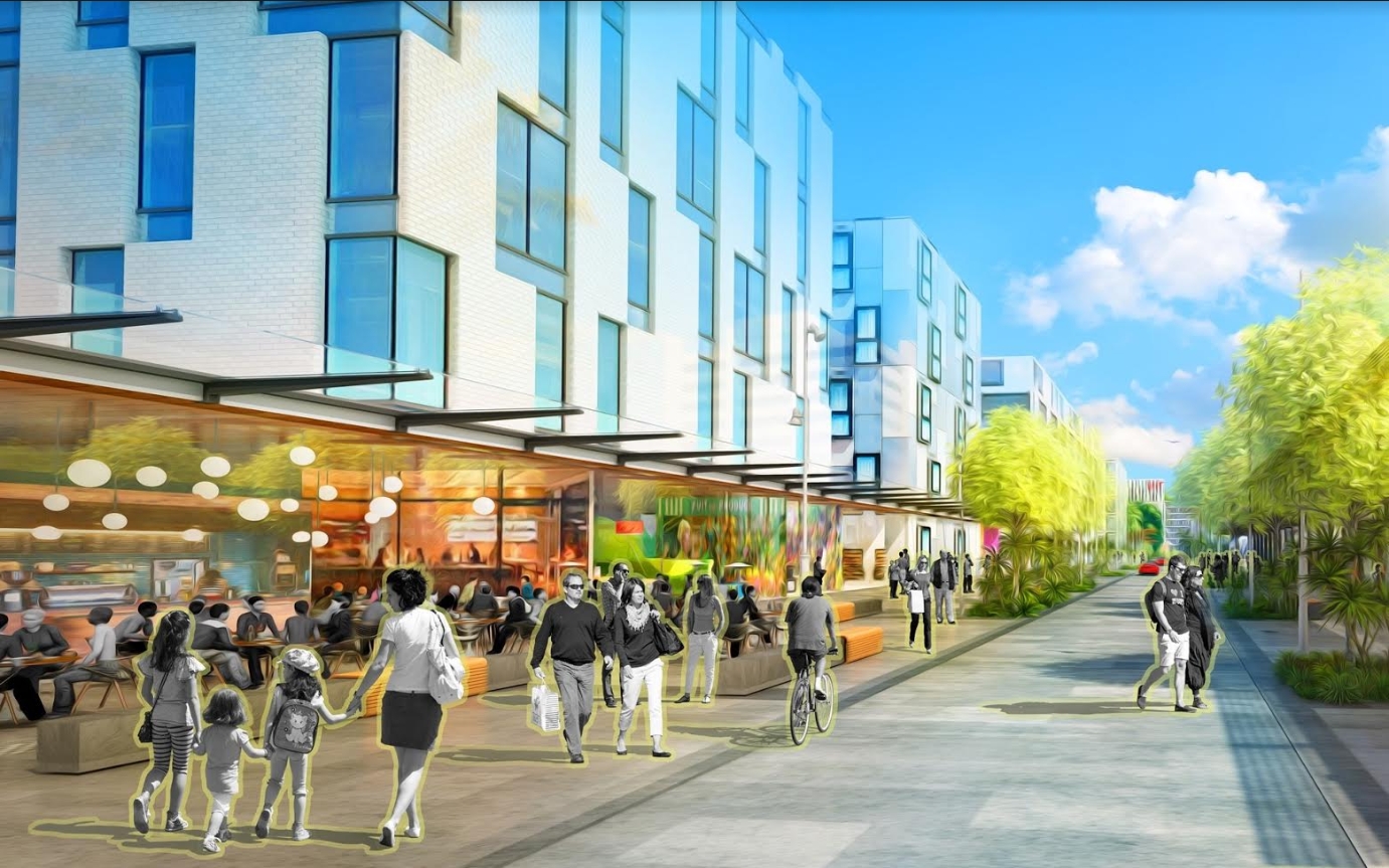
The upgrade of Putney Way into a pedestrian-friendly main street for central Manukau starts next week.
The upgrade will include a new single-level surface extending from the new bus station to the opposite pathway.
Native trees will be planted along both sides of the street to make up rain gardens that help to clean stormwater before it reaches our drains. New lighting will also be installed to create a stronger sense of safety for evening commuters and residents. A local group has been invited to design artwork for the light panels.
Otara-Papatoetoe Local Board Chair Lotu Fuli says it’s great to see changes in Manukau that benefit the community. “This type of street design is the first of its kind for central Manukau, improving the area for pedestrians and encouraging use of the new bus station, which sits at the heart of the south Auckland public transport network.”
The upgrade is being carried out by Auckland Transport on behalf of the city’s urban regeneration agency Panuku Development Auckland. Panuku Project Director Clive Fuhr says the upgrade of Putney Way is part of the overarching plan to transform Manukau into the thriving heart and soul for the south.
“This is the first of a series of projects for 2018 that will help rebalance the impact of roads, car parks and large buildings, making the area more people-friendly.”
The works are now completed and the council want to celebrate with a community event. But what caught my attention were the images of the completed street which seems to bear little to no resemblance to what was pictured and described above.

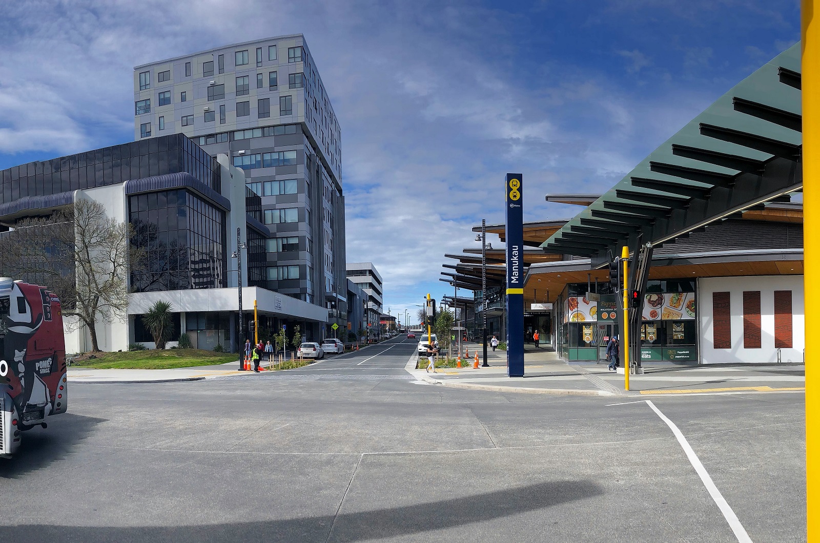
With the exception of different kerbing and being a concrete road, there doesn’t seem to me to be anything like what was sold to the public.
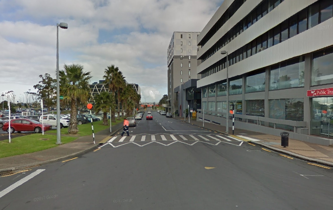
All of this isn’t to say that what has been built isn’t an improvement, for reference, here is what Putney way looked like before the bus station was started.
What do you think of the outcome of the upgrade?

 Processing...
Was a slinging match between AT and Panuku over this just as their was with the Manukau Bus Station. AT were not going to do Putney Way at all so Panuku had to part some coin to get AT to do this and look what we get?
If this was a commercial product I be wanting a refund real fast before lodging a complaint under the Fair Trading Act for misrepresentation and false advertising.
Just another one from AT not really getting on the ball with Our Manukau projects. First the bus station, then bus lanes down Manukau Station Road (oh my the FLOW they said), then lack of lock up cycle parking and now Putney Way.
Oh and what about the 33 and 361 busses? Both are Through busses (so they cant use the bus station) but are left on the lurch using the windswept Davis Avenue that also leaves a decent walk to any connecting busses (the 33 to 380 and vice versa I have done a few times now). How about getting the cars out of Putney Way and turning it into a transit mall with the 33 and 361 able to use it?
The more of those story, the more incompetence we see from AT.
Perhaps the whole organization needs to be restructured.
May I ask why there are two routes that can’t use the new bus station? Seems a bit silly to build something and not use it for the buses passing through.
Through routes seems an odd excuse for not letting them use the bus station; I understood the layout of Manukau is rather similar to Christchurch where almost all buses are through-routes
Speed I think and as they pretty frequent buses.
Saw tooth designs are not efficient at Through Busses
Takes too long for them to reverse out and start again to keep to time table
Works in Christchurch
Pretty sub par, even by Auckland Transport standards.
AT forgot to install those happy people from the original proposal too!
they did right with the sky and clouds…
I think they look more radioactive than happy, actually.
Just call a spade a spade. Its a perfectly fine street/road upgrade, no different to what they have done around Wynyrd Quarter..but don’t sell it as “This is the first of a series of projects for 2018 that will help rebalance the impact of roads, car parks and large buildings, making the area more people-friendly.”
There is no re balance, its the same road but nicer. Hardly a pedestrian haven where its begging for cafes and restaurants to spill out onto the busy street.
If you call it by its name, everyone will appreciate it.
Good is the enemy of great when designers believe that what they’ve created is good enough and is better than what was there before. Without a UDA running things, AT and Panuku will continue to ‘un-placemake’.
Still provides more for cars than it does pedestrians, sigh.
I may want to repeat my self again.
This is what happens when something is designed by Engineer instead of Architect.
AT should stay way from doing this stuff. The whole design should be carried out by professional Urban Designers.
Depends on the engineer. Robert Stevenson left a wonderful legacy which includes bridges designed for a horse drawn cart to cross a railway line that now being used trucks 150 years after construction. Then there is urban design – in the UK anywhere urban designers / city plaaners got their hand on during the fifties and sixties was ruined – generally far worse than Hitler’s bombers managed. Fortunately much of that rubbish is falling down or being replaced and I hope I am right in saying English town planners of my youth were uniquely incompetant – on a recent trip to Europe I saw more respect for heritage alongside modern design than in the UK.
I also think it depends on the engineer (and the project manager). Fort Street had a design engineer and they did an excellent job.
Could there just be a simple location error? The artists impression clearly shows several matching 5 level white brick fascia buildings. Where are these on Putney Way?
Agree with comment above that this should become a transit mall for 33 361 busses after removing cars and their parking bays.
This is a valid point – we’re about to make the same mistake with the Commercial Bay Precinct. It will be a great place on a warm (but not too warm) still dry day. In any other circumstance, it will either be a wind-tunnel, a washing machine or won’t have sufficient shade.
Given Auckland’s notoriously fickle weather, this is something we need to get our head arounds. Committing to a design that only works in specific conditions is spending money on a missed opportunity.
That piddly little canopy over Davies Ave is not going to do much to shelter commuters from the elements.
++
It’s like they assumed rain only comes straight down …
Whole thing should have been one integrated interchange station, not two buildings opposite each other. Missed opportunity, but that’s history…
Shall we start toting up the costs for fixing these projects? In this case, whatever required to integrate the stations, atrium roof over the road, removing the parking, shelters, bike lockers, bus lanes?
The emerging financial implications of ignoring active modes and placemaking will certainly become clear. Better get the RASF implemented asap, AT, to stop wasting our money.
The trees will grow over time and make a difference. But surely something as simple as changing the texture / color of the surface (like in the artist’s rendition) would stop it looking like a road, and encourage behavior that suits that perception?
Interesting point. I went to the talk today about the Ellen Melville Centre and Freyburg Place. Including smaller paving blocks, and some red ones amongst the grey, was a design decision to indicate it’s a pedestrian space, not a car space. Of course, in our culture, the drivers still think they own it, and use it carelessly, but hopefully that will change soon.
The yellow glowing pedestrians will make the world of difference.
“New lighting will also be installed to create a stronger sense of safety for evening commuters and residents. A local group has been invited to design artwork for the light panels.”
Where are these panels?
I must be missing something. How is it better?
Have the exotic Norfolk palms been replaced with native hebes – is that it?
The build-outs that shorten the pedestrian crossing. And is that a mid-block pedestrian crossing too? I think that’s it.
It’s bloody terrible. I went through it today for the first time and I thought they were still working on it. I got told, “no, that’s it”, WTF, what the hell do you mean that’s it, it was supposed to be a shared bloody space (according to the paraphernalia). AT really have outdone themselves this time the bloody clowns.
Putney Way wasn’t built in a day. Time and capital will complete this artistic impression and we’ll have achieved that great planning outcome – everywhere awesome all the time for everyone.
Lemon. That’s what I think of this street upgrade; Panuku / AT sold people a lemon.
Unfortunately, this continues a long line of poor outcomes at Manukau:
— sited by highway rather than rail-line
— poor street connectivity in all directions
— huge amount of poorly configured surface parking
— rail branch not extended into town centre
— big money on poorly-utilised off-street carpark
— off-line bus station away from rail station
When you consider the cumulative effects of these decisions I start to wonder if Manukau is a write-off and we’d be better backing a real metro centre at Puhinui?
I find it interesting there was a press release announcing certain outcomes for Putney Way that are very different from what was delivered. Why no press release to explain the reasons for the difference? Rather sad that good intentions have led to disappointing result.
Imagine what an honest media release might say ..
Maybe Greater Auckland should issue such a media release?
I, for one, would be quite forgiving if a press release existed that stated reasons for why Panuku / AT were unable to deliver the original design. And, yes, I would respect and accept lack of funds, even if I was unhappy about Panuku / AT being in this position.
What I don’t think is acceptable is telling people (and perhaps more importantly in this context) businesses that you’re going to deliver something, then leaving them with something else entirely. That’s a quick way to destroy public confidence in government!
Quick question: Are we sure that we’re not missing something here? That is, was any subsequent information released by Panuku / AT communicating the reasons why the original design was not being delivered? If so then I retract my criticism! Otherwise it stands.
Stu, unfortunately the problem with AT is larger than this one bad outcome for Putney Way. In my view they operate as though they report to no one. And in the Putway Way case that is indeed true. As much as we complain we have no right of appeal / redress. I understand that the public can only speak to an AT Board meeting if they give leave to do so.
I also understand that the Council have abdicated much influence over them by removing Council delegates from the Board table.
The organisation is a sorry mess failing to achieve key deliverables. It is time to again refresh the Board and install people who want the change that Council says they want.
We can thank Len Brown for the disaster that is Manukau Station / line.
One hope of redemption is the LRT line through Puhihui & Manukau then onto Botany.
I’m not in the habit of defending AT but it looks to me like they built exactly what they said they would.
Yes, they omitted to show any parked cars and instead put in heaps of pedestrians, showed the buildings along the side already built and the trees already fully grown but there is nothing there that would require major changes to the existing layout to match the physical design shown in the visualisation (blast the line markings, ban parking, let the trees grow). I doubt making those changes in and off themselves would result in the hoardes of pedestrians shown in the visualisation. That would rely on the rest of Manukau being fixed. You can’t expect one streetscape design on one street to result in the immediate revitalisation of the poster child for terrible town planning.
If you think the design is shit then criticise the design but don’t accuse them of mis-selling it just because they portrayed the street being used in the future way they were no doubt briefed to build for.
I do not agree. Superficially the design looks the same but lots of cheaper details have been substituted to end up giving a different effect. For example:
– use of normal road asphalt pavement instead of pavers is cheaper but loses surface texture and colour effects so does not slow vehicles down
– centreline pavement marking inappropriate for a shared space
– lots of pole and signage clutter inappropriate to shared space
– smaller (chraper) street trees less established, less likely to survive and less likely to slow cars
– more parking spaces added reducing space for widened footpath
– footpath parking bays look asphalted rather than pavers too
– no “entry feature” chicane or raised table to slow entering cars.
– level pavement and edge drains replaced by conventional gutter and kerb.
This design looks like it was done by a highway designer on a tight budget. Not sure if the above decisions are due to the designer or the budget.
Just to reiterate, my point is not that it’s a good design, it’s that I don’t think you can accuse AT of mis-selling. I haven’t been in person so stand to be corrected but:
– the article says concrete road not asphalt
– it looks like a flush surface with drainage channel not standard kerb and channel
– the visualisation does not show a chicane entry feature
– Agree bigger trees would be better but I assume the design will allow them to grow into a similar size as shown (if they can’t then agree that is mis-selling)
– Parking: you can ban the parking any time you want, that’s an operational decision and does not require any major physical change, if you look at the visualisation the layout looks like it intended for parking to be provided
– signage: the signs look to be related to parking, so ban the parking and you can get rid of the signs
It looks to me like is was built as shown, it’s just that it’s unlikely to operate as shown until wider changes take place.
Two points I’d make are:
– What AT presented wasn’t just the design. They presented an image of the design and of how they expected it to be used. In Auckland, if you present an image without any cars parked along the length of a street, that is an indication that parking will be banned. Otherwise, AT can expect there to be some cars parked there. The words “first of its kind… improving the area for pedestrians… transform… rebalance the impact of roads, car parks and large buildings, making the area more people-friendly” all support the image they have provided that this is a pedestrian friendly area and that the movement and storage of private vehicles wouldn’t be allowed to impact on pedestrian amenity as it does in the rest of Auckland.
– The photo most certainly shows a modern kerb and channel, and not a level pavement and edge drain. Which one should be used depends, I believe, on whether the cars are allowed to park. Look at Wynyard Quarter: https://www.google.com/maps/@-36.8434148,174.7563454,3a,75y,112.93h,72.92t/data=!3m6!1e1!3m4!1sZOr5ulVUTs0YQK7ggu5d1g!2e0!7i13312!8i6656
The level pavement would be alright except for the fact that the cars still dominate, and because of that, it actually invites them anywhere, including up onto footpath. If cars can park, I think there should be a kerb to tell drivers to keep out of the pedestrian-only space. A level pavement area can work if drivers are to feel like visitors passing through very slowly without being able to do more than drop someone off. As soon as they’re allowed to park and claim the space, the concept falls apart.
I’m sorry but I’ve lost your train of argument. The Wynyard design is flush and designed for cars to be allowed to park between the plantings. Are you saying it should have a kerb? Bit confused as to whether you’re giving Wynyard as an example of good design or bad design?
To me both designs look very, the main diffence being the dish channel is concrete in Putney rather than cobbles in Wynyard.
I don’t like Wynyard’s level pavements. For me as a Mum, I know they don’t work except in areas where cars are very much the visitor – which is not the case in Wynyard.
When you’re walking along with a four year old, or even a six year old who’s grappling with some thought, kerbs are very important. The child may be imagining water going down an enormous plug hole, and from the outside you may see a slowly spinning child. He or she may be holding a conversation with an emperor with peacocks and golden goblets, and from the outside you may see gesticulations and bows and maybe the serving of the finest beverages.
Kerbs – particularly proper traditional ones of enough height – provide a consistent clear message that contains the movements of the child without the child having to be conscious of it. Mum and drivers just have to look out for cars crossing on vehicle crossings, which should be slow and careful.
Level changes between roadway and footpath don’t do this, so it puts a higher requirement of restraint onto the caregiver and onto the drivers. The difference for me as the Mum is huge.
So my point is that Sock Puppet is right: they did not build what the design showed. But unless they’d banned parking and made it a 5 km/hr car-as-visitor zone, I wouldn’t have wanted them too. With parking as in the layout they’ve given, I’d prefer full basalt-style kerbs instead of the little concrete lips.
I actually think these concrete lip kerbs are very inconsistent – they give an impression of kerbs that designate pedestrian and car areas, yet they’re also used where cars must mount them to reach the car parking space, normalising the damaging SUV practice of driving up over basalt kerbs to park half on the verge. It’s similar to the white triangles on the sides of speed tables – sometimes they mean crossing points, and sometimes they mean places that are impossible to cross.
We have a One Network Road Classification system which claims that consistency is all-important, removing the possibility of local unique solutions even if they are superior. Yet when it comes to pedestrians, all that consistency goes out the window, meaning pedestrians are left with no built environment that requires drivers to behave a certain way.
OK I guess we’ll have to agree to disagree on this.
I think what they built (physical elements) is largely consistent with what was shown in the visualisation. If you pull out the elements in the visualisation that are not down to AT to deliver (buildings, outdoor seating, all the people walking across the street) I think you essentially end up with what was built.
Like I said I’m not saying this is a good design but it is what’s shown. Whether it will operate as a shared space successfully is down to how many peds use the space and in particular want to cross from side to side, and that will be down primarily to land-use.
In terms of kerbs, I quite like the approach they have used on Teed St in Newmarket. The furniture section (between the footpath and the traffic lane) is flush with the footpath. In some areas the space is used as a loading zone, outside those times it provides additional footpath space. It’s separated from the traffic lane through a combination of high kerbs where they do not want cars to enter the space and a very low kerb where the loading zones are.
I was sceptical when it was being built and thought it would lead to ambiguity and cars parking on the footpath but I live in the area and walk it multiple times every day and have witnessed no problems (this despite all the on-street parking being fully occupied often).
I can also attest that it works well for small children. An added bonus is that lower kerbs are much nicer to cross with a buggy than the full height kerbs and I imagine this also applies for other mobility impaired users.
You should check it out.
https://www.google.co.nz/maps/@-36.8691151,174.7764709,3a,75y,205.86h,87.08t/data=!3m7!1e1!3m5!1sAF1QipPkhHl1Xry55euwRxRYXsw97x5rjeMIhWQ2GdNB!2e10!3e11!7i10299!8i5149
You’ve ignored the point that AT does have control over how the space is used, as regards to parking. Their illustration showed no parking barriers, no parking signs and no parked cars. Is there a place in Auckland where a site next to a transport hub with a whole street of parking would have no-one parking there at a time of day that there are plenty of pedestrians? No. Their illustration was misleading. OK for a real estate agent. Unacceptable for AT.
Yes, we’ll have to disagree about level pavements and their suitability for children. But then most people hurry their kids along between activities and don’t spare a thought to spaces being places of freedom. That the pedestrian must be wary of a car coming onto a footpath has become normal in Auckland, and needs to change. Frustrating that I have to fight both illegal parkers and the funky child-freedom-unaware urban designers on this.
No I haven’t ignored the parking, I clearly stated in my first comment that it was an operational consideration and it could be banned tomorrow without any major physical changes to the design. If you did ban the parking however, I doubt it would result in an immediate uptake of pedestrians, that requires land-use change.
And just a heads up, it’s not just the “funky child-freedom-unaware urban designers” you’ll need to fight on the kerb heights its also parents like myself (neither funky nor urban designer) who actually use those spaces with their children to play in (not just hurry through) and are quite happy for there to be more of them. The issue isn’t the lack or kerbs, it’s the linear layout that is designed to accommodate two vehicles side by side that is the main design flaw. Drop it to one lane and get some horizontal deflection in there.
Yes, agree about horizontal deflection.
You’re not alone in your comments bout AT. In Devonport AT forgot to get resource consent prior to their attempt to build bus shelters at the side of The Devonport Wharf, they wanted to block the most stunning view of the harbour with their construction plans. We pointed out they didn’t have consent, raised objections to their plans, its not like they understood the local concerns, they begrudgingly backed off. They had a plan, did tick box consultation, and acted like they knew what they were doing. They don’t seem to be an intelligent life form (and there’s more!!)
Trish, is that the stunning view of the harbour blocked by the huge car park near the ferry terminal, or is it somewhere else?
Do you mean the free park and sail facility taking up approximately half an acre of prime coastal Devonport real estate for the first 200 lucky commuters? It’s so important to subsidise those few Devonport commuters to the tune of over $25 a day each, isn’t it? Yet we must put advertising on our bus shelters (blocking visibility of the harbour apparently, and certainly making a CPTED problem for users), because where oh where in the budget would there be enough money for bus shelters without trying to bring in an income from advertising?
Sorry, I meant half a hectare… about 5400 m2.
Agreed, it seems silly doesn’t it? We should have frequent feeder buses and integrated fares, like the rest of Auckland, rather than force-feeding this addiction to car usage.
And no cover was allowed for the bike parking on the wharf as that would also block views. So now no one uses it. So stupid.
I am surprised that the historical society allowed the redevelopment of both the library and ferry terminal given that both buildings block views of the harbour from various points. A bus shelter spoiling a view – spare us!
At submission time, asked that the connection between Rail and bus intersection be narrowed and sheltered. There’s been no change.
The walk from the bus station to the whopping centre needs shelter from the south west weather and good crossing from the bus station across Putney and the park like area to the north of the Council building.
Prior to the bus station the walk from the Rail to the town centre was not a pleasant walk on the days of South West weather during winter or on cold wet days. It’s still not ideal nor the problems addressed.
I would have liked an underground link between the bus station and the Rail station. I wonder if it could be put in later. To be honest, without significant redevelopment in the area (more apartments, less or underground carparking, Putney way is never going to be fill of people. It is too far from the shopping centre and the main cinema/restaurant area is on the far side (northern) of the shopping centre. Very few artist depictions are the same in real life. Remember manukau has not have to love/money that the viaduct/CBD or Newmarket has had spent on it. It needs it but Manukau woes will not be solved by one project.
Hopefully te Papa North can be built on Hayman park near the station, MIT Campus gets expanded and Urban School is placed there as well and Panuku plans for Manukau are funded. then you will get the restaurants/foot traffic (plus hopefully the car bans) that is needed to transform Putney Way into a pedestrian-friendly mall (without only through buses). I think the statement is that this is “the first of series of projects …..[that are] making the area more people-friendly” is correct. Hopefully the rest of the projects will progress and not get left to gather dust in some office.
I do get the feeling that in the rush to build a better Auckland to much is being done to improve the CBD at the expense of place like Manukau.
All they had to do was dig the trench approx. 50m further when it was built and they would have had the option later on if required to connect it to the bus terminal.
To build a underground pedestrian connection now would be very expensive I would think.
Let us hope when the CRL is built they factor in for a possible North Shore Line in the future.
Yes, Aotea station is being designed so a North Shore line can run underneath if needed.