Data from the census remains one of the most important tools for helping to define the future of our city. The results are used for a variety of ways to help guide decisions such as what, where and when both public and private investment is needed. As of yesterday morning, Stats NZ said that already 1.2 million people had filled theirs in and they’re targeting for 70% of forms to be completed online. With today being the official census day, I thought I’d look at a couple of the results we’re most interested in seeing, once they’re finally available.
Population and Housing
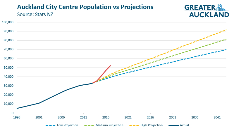
Our population growth is estimated every year and the census will help us see just how accurate those have been, both in scale and location. For example, has Auckland’s city centre really grown as much as has been estimated. The graph below shows the growth in the city compared to projections. The red line is the growth since the last census and represents a growth of 19k people (58%). Was there enough spare and new capacity in the city to handle that many more people.
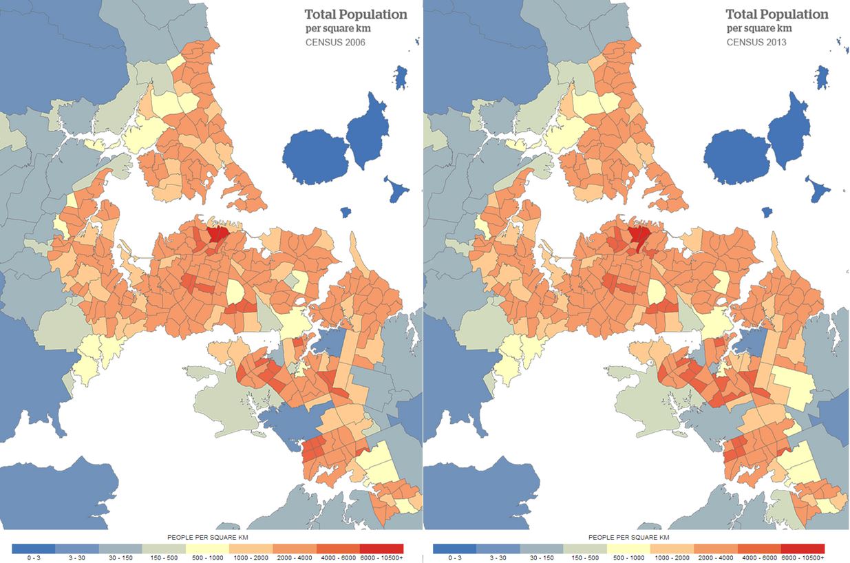
For many years we’ve been hearing about Auckland’s housing crisis as a result of huge growth but not having and building enough homes to cope with that. So it’s also going to be fascinating to see where that growth has gone. Are we going to see a lot more density in some of our suburbs from people crowding into homes and garages? From previous census’ we’ve seen that some of Auckland’s densest areas are around Mangere and Otara as a result of this. Will more areas join these ones?
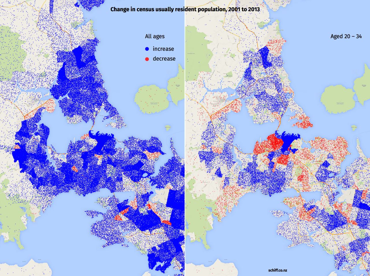
And then there’s looking at how the population has change through metrics like age. Following the last census, Aaron Schiff make this map showing how population had changed for the 20-34 age group which highlighted that some areas, like the inner west, are seeing a lot fewer young people living there. With the housing crisis seeing the value of some homes skyrocket in the last few years, I suspect that trend is only going to continue.
Transport
There have been a couple of major changes for this census
Journey to Work
Asking how people travel to work has long been asked in the census but this year the question has been change slightly. Instead of asking how you travelled on the day it’s now how you usually travel. At the time of writing this post the weather was looking good but had it not been, this should help get a more representative result, such as if a major storm had of been blowing through and meant a lot of people who normally cycle couldn’t. In addition to the change in the question, for the first time Ferry will be a possible answer. Previous it was just grouped under “other”, although motorbike has been relegated to that category.
As for the results, there are quite a few things well be looking forward to seeing, such as:
Up till 2013, the percentage of people who are recorded as “Work at home” has remained remarkably steady at around 7%. Technically, it’s easier than ever to do for some professions but are people doing so in larger numbers?
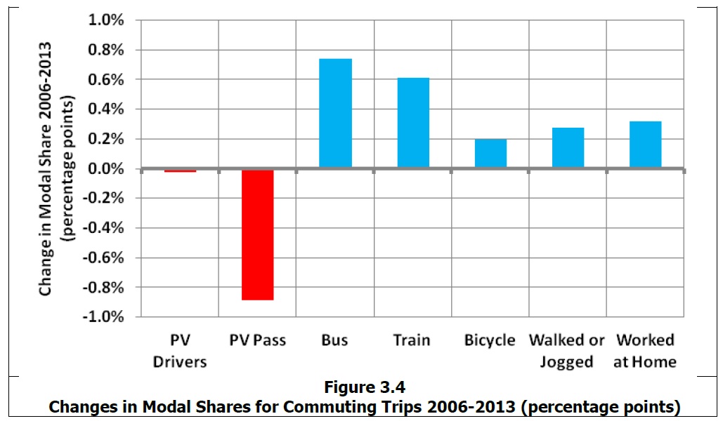
At the last census, after breaking down the growth in travel we saw the combined growth in PT modes was actually higher than growth in cars (and as a quantum, not just a percentage increase). That saw the overall share for trips in cars took a 2.6% drop compared to 2006, although it was still nearly 83% overall. We’ve had some pretty decent PT growth in recent years so will we see that kind of result again?
Auckland Transport’s automated cycleway counters have been showing steady growth over the last few years as the cycleway network has been improved and expanded. How will cycling be reflected in the results.
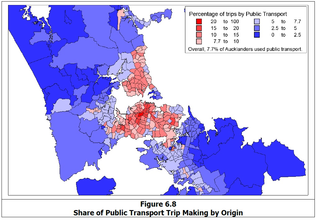
How does modeshare change by location. For example, the map below shows the share of trips by PT. The areas with the highest PT modeshare tend to be on the Isthmus and then the North shore (although Devonport doesn’t show up due to ferries not being counted before). Will we see those areas intensify usage and/or will we see other areas come up to a similar share? Will the doubling of rail use see those corridors start to become more defined too?
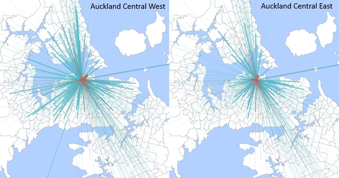
And where are people actually travelling to. Following the last census, Stats put out this useful tool that tapped into the origin/destination data collected. The maps below show where people are travelling to the city centre from
How does modeshare change with different demographics. For example, people travelling by PT tend to be younger.
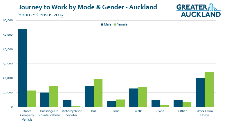
Whilst the previous census showed that women are much less likely to drive a company car or ride a bike.
I do have one little bugbear about the question though and that is you can only chose the mode you travelled the most on. That’s a problem for me as I’m possibly one of the most multi-modal people in the city. My normal commute involves a walk to the train, a train to the city, a bus to a busway station on the North Shore where I’ve left my bike overnight for the final leg to work. Whilst it’s possible to replace the bike leg with a second bus, it’s not as reliable, but I can’t replace the need for both a train and a bus. I think this kind of multi-modal commute is only going to become more common as our PT network matures.
Journey to Education
One of the major complaints that has existed with the census in the past is that it only focused on trips to work when there are a lot more trips that are taken on a daily basis. Only focusing on work can skew the results, for example when looking at the modeshare to the city centre, it ignores the fact that there are tens of thousands of students also travelling there but who don’t show up in the numbers. This is especially important as students tend to have a lot higher use of non-car travel. So this census, journey to education has been included too.
Have you filled in your census yet and what are the results you’re most interested to see?

 Processing...
I filled my census form in a few days ago and I really struggled with the travel to work question. In practice I’m almost perfectly even between walking and cycling. I basically had to toss a coin to decide what to put. I hate to think how you decided Matt!
Maybe in future they could offer public transport as an option and then ‘tick all that apply’ for the modes?
Matts choice is easy, he fills in as the mode, the one he covers the most distance using.
For him, clearly that would be the train.
I guess with smart software they could probably figure out what other modes Matt or anyone like that used to get from home to work, if they know the main mode was train, they could figure out he walked to the train station, then got the bus from the CBD to the North Shore somewhere.
But there would be gaps still.
So not capturing all the modes is criminal. You could easily capture all modes used, then have just one identified as the main mode, to keep consistency with other/earlier census.
I agree on the importance of the census, but I think this years census will probably be a disaster.
I predict well less than three million responses, which will make the whole exercise meaningless. Huge sections of society will simply be missed out.
Whoever decided to make the whole thing a penny-pinching, poorly advertised, badly communicated online survey should be fired. Once (as in as recently as 2006) an army of workers swarmed out to ensure every household was contacted and every form collected. Now, it is basically the same as buying a lotto ticket online.
Should this census be a failure Then it will be just more evidence of the vandalism of the previous National government, a regime that in nine years never tired in its search for petty and mean spirited savings and in its desire to suppress the collection of inconvenient facts.
Glad they changed is to “usually” as I’m not at work today but bike almost 100% of the time.
But overall it’s a pity. I’d say a large number of people would cycle or bus one or two days a week; that info will be lost.
I agree, my bike commutes have been reduced by family circumstances, bus still dominates, so my honest census answer is bus, but my preferred method is bike-train. No way to emphasise this in the census. So one continues misrepresented 🙁
It kills the accuracy of the data though. They may as well have asked “How would like other people to think you travel’? The specific on the day data was useful to end users. This data is suspect before we have even seen it.
For that they would require a “teleportation” option. That for me at least is how I like people to think I move about.
I’d need “with a wiggle in my hips”.
“t kills the accuracy of the data though”
As if how you travelled to work on Census day, the first Tuesday every 5th March [or 7th if you have a earthquake along the way], was ever truly representative of the rest of the way you travelled [or will travel] over or last/next 5 years.
It’s really only inaccurate in your view, because you obviously believe the previous travel to work question was accurate.
To which I say. Yeah. Right.
The census day travel question has always been a stab in the dark at the actual truth.
Now with the usually option and including education travel, it is more like a better aimed shotgun blast in the dark, than the previous wild stab.
So its likely to be closer to the actual truth.
So, even it is a lot more statistically messy and more vague over the previous set of numbers than you like..It’s going to be a lot closer to the actual truth, which after all is what a Census is supposed to be about.
Or is it really supposed to be just an exercise in gathering nice round convenient numbers for you to misuse for the next whatever years?
But it was right on census day. Now we cant even say that. So how can we use it? Advocates wont care , but if you are trying to figure out what the actual pattern is or trying to figure out whether to spend on infrastructure then instead of revealed preference data all you have is stated preference. We know that overstates by a factor of about 2x. So now we will simply take the cycle result and assume in reality it is half the census number.
(the 2x comes from unpublished ARC data showing the effect of introducing the DMU’s on the mode of identified catchments. Stated preference said 11% would change mode, revealed put it at something like 5.6%)
As someone who has used cycling rates as part of an economic analysis, I really hope that the numbers become so unreliable that we can’t use them. It’s ridiculous to think that current cycling numbers reflect uptake of new infrastructure.
Greg, the advantage of the old question is that over the whole population, many personal quirks on that day are averaged out. If one person travels differently on different days, so will others, and all modes will be represented by someone on the day.
What the old question didn’t capture was the different modes on different legs, as others have mentioned. So I’d suggest:
A chart to fill in, with each mode along the top, and enough lines for each leg of each journey down the side. People could tick which mode for each leg, which legs were part of a larger journey, and maybe also which leg was the longest in distance for that journey.
Of course, weather will skew this, so there should probably also be a set of questions such as
How do you usually travel on:
a sunny weekday in summer
a rainy weekday in winter
a sunny weekend in summer
a rainy weekend in winter
That’s my ten cents’ worth. 🙂
Totally agree
I travel a lot, but not to work. So my form didn’t ask me any transport related questions. A bit silly really, if someone works at home or doesn’t work, why should that be reason to ignore their transport use?
Well Geoff,
I and a few others argued with Stats to widen the travel to work question beyond just “usual” paid Work or Education travel.
To help capture this sort of travel (after all plenty of people travel each work day in the AM/PM peaks for other than just work or education, such as medical treatment or unpaid/voluntary activities).
To no avail.
Seems the Stats. Dept question and data set minders truly felt asking about both usual travel to paid work and Education this time around was a bridge far enough for them.
Maybe next time they start soliciting feedback on the next Census questions, likely to be around 2020 or so for that feedback period, you can put your oar in then.
So the most important question: how long until we can get the data?!
By the time they run QC on all the user entered responses and check they have no duplicate responses and figure out all the missing responses.
Then chase up missing respondents, get them posted out some paper forms, wait while they fill them out and [hopefully] get them back, then manually key in all that mountain of unexpected paper forms they get from those who wouldn’t or couldn’t do it online, for whatever reason.
Then QC that data. And hope like hell those who filled in the paper form after the fact remembered that they had to pretend it was still census night when they filled them out.
Then normalise and anonymise the data.
Then identify and throw out the dud data they got from people who owned/had an empty house but who couldn’t just do a dwelling form on its own without adding a “fake person” to the list of people living in that dwelling, then setting them to being “away” on census night.
[as I had to so I could do the census dwelling form for my mums house].
So all up, I’d guess about the same delay as last time.
i.e. still Months and Months and Months of waiting…
But hell, I’m sure they’ll maybe save a shitload of money doing it this way…
Except this time they will spend time figuring out whether to own up to the under-reporting and come up with correction factors or alternatively to deny the under-reporting. Any time series with previous censuses is going to be meaningless. But that won’t stop people making comparisons and claiming a huge shift or trend in the underlying data.
Based on last census, we should see the first data just before Christmas.
Wow, some fascinating stuff there. Thanks, Matt. Between the last two censuses there was a big drop of modal share for private vehicle passengers, but private vehicle drivers stayed about the same. I wonder how much of PT increase is from car passengers switching… and how little of the PT increase is from drivers switching.
The map showing the increase / decrease in density for all ages and for young people could be very useful in community conversations around submissions for the Auckland Plan. Thanks.
It will be interesting to see whether there is a visible break in the results given the question on travel to work has now changed to being “on census day” to “usually”,
“”For example, people travelling by PT tend to be younger.”” – I would replace ‘younger’ with ‘poorer’; tends to be the young and the old with more of the former.
Purely a subjective reckoning and probably a poor one since I’m a GoldCard traveller – in North Shore it seems to be disproportionately more visible ethnic students are using our buses. They don’t seem to have that car usage for prestige & status hang-up that is common among many Kiwis.
Those assumptions will be proved or disproved by the census data.
Yeah, my observations are quite different. Plenty of middle aged people using the buses here. Perhaps that’s because I’m in one of the areas which has seen an increase in overall density but a marked decrease in young people whereas Birkenhead has had an increase in overall density but not much change for young people?
Reckon that is a fair point about Birkenhead and surrounds – young are moving in but the rest of us are staying put and getting older – result not much change except for congestion.
Maybe we notice those who are like us and I’ve always suspected you are an energetic young ‘middle-aged’. Of course the date range for middle age changes as you get older – I reluctantly abandoned the designation for myself when the Goldcard was delivered.
Since I virtually never catch buses before 9am my sampling is poor – maybe at 8am the Highbury bus stops are filled with women with Gucci bags and young men with Rolex watches.
And I forgot to thank Matt for his informative graphics and excellent maps.
Once again I enjoyed answering their question “What ridiculous mumbo-jumbo do you believe in?” The Ms mfwics went for Jedi. I considered putting ‘the old gods and the new’ and even thought about ‘the drowned god’ but in the end went for polyatheist a blend word of polytheist and atheist on the basis that there are lots of gods I don’t believe in.
I used to put “Viking” as my ethnicity when I was at school.
Cool. We had a book to sign in if you were late. I put ‘stigmata playing up’. The next time I got to put ‘Stigmata playing up again’. My best ever entry.
That’s brilliant. 🙂
I’m going to have to stuff up my response today. I have my inlaws staying, so I’ll be including them on the dwelling form. However, they didn’t know they’d be staying, so they completed their forms last week, saying they were staying elsewhere… I haven’t done it all yet to know whether there’s some way to properly answer this. I imagine I’m going to have to be very naughty, and not submit individual forms for them. Being able to submit ahead of time is definitely another source of inaccuracy.
“What ridiculous mumbo-jumbo do you believe in?”
I put “Nun”.
Eric Crampton has a good mini-essay out (Google it) pointing out that NZ’s large population of Jedi may well have a strong deterrent effect on hostile foreign powers eyeing us up. As he points out it is illegal to lie on the Census form so he couldn’t claim Jedi status himself (and nor could I) but this just proves that our 20000 odd Jedi are suitably legit.
In previous census most Aucklanders could have put “travel by private motor car” as their primary religion.
This time round? not sure…
My primary age kids scooter to school (as does seemingly half the school), but there was no option for scooter. I put them under “walk or jog” but suspect lots of other parents will put it as “other” and then it will get lost and no-one will realise there’s a big bunch of kids taking active travel to school.
If the people doing the analysis are any good, they will pretty much clump everything other than Car or Bus as “active” – so it will get counted
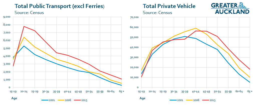
I am looking forward to seeing the age demographics of PT this time – especially with the large growth compared to the last census.
The PT stats by age group were fascinating: ~24,000 under 35’s using PT and ~20,000 over 35’s. Looks like the target market for PT is in this younger group in the medium to longer term.
There was a big jump on private vehicle usage from 35-45 which remains strong till 55, but that is probably a lower priority to gradually encourage towards PT options. The bus lanes, new network and increased frequency should hopefully help some switching.
I keep wondering whether the census travel data was used as justification to build more roads, but now that it doesn’t support the required outcome, it’s use will be discredited by those who have previously relied on it, so that no one can use the techniques that were previously used.
How does the census include those living in cars or the homeless? I assume the garage renters will be included in the main home count?
The census often doesn’t include the homeless including those living in cars. People living in garages also frequently do not respond.
It’s a massive issue with relying on census density data.
55 years ago when my Mum worked with the census in Birmingham UK they went to great lengths to capture everyone including the vagrants and homeless. I suspect the results for Auckland will embarrass our governments (current and previous).
I was flatting with a couple of guys in a big old house in a suburb of Glasgow when the 1981 British census came around. Our dwelling nestled in a large overgrown garden and looked for all the world like it was uninhabited and likely haunted. So no census enumerator ever called on us, and no forms got delivered.
The day after the census I contacted the enumerator for our area, mentioned that our household had been missed, and please could we have some forms to rectify this?
“Nah, just forget about it”, came the reply from one of the very people charged with ensuring the accuracy of the project!
And so that day I simply disappeared off the statistical radar.
If its a separate household, then it should have its own dwelling form.
Not sure there is a dwelling type option/selection for “hovel” though.
But all jokes aside, yes everyone and where they are living needs to be counted.
Whether officials will believe the numbers they get? A different story.
The ability to answer ahead of time – which I criticised above as bringing in inaccuracies – may on the other hand mean that if agencies are actively trying to reach the people without homes, that they have more time to do so, and take away a filled-out form. I’m not sure though. there was something of an ‘event’ about keeping the forms until the day that may have led to more homeless people filling out the forms as they felt their information was important and that they literally counted.
And therein lies a major problem, that the census is based on dwellings with a proper street address. This probably means the tens of thousands or more people without an addressed dwelling are not accounted for in the census. We often hear that with housing high prices and declining rental supply in Auckland that the homeless numbers are growing. Looks like they will be invisible too as far as the census is concerned and hence govt support.
“Whilst the previous census showed that women are much less likely to drive a company car or ride a bike.”
It didn’t actually show that. It showed fewer women drove a company car or rode a bike. The concept of likelihood pertains to an observer randomly selecting examples rather than the individuals themselves.
I’m interested in how Aaron-Schiff-Population-Auckland-Combined.jpg was generated.
To me, that looks like there are now lots of people living in the Riverhead Forest, on the mangroves north of the Waterview causeway and on the causeway to Puketutu Island in the Manukau Harbour.
Rob
There’s a description in the linked post. The original post by Aaron Schiff has vanished unfortunately. IIRC the amount of dots was calculated per census unit, and the dots are evenly distributed over the areas occupied by the census units.
Looks like the algorithim says ‘x many new people in census are unit y, distribute them evenly’ across the census area unit’. That’s why there is population loss on Rangitoto, even though no one has lived there for over 50 years.
There have been a few baches there that the owners could keep until they died. If my ancestors are anything to go by, census time is a time to go and live somewhere funky for the night. So last century a couple of 12-year old cousins were living on census night in the barn on the farm rather than with their families. If you had a bach on Rangitoto you’d be old in 2001, (no decrease in young people shown on the map), and you may have died by 2013 or become too old to go and stay for the night.
Or am I suggesting this because it’s the sort of thing I’d do? 🙂
The biggest problem I have with the census is the privacy obsession, bordering on paranoia that Statistics NZ has over detailed data. You can have anything you like if it is so vague as being useless. But if you want to know the pattern of trips by mode and age then their rounding nonsense will turn all the data to zeros. They stress that you might identify an individual. but that would be almost impossible. The trick is to not over-specify the detail and live with the broadest level you can.
Privacy obsession? I might just be too sceptical but census detail data not being accessed by security services inc police, immigration, ird and other unknown ‘officials’ seems like wishful thinking or ascredible as that bovine squadron I always see circling AT’s hq.
The campaign to get people to do the census online has been so successful that I have come across several people who are not online and were unaware that a paper based form was available. This was not mentioned in the advert.
I liked the irony of the people complaining on social media that they didn’t have access to a computer – presumably they were posting their complaints via a (Census do-able) tablet or smartphone…
Today census day I had a pensioner come over to do his online and as he does not work anymore there was no question on the mode of transport he used today and to get to me he used both Bus and taxi then he walked down to the bus stop to get 2 more buses home . So the this census is only good for the working people only so no one will know how the ones not working get around . It should have said for everyone what means of transport did you use today instead of having those drop down boxes and I never saw it on mine either
It’s why we also have a MoT Household Travel Survey that picks up all personal travel patterns; albeit with a smaller sample size.
But why the exclusion for the census? Who stuck their heels in, and why?
Left mine a bit late & finished my Census at around 1am for the household (though distracted myself with my looking up what my qualification actually was etc). The income & working hours one is interesting in that it wants the last 12 months for income (would be easier if aligned with 31st March), but then wants to know what hours you normally work. Is the currently or to align with the last 12 months…..can be wildly different for part timers etc. My first thoughts is surely they want the $ amount to align with the hours, but then maybe they want to know “current” “normal” working hours, so very ambiguous & don’t think the help had a section on that specifically. There will be some interesting hourly rates coming through with different responses to this. I guess the have the quarterly household labour survey or what ever it is to handle that more accurately.