At last!
Shine down on us Robbie, we’re actually getting there.
In the same week that two brand new – and already wildly popular – city centre sculptures have been unveiled, and the opening date for our fabulous new underground urban railway was announced, Auckland Transport has also quietly agreed with our artful pitch on naming the top-tier transit services.
There it is, on a map that was handed out at the opening date announcement: Auckland Rapid Transit or ART.
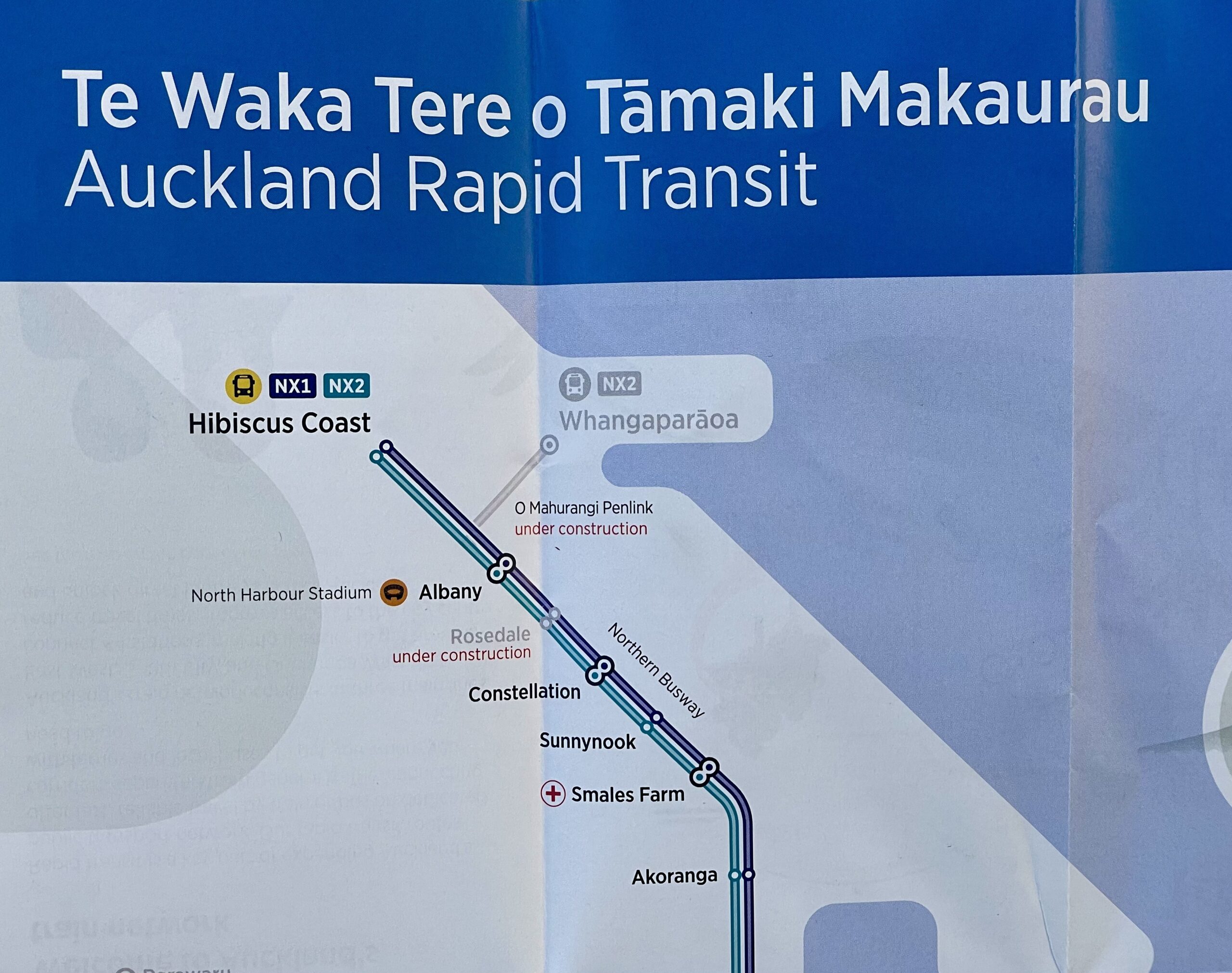
A map handed out at the CRL opening date announcement.
We now officially have our mixed-mode top-tier transit network presented as a unified whole:
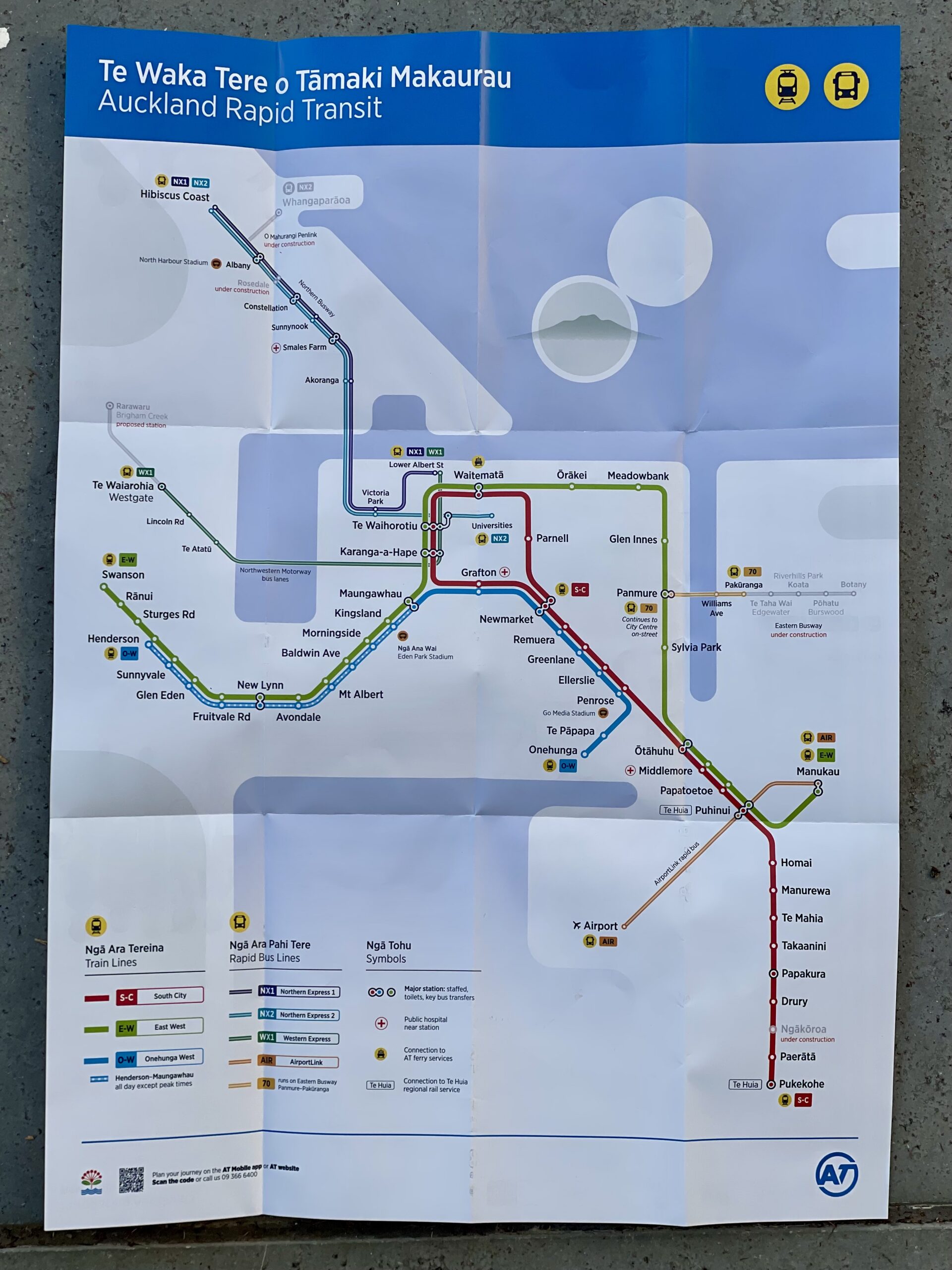
The ART-ful map in full.
We are really pleased that Auckland Transport saw the logic of the network naming argument I laid out in a blog post in May this year, and has just quietly picked it up.
To recall, here is an earlier iteration of the network map from April this year, under the prosaic banner: “Trains and Rapid Buses.”
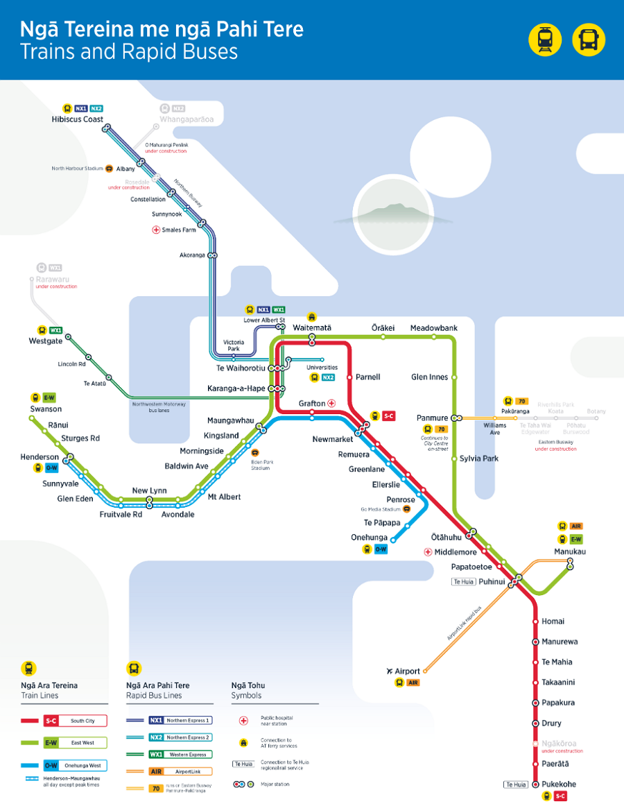
Auckland Transport’s Rapid Transit Network map from April 2026. Working title, as it were.
From Trains and Rapid Buses to ART is a small but powerful change. Network effects accrue from network thinking and network communications.
Each city’s transit map is a key to that city, a means of making it legible, intelligible and accessible, for the visitor and local alike, as well as a reflection of how the city understands itself.
Looking at various shots from the Karanga-a-Hape Station open day, it’s abundantly clear that The Map is critical for people, and highly magnetic. An instant activation.
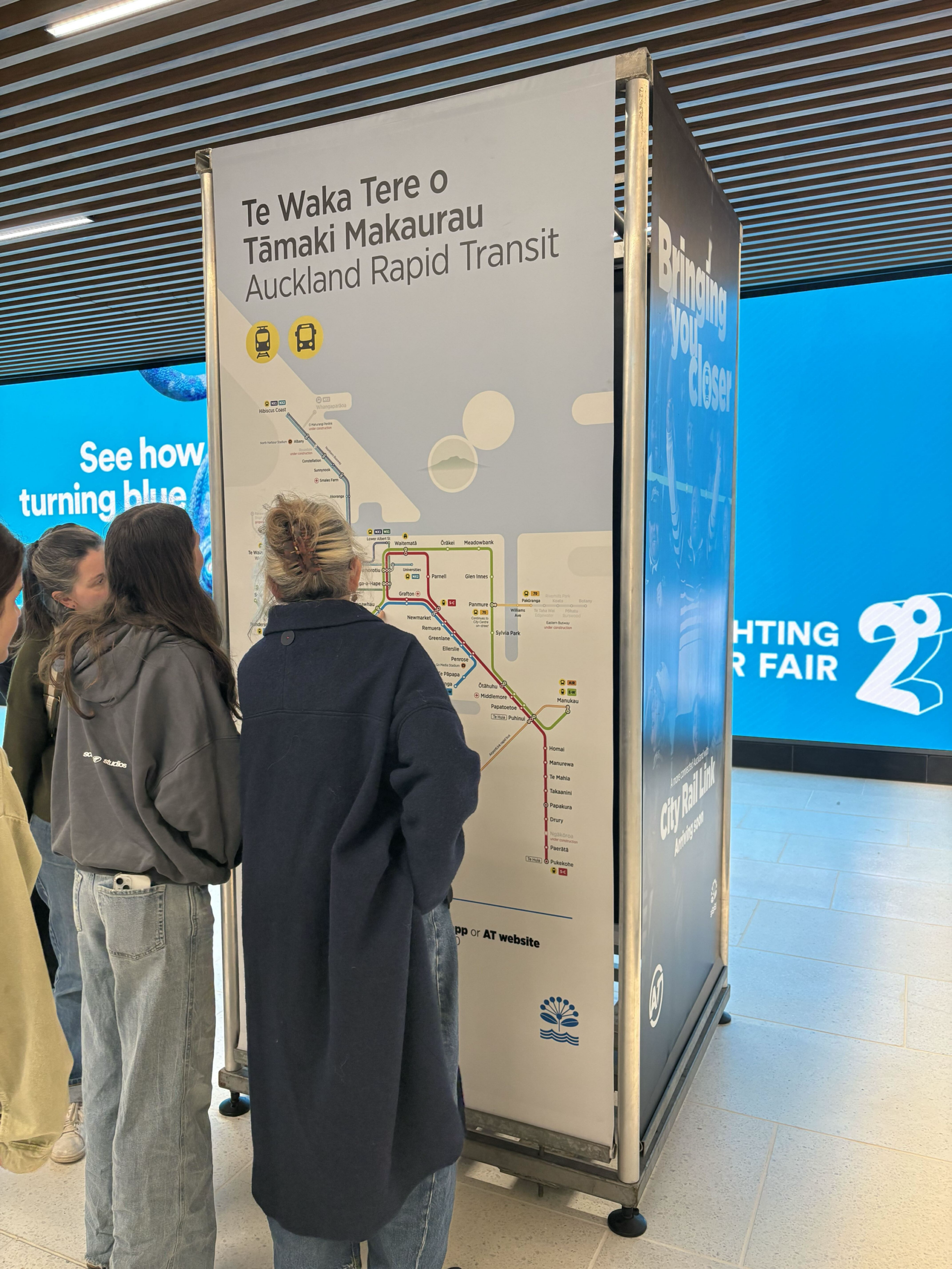
Karanga-a-hape Station open day. Photo by Jolisa Gracewood
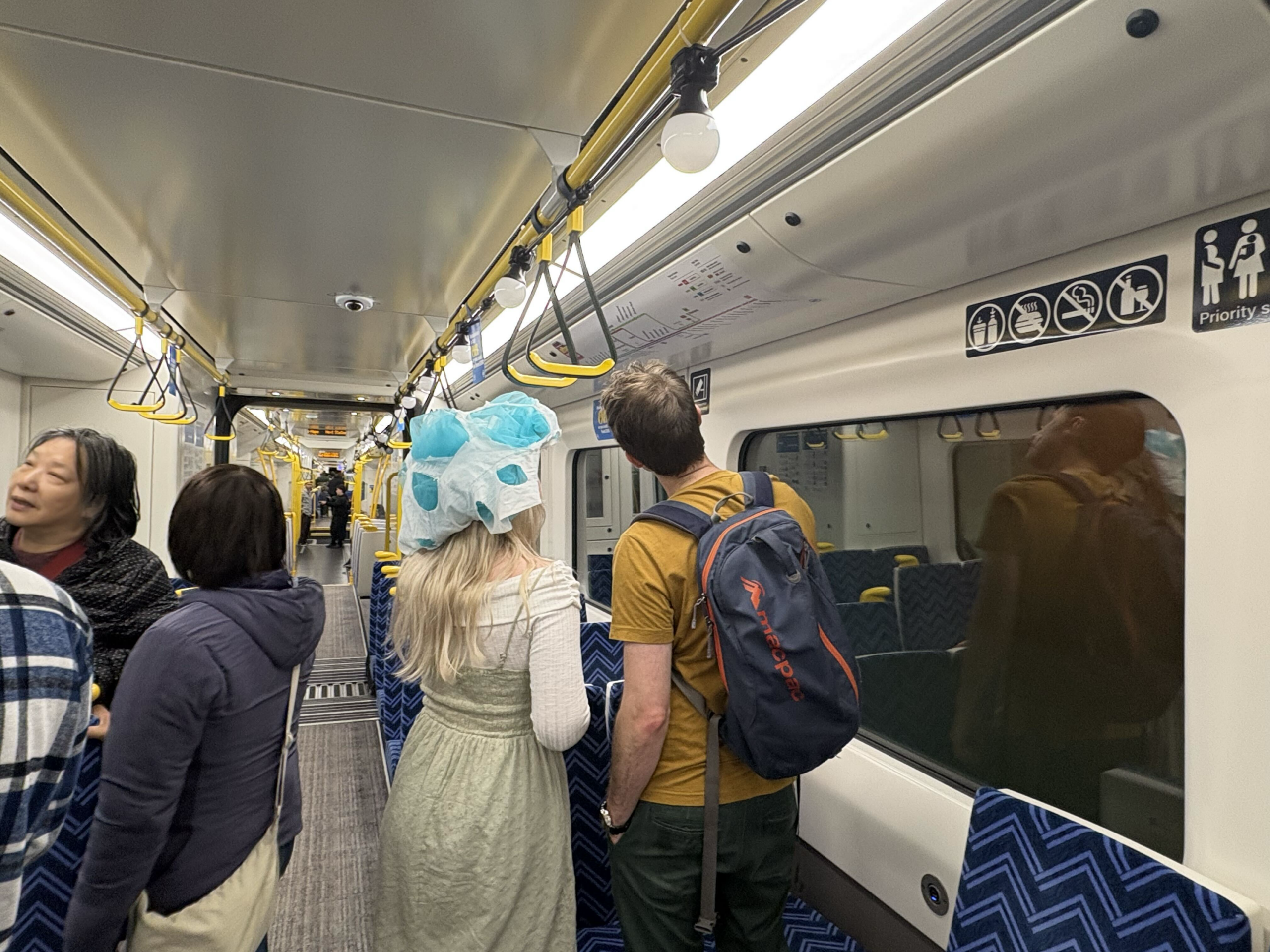
Karanga-a-Hape Station open day. Photo by Jolisa Gracewood
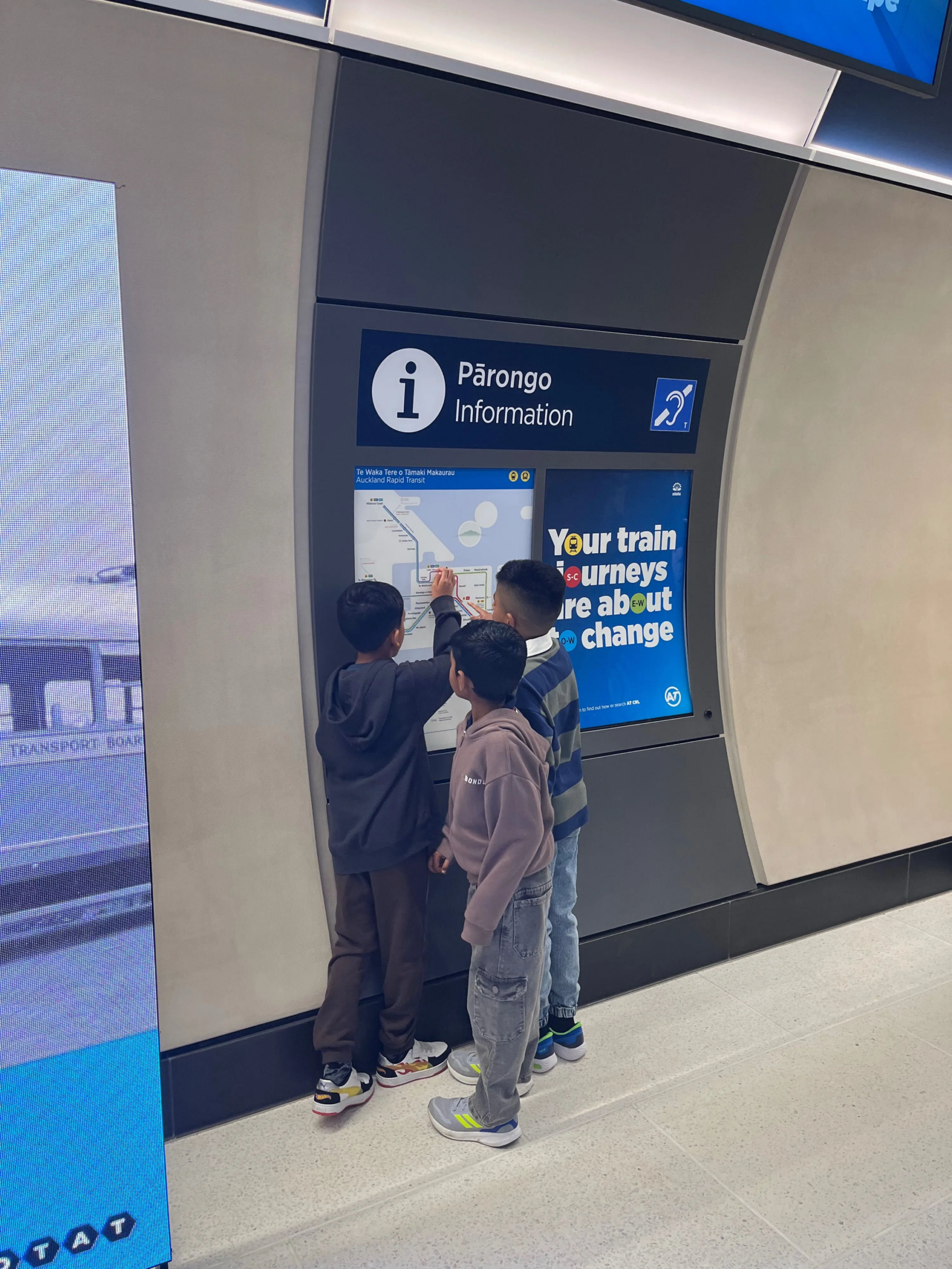
Karanga-a-Hape Station open day. Photo by Russell Brown, via Bluesky.
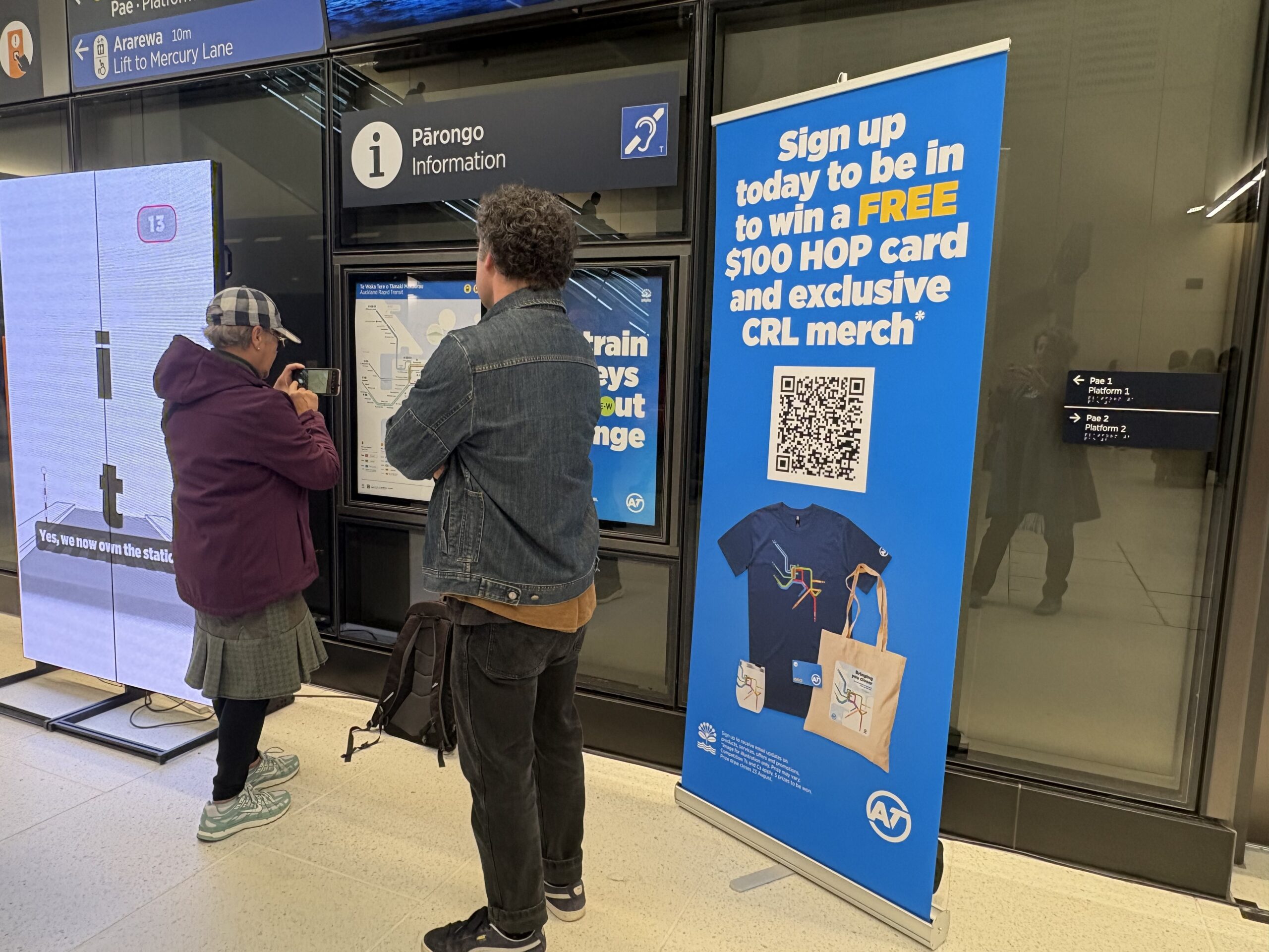
Karanga-a-hape Station open day, perusing the maps. Photo by Jolisa Gracewood.
The stations are fantastic, and the energy was brilliant. It was fascinating just to watch people making sense of the potential journeys via those maps, seeing the city become intelligible in a whole new way. “Wait, a one-seat ride from out west to IKEA?” was one overheard conversation.
I just have one small further piece of feedback for Auckland Transport: go big or go home. Make the maps as large as you can.
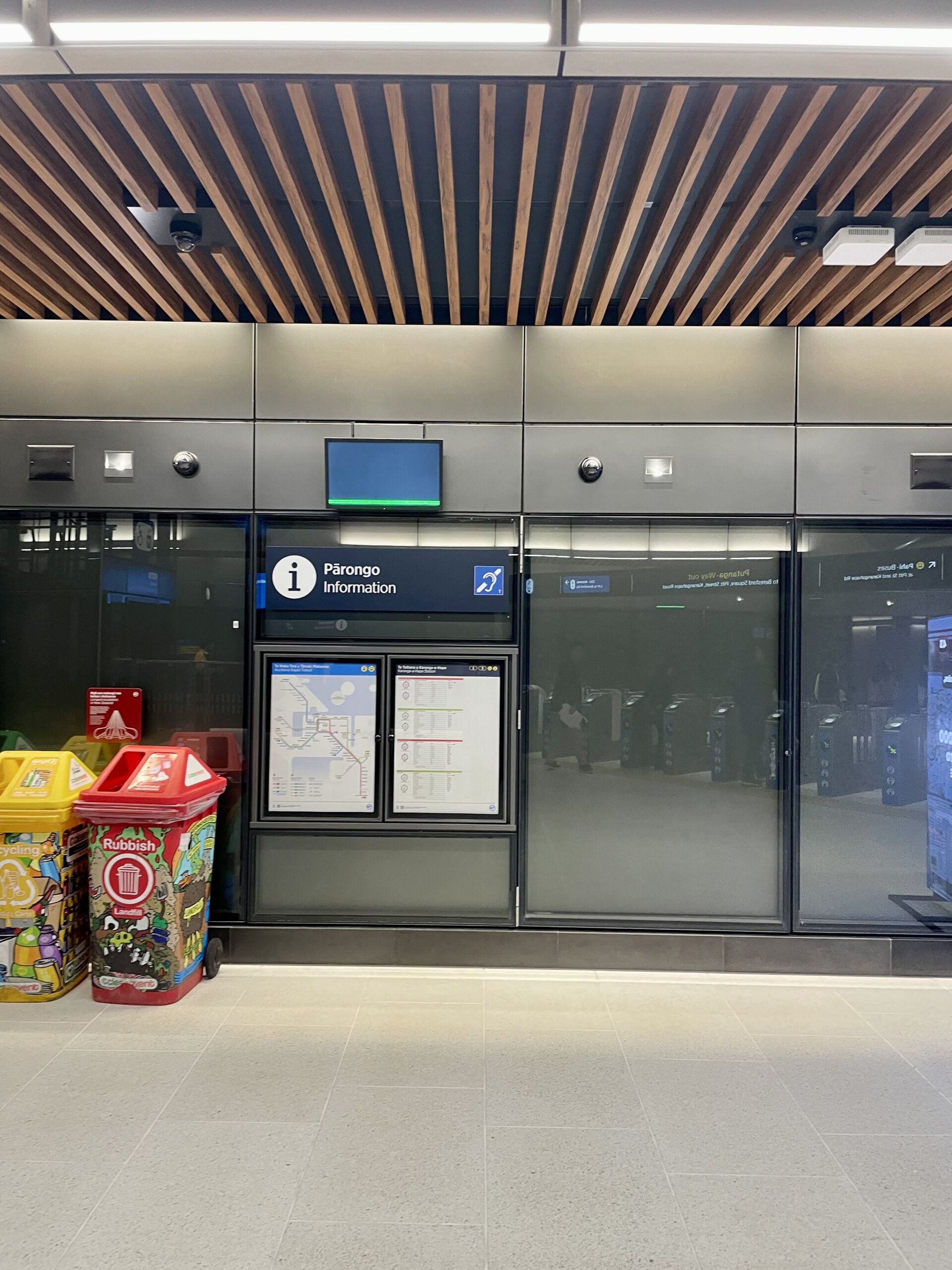
Squint and you can juuuust make them out. Photo by Patrick Reynolds.
I think the maps on permanent display in the stations should be as large as possible. They can and should be the size of the whole available display panel in that image above. A map as big as any advertisement, because the map IS the advertisement.
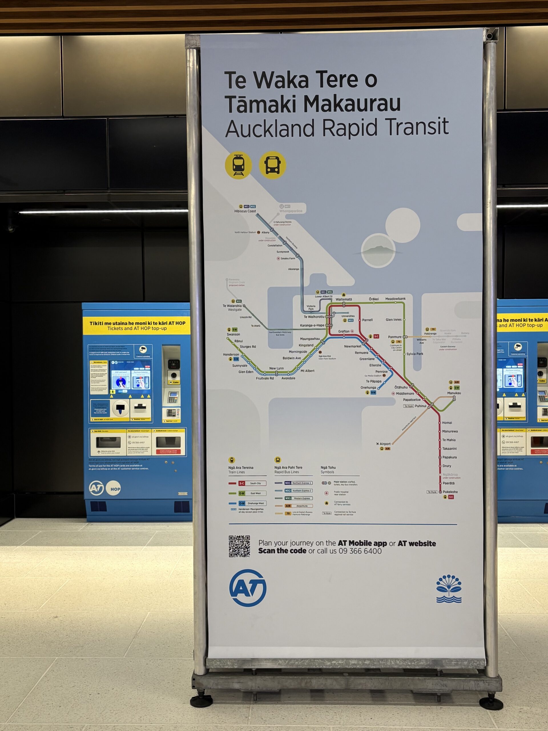
Make ’em big. This big. Photo by Jolisa Gracewood.
The Art of the Actual Art
On the subject of art, the stunning artworks in and around the CRL stations are immediately impressing people who see them, as we knew they would from our early preview. Like these visitors from down the line, as reported by RNZ (and see also this nice report from Three News/ Stuff):
Thirteen-year-old Aizu Rive, who’s visiting his Auckland grandparents – coming all the way from Tokyo – said he likes the architecture of the station, including the ceiling designs.
The young rail enthusiast said he’s excited that New Zealand now has a metro network.
[…]
Mary Thompson, who’s come from Te Aroha in Waikato to visit the station, said [the] opening of Auckland’s City Rail Link will make it easier for her to do day trips to Auckland. […]
Thompson said she’s pleased with the art at the station.
“I just think you only have one chance to make it beautiful, nobody retrofits a building to put art in it, and the spaces are so pretty.
“I’m just happy it’s got brightness and light, and after living overseas, some of the stations are rather dingy and horrid, and this is just lovely,” she said.
It’s also clear (and should be made clear by everyone reporting on these stations) that the artworks cost an absolutely trivial amount of money, by any measure – particularly in contrast to the value they bring. There’s cost, and then there’s value.
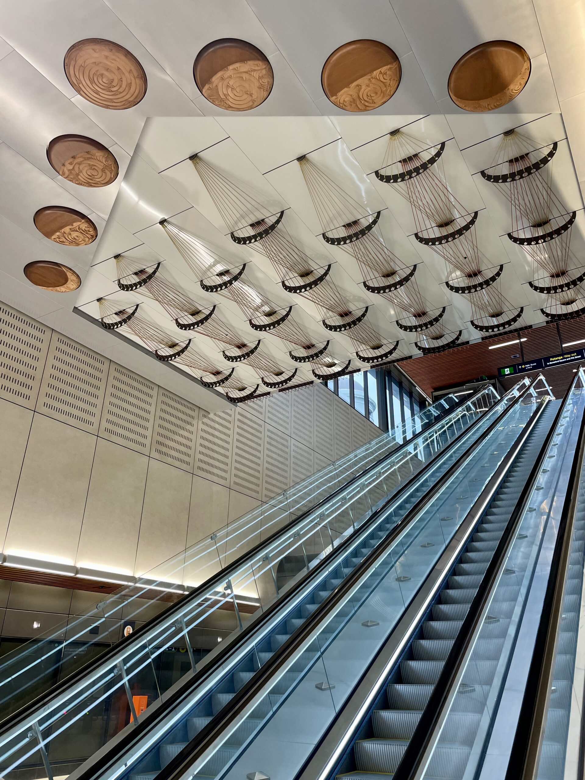
Me te Ōturu, an artwork depicting the phases of the moon, a collaborative design work led by Reuben Kirkwood ((Ngāi Tai ki Tāmaki, Waikato Tainui, Waiohua, Ngāti Ruanui). Photo by Patrick Reynolds.
I recall a $1m line item for artworks in the initial budget. So I asked Auckland Transport for an update on the final numbers, and this is what they sent:
CRL station artist costs
The total cost of Mana Whenua Artist input is $207K across the three stations.
There will also be installation costs, of course, although those are all but impossible to separate out from the rest of the fit-out cost. Regardless, even if the total budget for artworks was a million dollars, that’s still an entirely trivial sum in the context of $5.5 billion.
As in, literally 0.02%. Anyone who still thinks this is a material issue has serious numeracy problems.
Besides, the two new sculptures on Te Ha Noa downhill from Te Waihorotiu Station were 75% funded from the City Centre Targeted Rate, with the balance coming from Auckland Council’s Public Art budget. So the instantly iconic tuna (“COOL NEW EEL!“) and its presiding personage Wāhine are not part of the CRL cost at all.
For contrast, and for anyone still doubting the power and presence of public art in public infrastructure, I came across this image of the a station on the new Eglinton West LRT line in Toronto, on Taras Grescoe’s blog HighSpeed. To quote Mary from the RNZ article, “rather dingy and horrid.”
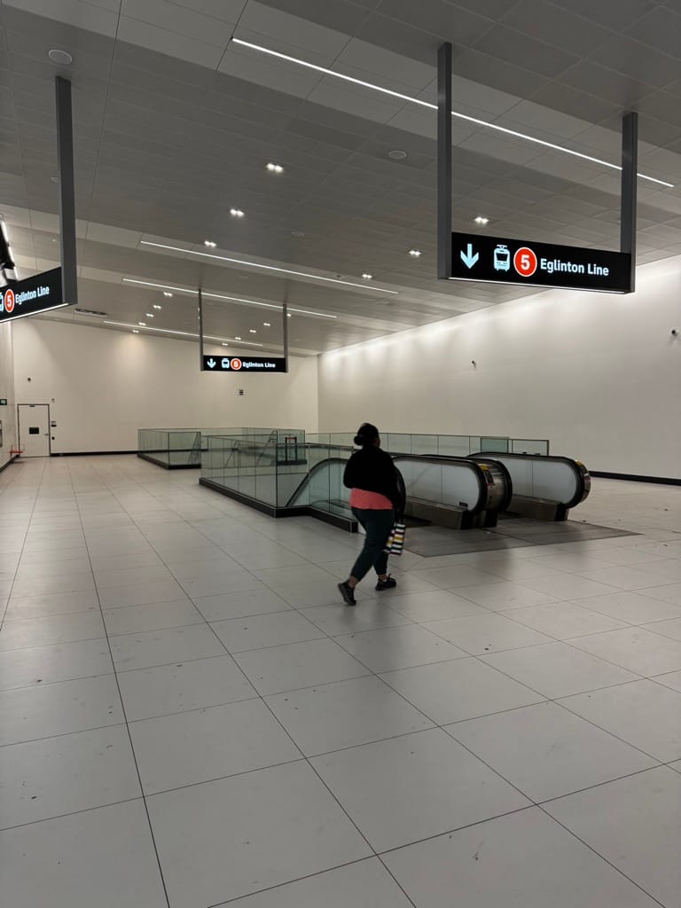
Eglington West station: photo from Taras Grescoe/ High Speed.
The Eglinton West LRT line was not cheap by any measure, and they certainly didn’t save any money by making this room as miserable as possible. As Grescoe writes:
Cedarvale is a major Line 1 connection, and the station is not small. In fact, it is jarringly capacious, with a large “Lightbox” entrance at the surface, and a vast atrium/hall, barren of public art, leading down to the platforms.
Grescoe adds:
The Eglinton Crosstown, in contrast, began construction in 2011. And it cost $13 billion. (Nor is it complete: the Eglinton West extension to the Mississauga Transitway is projected to add $4 billion to the final bill.) That works out to about $700 million a kilometer, versus $143 million/km for the REM.
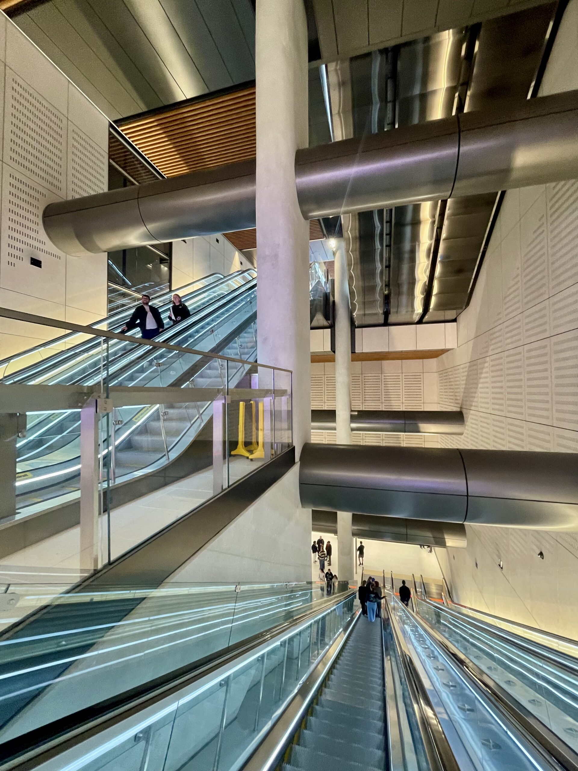
Karanga-a-Hape Station. Photo by Patrick Reynolds
Particularity
Why Mana Whenua artists, and for that matter Te Reo station names? Because nothing else says “of here” more than the images and language unique to this land. We could have equally expensive empty bland boxes for stations, I am so grateful that instead we have confident, aspirational, and enduring new places for us to live up to as we move through our city. Each time we build we have the opportunity to create a better future.
As previously argued here: Imagine.
There is nothing excluding about these artworks and spaces, all three new stations have a generous, welcoming and embracing tone. A critical attribute, and one not always achieved in large engineering led projects.
Inasmuch as some people will still want to insist the CRL was “too expensive”, that is not because its builders failed to make it ugly enough. Engineering on this scale costs money, with or without good art and design.
As ever, the real question is: what is the value? And on that point, I am as about as confident as is possible that this investment in our future will never, ever be regretted.
We will of course be following the data in the years ahead. Although if it’s quick anec-data you’re after, I’m reliably informed that during Saturday’s “First Look” festivities, more than one very popular hospo establishment in and around Beresford Square ran low on food and drink even faster than they could have imagined.
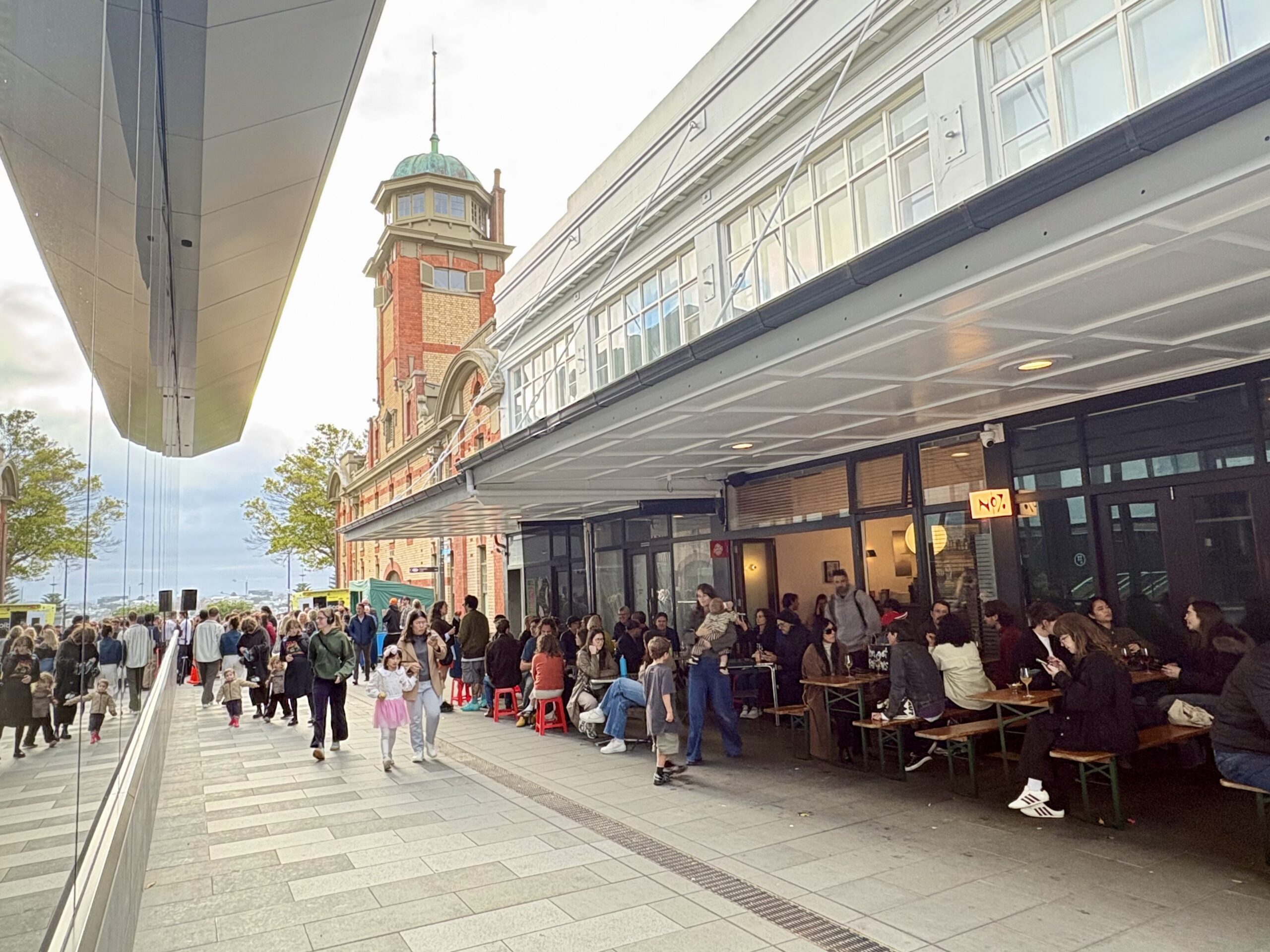
Beresford Square on Saturday, buzzing with people. Photo by Jolisa Gracewood
Lastly: is this the definitive source of the alleged “gold plate”? If so, shine on, you absolute beauty.
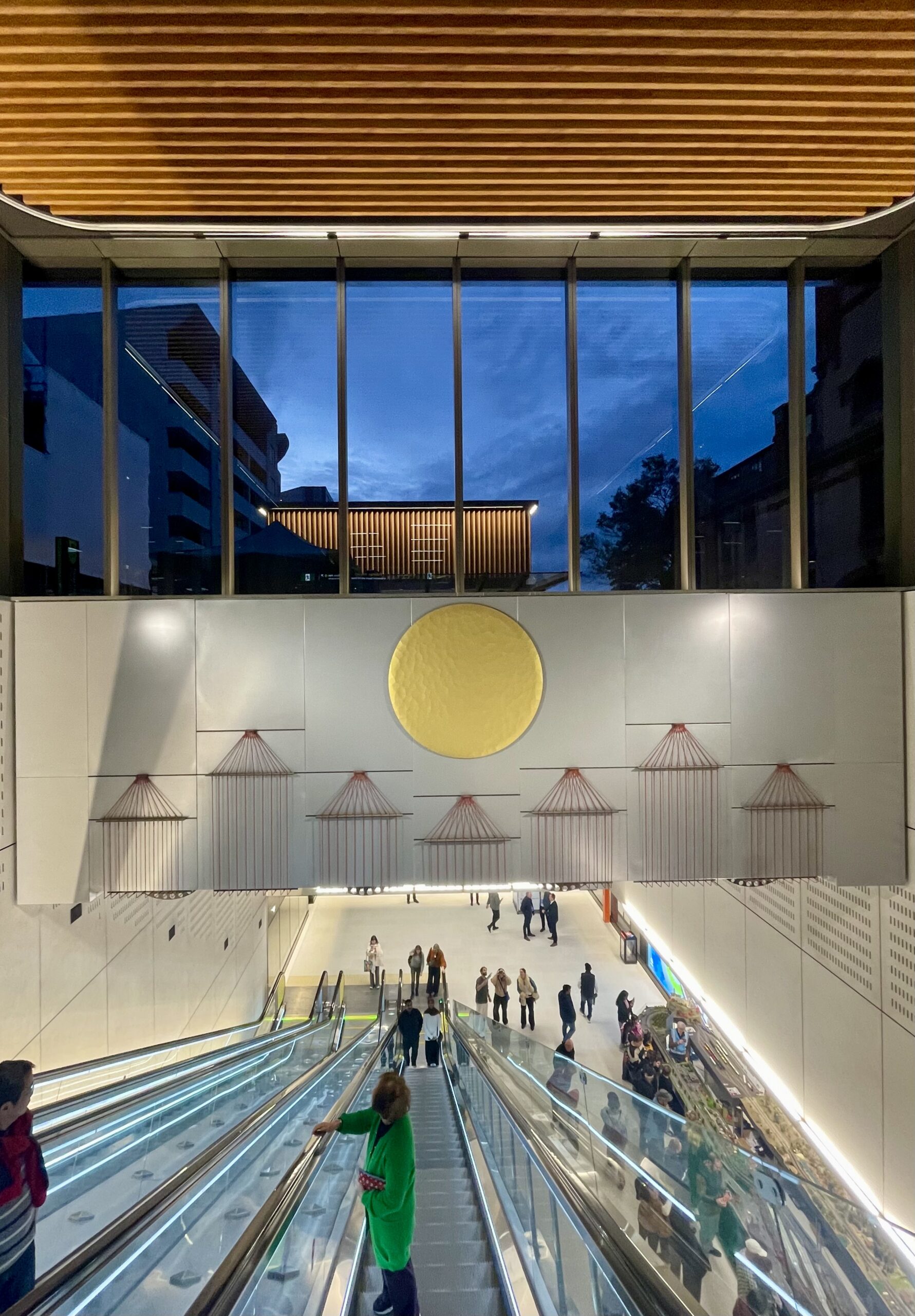
The other side of the artwork Me te Ōturu by Reuben Kirkwood (Ngāi Tai ki Tāmaki, Waikato Tainui, Waiohua, Ngāti Ruanui), as seen from the Beresford Square entrance to Karanga-a-hape station. Photo by Patrick Reynolds
Addendum: This beautiful video – about the art and architecture of all three new stations – includes commentary from Reuben Kirkwood who led the artworks for Karanga-a-hape, from about five minutes onward. Lovely stuff.
Greater Auckland’s research and advocacy is powered by hundreds of hours of work each month, and your support helps keep us going! We always welcome your donations; likewise offers of guest posts, practical help, or pro-bono expertise.
You can also wear your heart on your sleeve with Greater Auckland merch, including CRL station themed T-shirts. Note: allow a week for delivery, and double-check sizing as these items are print-on-demand.

 Processing...
I don’t mean to be nitpicky, but the quoted line for the art spend is “The total cost of Mana Whenua Artist input is $207K across the three stations.”. The word input is quite a strange choice and given it’s only a fifth of a million are we quite sure that this does not refer to purely consultation costs (whatever that means)?
In any case, the art installations and additional design costs are well worth it; people seem to decry anything that isn’t purely utilitarian spending while complaining that all the old stuff looks better and don’t put together the relation.
Yeah I think that’s more awkward corporatese than anything meaningful.
““The total cost of Mana Whenua Artist input is $207K across the three stations.” Translation. This is the cost for the artist to attend some meetings. It is not the total cost of the art installation.
That’s how I read it too, seems like the typical double speak where they quote a part of figure instead of the total. Regardless of the total cost, I think we’ll have overpaid, but glad it happened and in the scheme of CRL the cost is a rounding error.
100%
This is the Mana Whenua Artist time and consultation only. In my experience on other government projects they only quote this time, not the entire installation costs, which will be significantly more.
And no its not worth it when the money could have been put to other service investment / improvements. If we want to get people onto more efficient forms of transport, frequencies, reach and quality of service is what matters. Not pretty art work! Take that money and put it into other network upgrades!
I think we can all agree it looks a hell of a lot better than those original artist renders that looked like they were going to smear poo on the walls. They looked more like HM Prison Maze or Long Kesh rather than a public station.
I’m not sure Sweeney was only talking about the cost of the art, there would have been a whole load of costs and addons that could have been minimised. Every cost has an opportunity cost – for example, Karanga-a-Hape Station station would have cost a fortune being that deep, maybe we could have had basic surface level LRT to Mt Roskill instead, with Karanga-a-Hape being one of the stops on that.
But at the end of the day we have got something amazing, no need for any more negativity.
Sweeney’s cost-savings came from designing a fundamentally different system with lower capacity. The equivalent would would be saying something like an international airport could have saved millions by designing the runway for Cessna’s. This would technically be true but fundamentally change the capacity and usefulness of the airport.
exactly, it’s just a bunch of reckons that appeal to and get boosted by people who don’t understand transit and transit planning in any sort of depth.
Sweeney’s alternate proposal would have maintained capacity by running more trains through the station’s. As Matt L pointed out this would require alot of investment in signaling. But who is to say it wouldn’t have been cheaper overall. It should have been costed in the planning for the CRL.
From what he has said, Sweeney’s proposal would also appear to have required full segregation from non-metro services, i.e. a separate network for freight plus other pax – i.e., what would be saved on stations would be balanced (if not over-balanced!) by spending elsewhere.
Astonishing, really, that he was happy to be paid large sums to build facilities that he later said was not needed, and that he didn’t seem to understand the full consequences of his thoughts.
What would drive the need for separation of the freight network?
Freight and suburban trains running more than every 10 minutes cannot coexist without significant disruption to both.
The reason the naysayers are going nuts over the artwork is not because of the cost, which is a drop in the bucket compared to what was actually spent on rescoping and COVID delays. They are going woke because paying for art means giving money to artists, who are “woke” people, and sometimes Māori, the worst kind of woke people. It’s culture wars all the way down.
That’s certainly some of it, and it feels way out of step with Jo & Joe Public, tbh.
There’s also a peculiar strain of chilly puritanism that likes to boast about how frills-free things can be. Only bread, NO roses, and one slice each if you’re lucky, certainly no butter. Which again, pretty out of step with public feelings, I feel?
The grim photo of a soulless corner of that one Toronto station shows the path (thankfully) not taken here. Meanwhile the proof of value shines through in every other image – and in the grins on the faces of the thousands who strolled through on Saturday.
Eeek that Toronto one is horrid.
Also re cultural art, lets not forget that the more central city station has a whole pile of art from all the children (of all different races/ethnic/nationalities/backgrounds) during COVID lock down or in between from memory “set in stone” at Te Waihorotiu Station. Will probably be there for 100 years or more.
It should be noted that there is artwork incorporated into Eglinton Crosstown stations, but that one mezzanine is very bleak, yes. I’m almost wondering if they’re waiting for something else to go in in the future.
https://www.blogto.com/city/2023/03/preview-torontos-eglinton-crosstown/
I disagree, as someone who fully supports this project it is simply a example of miss-mangement and wasteful spending.
Yes the real culpert was the incompetence of the last Labour / NZF / Greens government who commited our limited contruction and engineering resource over numerous co-current major infrastructure projects causing massive delays and therefore major delay costs and inflated professional labour costs due to competive nature to almost every project during the tenor. You literally had engineers jumping ship on a yearly basis to different companies due to the ridiculous wages being offered.
But when you bring this up its beyond most peoples understanding so the simple cost wasting on art and gold plating is easier to understand.
Lovely story, beautiful images, great comparison to Canadian ugliness, huge win on naming. I concur wholeheartedly with the push for BIGGER maps. We love your work, Greater Auckland!
There is artwork in stations on the Toronto line, that’s just a particularly bad mezzanine.
https://www.blogto.com/city/2023/03/preview-torontos-eglinton-crosstown/
Tautoko.
I went along to the ‘First Look’ on Saturday. It’s (obviously) a self-selected group of people in attendance, but the buzz of excitement was palpable. While it has been an expensive exercise (and I feel sorry for the businesses that didn’t survive the construction disruptions), I firmly believe this is the best thing to have happened to the city centre this millennium.
No longer is Britomart, uh, Waitemata, a dead-end station, but the CRL will make travelling into & through the city centre so much more convenient. This is a great opportunity to rejuvenate the city centre.
The decor of the station & the artworks, even the name, Karanga-A-Hape speak clearly & proudly of a sense of place. As a commuter visiting the station, it is obvious that I cannot be anywhere ese but Aotearoa. I love it! Bring on September!
The art is lovely, but I can’t help wish there was a bit more… I dunno… colour.
For one of the historic centres of New Zealand’s rainbow culture, the Karangahape station is still mostly a grey box, even with the addition of some brown and grey art. One of the things that’s so striking about the Syndey Metro art is how bright and vibrant it is…
The cynic in me wonders if they didn’t pick a bland, neutral colour palate so that the station would better serve as a backdrop for the ABSOLUTELTY MASSIVE FULL COLOUR ADVERTISEMENT FOR A PHONE COMPANY we insist on visually polluting our public transport infrastructure with.
Thos advertisements help to offset the running costs of the PT network. AT’s own research shows that passengers are happy with advertising at stations and on bus shelters, if the revenue helps to offset operational costs.
Clearly I’m not happy with it.
In 2024 Auckland Transport earned like $7M a year from advertising- it’s less than 0.2% of their revenue and saves a whopping seven cents for each of the 94 million public transport boardings. I’d happily pay seven cents more to have a break from the visual clutter of people trying to sell me stuff.
Think you would be in the minority laughing at $7mil.
Saves almost $1 per week if your PT’ing 5 days a week
There was a peoples panel questionnaire the other week on advertising, think I haven’t done any of the surveys though on the list. Normally they take up so much time I not commit to starting one. The figures would be interesting as I am too in the camp that a rest of the eyes/ears of this stuff would be nice to have if possible.
I agree. What a missed opportunity.
We could of had some brilliant artworks done in mosaic form like we see in London, Moscow and elsewhere instead of bland white/grey walls.
Imagine a massive taniwha in Aotea/Te Waihorotiu station, the old foreshore illustrated in Britomart/Waitemata and something special related to K Road at K Road.
As a side note, I still do not agree with some of the station names given.
Nothing to do with the Maori/White NZer naming wars, but instead, due to their locations and the names they have carried for over 100 years.
You dont see US, Canadian, British, Irish, German or other European stations change names from places where they are to other names that have nothing to do with the stations location. They are kept as is for clarity.
Cardiff is a good example: Station names in English and Welsh. The Welsh name is often quite different from the English one but they are kept together in the stations name.
Waitematā station is on the foreshore of the Waitemata Harbour, Te Waihorotiu station is a few metres uphill from where the Te Waihorotiu stream once ran, Karanga-a-hape Station sits on the ridge from where Hape (or Rakataura) made his welcoming call to the Tainui waka, and Maungawhau sits within view of the volcanic mountain named for the whau trees that once grew on it.
These are names that these places had for centuries before English colonisation.
I reckon we should have stuck with Aotea, given the centre and the square. Ah well.
honestly i’m less of a fan of that name the more i think about it. It feels like it was something appropriated, and i get the connections to the name Aotearoa and the heart (aotea —> aorta), but Aotea’s also the name of Great Barrier Island and the waka that landed in the Kawhia Harbour. Te Waihorotiu is a definitively Auckland natural feature and very close to the station too.
certainly a sight better than some of the Northwest Busway Te Reo station names for streams that are kilometres away from the busway itself (not to mention there are two Rarawaru streams – one closer to Whenuapai than Brigham Creek and the other between Lincoln Rd and Royal Rd.
or the Eastern Busway – Pōhatu being a rock outcrop in the Tāmaki River
I was going to mention the Eastern Busway. Stations named after plants and rocks of the area but, personally, Burswood would have been fine. That’s the area the station serves. Not sure Edgewater needed renaming, either.
there were two kāinga within or close to Burswood named Te Titoki and Mangatu that they could’ve named it after as well. Maybe Mātanginui (Greenhill) could’ve been in the running but I reckon they should save that for Smales Rd on the A2B, and then you’ve got the extra argument of avoiding confusion with Smales Farm bus station
Te Taha Wai is just the Te Reo translation of Edgewater so I think it’s fine. Koata/Riverhills could’ve been named Te Whārau after the Pakuranga Creek.
In the end, who cares what they are called, as long as we find them and it has a train/bus that works. It’s probably what most people think about when going to the 6 days a week job at 7 am in the morning.
Aotea station comes out around Aotea, makes sense to me. It’s the name of the place where the station is, Te Waihorotiu was a stream that ran down the the harbour, not specifically where the station is.
Are we going to rename Devenport ferry terminal Waitamata because its on the shore of the Waitamata? Britomart was in Britomart, made sense.
I should probably speel it correctly, Waitematā
Waitemata is more connected to its location than Britomart was.
But Britomart is really now that whole area, isn’t it. Like Wynyard Quarter, for example.
Advertising is a smart move for a public service to offset rates and subsidies that we have to otherwise provide. Take the corporates’ money so they can plaster their ads for anyone who is still conscious enough to notice.
But in terms of art vibrancy, this is actually a symptom of our cultural art. Māori cultural art tends to use natural and dull colour palete, and the art at these metro stations were create by very talented Mana Whenua Artists, however natually this is going to have a dull colour palete that follows the colours of our natural environment. And thats ok, because that is our culture. Māori art tends to rely on puting earthy reds or timber colours with extremely contrasting grey / rock or black to make it pop rather than relying on the colour itself.
Great post Patrick. A small tangent – not sure why there only two tunnels connecting the platforms. This will surely lead to concentration of people around two points rather than optimal spreading along the platforms, which are very long but not all that wide. It could also result in uneven distribution of passengers in the trains – though this is the only station with this issue.
Probably only a problem if the train service has a disruption. One six carriage every few mins in either direction (not sure how many off-hand) means there won’t be crowds clogging anything. Quite exciting actually seeing the people moving power of these new stations (I must of played Sim City in my youth or something).
“Why Mana Whenua artists, and for that matter Te Reo station names? Because nothing else says “of here” more than the images and language unique to this land”
Gotta disagree on that. What would be better is images and language representative of _all_ the people of this land. If Te Tiriti is a partnership then representation of both partners would be appropriate. The art is fine, albeit disappointing if only mana whenua were allowed to participate. The names are also fine, with the exception of renaming Britomart which to me remains an assault on the heritage of one of said partners.
Oh dear – poor old Pakeha heritage being wiped out everywhere. Never mind Bob – we’ve still got Victoria Street, Victoria Park, Victoria Square, Mt Victoria, Queen Street, Albert Street, Albert Park, Alberton, Mt Albert and a squillion other place names to remind us of the glorious days of the Empire.
You mean Waitemata station that sits between Queen Street and Albert Street, named after the human embodiment of the other treaty partner? Right next to Queens Wharf and Princes Wharf? Just over from Hobson Street, named after the crown representative who negotiated the treaty and Nelson Street named after the Crown most famous military commander? Do you mean the Waitemata station that sits inside the CPO, a heritage building built by the crown to reinforce their control of Auckland, in the exact crown style developed in England and covered in crown imagery?
Even in that context, you are worried that the crown is under represented?
No. I’m worried that we are repeating the mistakes of the past. What I take from our history is that being exclusionary is wrong. And yet today there is a huge push from parts of society to be exclusionary but in the opposite direction to the past. If it was wrong before it is wrong now. The people of today are not the people of the past and excluding them based on things they can’t control based on what people who looked like them did in the past is simply racist. I love transport, but it absolutely grinds my gears that supporting transport in this country ends up meaning aligning with such prejudice.
Even if the King of England feels personally assaulted by a train station being renamed, who cares? I didn’t vote for him
Who is being excluded? How are the stations exclusionary?
Which groups are barred from entering?
You claim your complaint is based on some idea wanting inclusion, yet you seem to be affronted by a group you are don’t identify with expressing themselves, this is not an inclusionary attitude.
The city overwhelmingly reflects our colonial past – streets, buildings, parks, suburbs, statues – and that’s perfectly OK. But if Maori want to add to that fabric there is a problem? Is there a ban on using English going forward for any of these things? I assume not since the most recent train stations added to the network includes “Drury”.
I think the irony here, Bob, is that you are being the exclusionist. An inclusionist would welcome additions from the other Treaty partner, not claim to be a victim of it.
dude it’s art and station names. what’s so triggering to you about those not being English?
the old status quo you love was not equality. This is not “exclusion” or “racism” or “prejudice,” but *equity*.
Good one Sailor Boy, was laughing at this comment and all our English names I’d taken for granted and hardly notice existing. Even like “Kingston St” etc.
“Britomart” was a much cooler name than all those Vic-era celebrities that lend their names to Auckland’s streets and parks.
Mythology, poetry and war…
There is already a Waitamata Harbour, can’t get bigger than that.
C’est la vie
“Britomart” was a much cooler name than all those Vic-era celebrities that lend their names to Auckland’s streets and parks. Rename them!
There’s Greek Mythology, English poetry, and war…
There is already a Waitamata Harbour, can’t get bigger than that.
C’est la vie. What’s done is done.
i fail to see how Greek mythology is relevant to Aotearoa New Zealand.
Lmao didn’t expect my hometown to be catching strays when I opened this article.
The opening benefit was felt all the way to Ponsonby Road with cafes there surprised by numbers. How cool is that!
It’s too late now, but naming it the Tamaki/Auckland Rapid Transport system, or TART, would have been a wonder.
Friday night as the pubs close… jump on the TART for a quick cheap and easy ride home.
And speaking as a peak time customer, we already have the jam.
Great post and I loved the open day. Go there just before 4 pm in my Greater Auckland Shirt arrived day before, so later than my original 10 am ticket but what a blast, was a great celebration and the station was amazing. Lots more fun that the first open station day (Maungawhau).
I wonder if the lifts will operate faster once trains in service, cuz felt like they a bit slow?
PS – this is a good page for the names and with audio of how to pronounce them properly: https://www.cityraillink.co.nz/meet-your-stations
I was listening to Siri read this post out while in the shower, sorry for that imagery, but was laughing at some of the comments & greatly pleased with the total big uptake at the various shops and hospitality in the area and beyond. I spoke to couple of shops asking if they are ready for the big uptake, notice the dairy/mart sort of between both entrances was flat out.
I was reflecting on how much more vibrant the k road open day was compared to Maungawhau, but I guess that’s on brand! I wonder if quite a few people saw the press about the first open day and came to this one. Anyway, as you say, it was a great afternoon and people should be buzzing for the CRL to open. Was also great to see places like the Northern Line packed out. I hope the owner has a long lease at a decent rate.
I imagine the lifts on the Mercury lane side will get a good working over as the escalators are a little cumbersome (though I am sure regular users will get into the swing of whipping down).
I got the train in to Waitemata, with a few doing the same but more going to Eden Park for some rugby match. So using free ticket system as well. One thing I noticed was getting the red CityLink bus the maps inside don’t match with the stops near the station infact, google, AT journey planner and everything I look all have different names etc. Please AT can you sort this, most of us got off one stop than we intended cuz we expected “Greys Ave” to be near the Beresford or Pitt St stop, take you pick, please…. and app probably something again. Find this qutie often station names and destinations on maps/App/planner/bus maps/LED display all inconsistent.
Have you actually sent this to AT rather than posting it on a random transport blog?
Might have, but I’m hoping they read it, it’s not a random transport blog. I will see if it comes right and then tell them if not. They may have reasons it’s kind of like this, often just in transition.
It’s all lovely.
But I hope Auckland can leverage the potential benefits it can provide. I am on the fence on that.
Now we just need to get them to change the names of the lines. Ew.
How about ‘The Art of Moving’, with Olivia Dean as background music