How did public transport ridership perform in 2024, where has the post-COVID recovery been the strongest and weakest, and how does Auckland compare to other cities? Those and more are questions that I’ll answer over a few posts.
In this first post, I’m taking a look at the high-level numbers.
In total, Auckland Transport report that in 2024, nearly 89.38 million PT boardings took place. To put this in context, it is:
- up by nearly 10 million – or about 12.5% – compared to ridership in 2023 (79.45 million);
- about 86% of the boardings in Feb-2020 right before COVID struck (103.54 million) – which was also the highest ridership had been since the early 1950s when the trams were still running;
- equivalent to what ridership was in August 2017.
- about 53 trips per capita (based on Auckland’s urban population). Over the last few decades this had risen from 34 to 64, and was last at 53 in mid-2015.

As we’ve covered a few times, there has been quite a different level of recovery depending on what kind of public transport people are using. The chart below looks at the annual rolling ridership for each mode and compares it to what it was pre-COVID. Overall, we’re sitting at an average of 86%, with:
- buses at 93%
- trains at 65%
- ferries at 79%
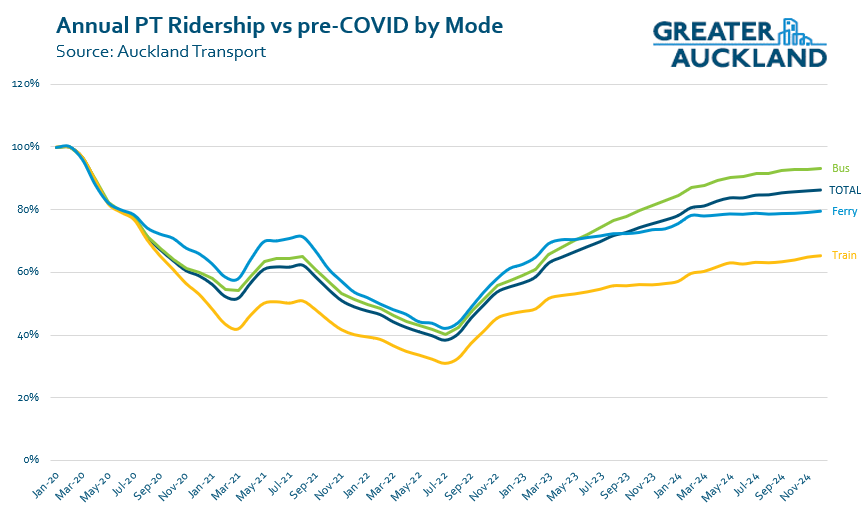
Both trains and ferries have suffered in 2024, for different reasons. Train usage continues to suffer from the ongoing works to fix the rail network and prepare it for the City Rail Link, while there has also been disruption to ferry services due to a shortage of staff. The impact of the ferry staff shortages lessened throughout the year and it was fully resolved in November.
Trains and ferries also suffer from having a higher proportion of their trips be to or from the city centre, compared to the bus network.
One thing that is a bit of a concern when it comes to the post-COVID recovery is that appears to be slowing down. This raises the question, what will it take to see the recovery move into the high 80s or even early 90 per cent range?
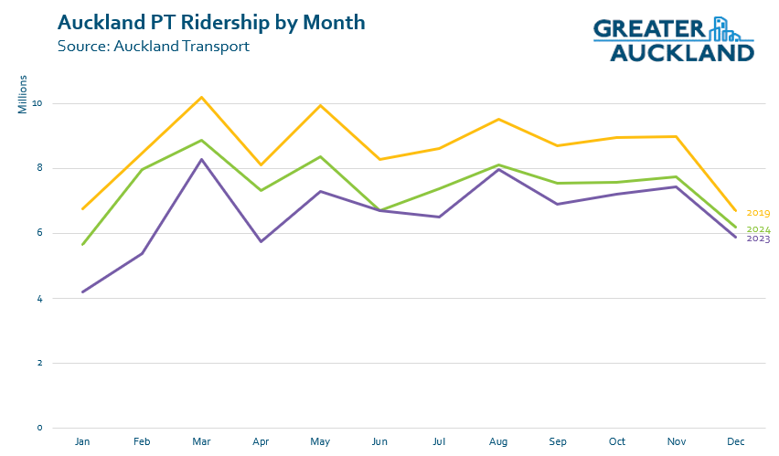
Next, a bit of a closer look at 2024 ridership, showing it by month. In this chart, I’ve compared ridership to 2023 and 2019. Every month in 2024 was higher than it was in 2023, though June was only just higher..
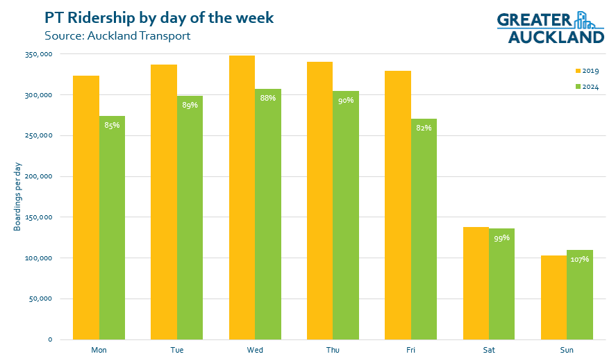
Since COVID arrived, AT have also been releasing daily ridership numbers by mode. One of the things that enables us to do is to look at ridership by day of the week. A couple of things stand out to me here:
- Weekend ridership overall is slightly up on pre-COVID levels, while weekday numbers are down. This is almost certainly due to the impact of people now working from home more than they did five years ago.
- On weekdays, there has been a larger dropoff of ridership on Mondays and Fridays compared to the middle of the week – again, this is likely due to people preferring to work from home those days if they can.
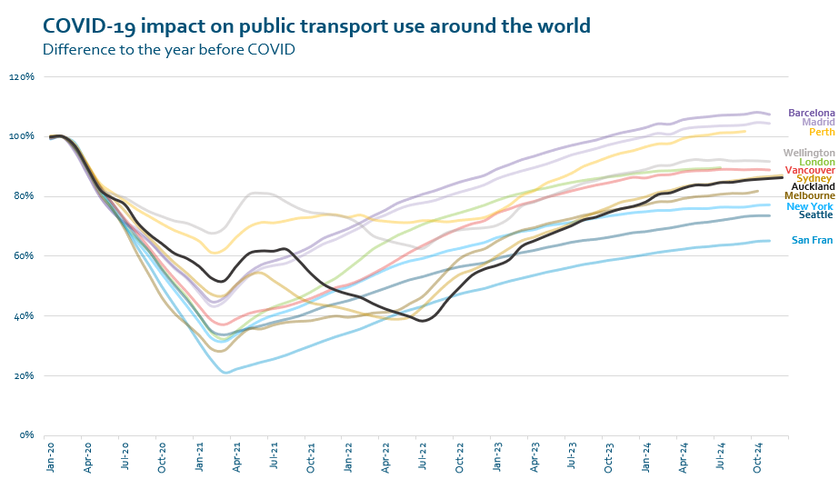
When it comes to how Auckland compares internationally, for some of the cities I’ve found enough data for, Auckland is in the middle of the pack. As noted above we’re sitting at 86%, which is almost identical to Sydney. You can also see both cities –along with Wellington and Perth – experienced some bumps of recovery following the initial travel restrictions, but dropped again with further lockdowns. Just three cities on this list are back above where they were in February 2020 – Barcelona, Madrid, and Perth.
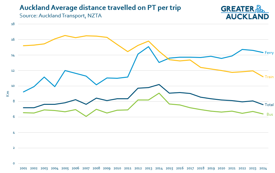
Finally for today, let’s look at the average distance travelled by mode. What stands out to me the most is that the average train trip had been getting shorter over the last 15 or so years – probably as a result of improvements like electrification. I’d expect that once the CRL opens, trips will get shorter still – especially as trips from the inner west will become much more competitive. Bus trips have also been getting shorter, which might be due to things like changes to the bus network that make transferring easier.
What all of this really highlights is that things have been getting better for public transport, but there is still a long way to go just to get back to where we were before COVID.
In a separate post I’ll been looking more closely at buses, including how individual routes have performed.

 Processing...
Re: Barcelona and Madrid patronage exceeding pre-covid levels, could this be due to record tourists numbers? Spain has had a tourism boom over the last couple of years.
I’m not sure that the metros in either place (especially Madrid) are hugely useful for tourists – and nothing near the scale of tourist use of London Tube or Paris Metro, to move the needle as much as that.
PT in those cities is exceptionally affordable. And with population booms (and huge unemployment in much of the country / youth migration to the two main cities) – it’s not a surprise usage is up.
But yes definitely lots of visitors too (and conferences, cruises all back – not Madrid lol) – – -also new lines and extensions do constantly open and spike usage… like good old Perth
Continuing extensions and improvements to the network however do drive ridership increases. Madrid is an absolute leader in this. For all types of users.
Would be interesting to track Brisbane and see what the income of 50c fares does to PT ridership there.
I was speaking the other day to a work colleague from there and he was raving about the savings it means for him and family and, of course, that has driven them taking PT more in off peak, weekends etc.
“impact”, not “income”…
I do track Brisbane too but they only release data quarterly and there hasn’t yet been a full quarter released since it was implemented.
Perth ran Free Travel for those using a Perth SmartRider Card for Buses Ferries and Trains from 14 December through to 5 February.
I was there for 2 weeks and I am sure that I saved by having bought it on my previous trip.
Public transport in Spain (like many other parts of the EU) has been heavily subsidised to get people out of their cars, and in some areas, such as the province of the Balearics, where I am atm, all train and buses across the province have been totally free for the last three years, still need to tap-on when boarding so they can count the numbers but you’re not charged for the journey. And it’s worked well, more people are using the PT system, the increased demand has necessitated extra services and new buses & trains, and now planning to replace some busy buses lines with light-rail.
That graph showing international cities is remarkable; just three cities bounced back to pre Covid levels.
London has reverted to driving (more congested then ever, mostly with Ubers and app miniicabs) or WFH.
Just noticed that labels are missing from the last chart, will fix later but they are the same as earlier charts, green = bus, yellow = train, lighter blue = ferry and darker blue = total
Perth of course has opened a whole lot of new train lines and services since Covid. I don’t expect rail ridership to fully return, even with CRL opening next year, till 2027 at the earliest, even that may be optimistic.
It will take a long time for people to rebuild trust in a system that disappears for month long stretches and considers long weekends time when its users never leave home.
One day AT and KR will absorb what the trend visible in Matt’s 4th chart above really means, and replace the word ‘commuter’ with something less narrow, like user or rider (customer is bad too- as public bodies they serve everyone, not just fee payers). Neither of the C words are helpful.
Of course people are still travelling to work places, but this is not the only type of journey, never has been, and is also not the only type of journey of value. This is heightened by the clear influence of WFH persisting and visible in these data.
We need to wean off December shutdowns. A week’s or two’s worth of shutdown during Christmas and New Year is still acceptable, but not a 5 weeks as we are seeing.
Even a Christmas/New Year shutdown is not ideal.
Yeah that COVID and work from home sure made a dent in the stats.
The rail disruptions across the entire network and impacts on ridership cannot be understated. 2020 onwards the network has been s#@t. Terrible reliability, terrible travel times/speed restrictions, and terrible long term closures of lines.
As said above, it will take a long time for people to want to rely on the rail network again.
Yes and the fact that shutdowns occur when new users might potentially be keen to give it a go obviously does not help.
This. PT needs to be fundamentally reliable, but it just isn’t in Auckland and it appears to be getting worse. Also madding how all of these shutdowns don’t ever result in better service (speeds, frequency or reliability).
Maybe the CRL will solve everything, but I doubt it.
thank you very much for that analysis. Is it possible to look at the data from the perspective of passenger numbers as opposed to rides taken in other words? Are more people using PT or are the regular users just making more trips?
The short answer is no. After the introduction of the current fare structure in 2016 through to when COVID hit, AT did publish both boardings and journey data (was pro-rated based on distance travelled so you might have something like a 0.4 bus trip and a 0.6 train trip)
But once COVID hit they stopped publishing that.
They’ve also more recently stopped publishing things like the breakdowns between the different rail lines so we can’t see how say the Western Line is performing compared to the Eastern Line
I don’t know how to do this but would an OIA request for this data? I cannot imagine that they changed the system so they don’t record this anymore.
When the new fare structure was implemented, a 2 zone trip was $3.45, now its a dollar more, soon to be $1.20 more. I’m an avid public transport user but the cost puts me off doing extra trips on weekends (if trains are even running) so sadly I just drive places.
The prices are a deterrent. When I cost a return trip for 2 adults, the comparable Uber is often only a few dollars more. Balancing the social guilt vs the idea of getting home in half the time, leads to decisions made for both comfort and speed.
Will be interesting to see what impact the removal of the off-peak discount has on the numbers.
I know AT have justified removing it on the basis it wasn’t achieving the goal of shifting patronage out of the peak times. This makes sense to me given my own experience that the discount was nice when I happened to travel off peak but wasn’t a big enough discount to re-arrange my normal schedule for it.
However what is possibly being overlooked here is that the discount also applied all day on weekends. So the discount may have been contributing to the growth in weekend patronage and its removal means that average fares for weekend travel are actually jumping by around 15%.
Does anyone know of any studies as to how increased availability of car parking at work has influenced commuter patterns? With 20-40% of people working at home any given day (anecdata from my Newmarket office), I certainly see car parking being more easily available – so those people who DO come in to WFO have it slightly easier to drive compared to pre-Covid days, when by 8:30AM or so, you had very little chance of getting a space…